Best Landing Page Design Ideas for Online Courses

If you’re building an online course, the landing page is the first thing potential students will see, and it’s crucial for converting leads and driving sales. After reviewing over 50 landing pages, I’ve identified five standout designs that can help you effectively promote your course.
The landing page is your opportunity to make a strong first impression and convince visitors to take action. It should clearly communicate the value of your course, address common pain points, and highlight key benefits.
A well-designed landing page can significantly impact your conversion rates and overall success.
Codecademy
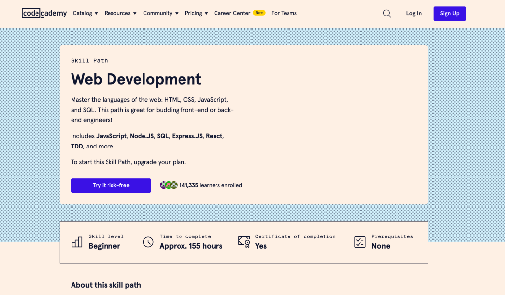
View Landing Page: https://www.codecademy.com/learn/paths/web-development
Codecademy’s Web Development course path landing page is visually clean and well-organized. It prominently displays the course structure, skills covered, and includes testimonials from past students.
The page effectively communicates the value proposition and provides a clear call-to-action to enroll. With its user-friendly design and informative content, this landing page likely converts well by addressing potential students’ concerns and highlighting the course’s benefits.
Skillshare

View Landing Page: https://www.skillshare.com/browse/graphic-design
Skillshare’s Graphic Design courses landing page is visually engaging and easy to navigate. It showcases popular courses, allows filtering by level and topic, and highlights instructor credentials.
The page’s layout effectively promotes course discovery and provides sufficient information to pique learners’ interest. With its user-friendly design and content organization, this landing page likely converts well by helping users quickly find relevant courses and instilling confidence in the instructors.
Udemy
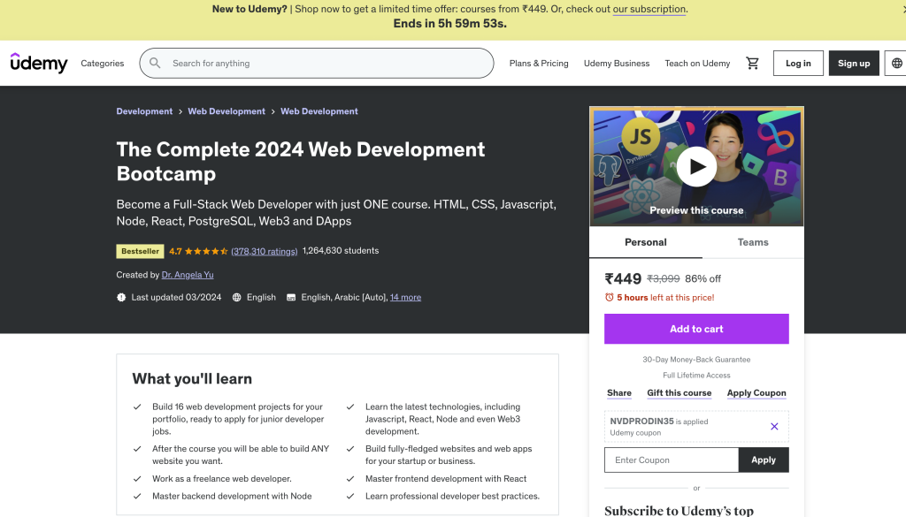
View Landing Page: https://www.udemy.com/course/the-complete-web-development-bootcamp/
Udemy’s landing page for “The Complete Web Development Bootcamp” course is comprehensive and informative. It provides a detailed curriculum, instructor bio, course ratings, and a free preview.
The page effectively addresses potential students’ concerns by showcasing the course’s depth, instructor credibility, and allowing them to sample the content. With its thorough content and clear call-to-action, this landing page likely converts well by building trust and demonstrating the course’s value.
Coursera
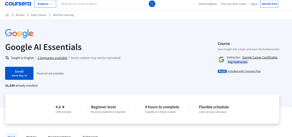
View Landing Page: https://www.coursera.org/specializations/python-data-structures
Coursera’s landing page for their Python Data Structures Specialization is well-structured and easy to navigate. It outlines the course content, prerequisites, and includes a video introduction.
The page effectively communicates the specialization’s scope, target audience, and provides a clear overview of what learners can expect. With its organized layout and informative content, this landing page likely converts well by setting clear expectations and highlighting the program’s relevance.
edX
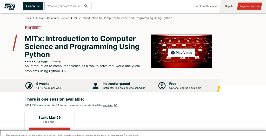
View Landing Page: https://www.edx.org/course/introduction-to-computer-science-and-programming-7
edX’s landing page for their “Introduction to Computer Science and Programming” course is visually appealing and highlights key information like course length, effort, and prerequisites.
With its clean design and concise messaging, this landing page likely converts well by quickly communicating the course’s value proposition and addressing potential learners’ concerns.


