
Fonts for Certificates That Look Professional & Impress
You’ve probably been there. Your course is finished, your students did the work, and now you’re building the certificate that marks the moment. Then you open Canva, Word, PowerPoint, or your LMS certificate editor and hit a weirdly stressful question.
What font should this use?
That choice feels small until you see the wrong one on the page. A strong course can end with a certificate that looks generic, hard to read, or oddly casual. And if your learners download it, print it, or post it on LinkedIn, every design decision gets noticed.
I’ve made enough certificates to know this part trips people up. Fonts for certificates aren’t just about taste. They shape whether the document feels formal, modern, trustworthy, accessible, and worth sharing.
Why Your Certificate Font Choice Matters
A certificate is a little like formalwear. You can show up in the wrong outfit and still technically attend the event, but people feel the mismatch right away.
Fonts work the same way.
A serif font, with the small finishing strokes on each letter, feels like a perfectly fitted suit. It signals tradition, seriousness, and authority. A sans-serif font feels more like polished business casual. Clean, modern, and easier on screens. A script font is closer to jewelry or a pocket square. It adds personality, but too much of it can take over the whole look.
Fonts carry meaning before anyone reads the words
Most course creators focus on the wording first. “Certificate of Completion.” Student name. Date. Instructor signature. All important.
But the font starts communicating before the reader gets to any of that. It tells them whether this is an academic-style credential, a modern digital badge in PDF form, or a decorative template that wasn’t thought through.
That’s one reason serif fonts have stayed so common in this category. Serif fonts have dominated certificate design since the mid-12th century, evolving from medieval Blackletter styles, and typography studies cited by The Hague Group’s certificate font guide say they increase perceived formality by 25-30% in formal documents compared with sans-serifs.
If you teach leadership, finance, compliance, healthcare, coaching, or anything tied to professional credibility, that matters.
Practical rule: Pick the font family that matches the promise of the certificate. Formal programs usually need a formal typeface. Screen-first programs often need cleaner, simpler letterforms.
The three personalities most course creators need
You don’t need a design degree to choose well. You just need a rough mental model.
- Serif fonts like Garamond, Baskerville, Caslon, and Times New Roman feel established and ceremonial.
- Sans-serif fonts like Arial, Helvetica, and Calibri feel contemporary and practical.
- Script fonts work best in small doses, often for signatures or sometimes the learner’s name if readability stays strong.
One place people get confused is thinking “professional” always means “fancy.” It doesn’t. Fancy often becomes hard to read fast. Professional usually means clear, balanced, and appropriate for the setting.
If you want a stronger eye for what gives certificates that realistic, official feel, this breakdown of Realistic diploma design elements is useful because it shows how fonts, seals, and signatures combine to create authority on the page.
A good font choice protects the moment
Your learner’s name is the emotional center of the certificate. The font either supports that moment or gets in its way.
I tend to ask one simple question before choosing anything: if a student framed this, would it still look credible a year from now?
That question filters out a lot of trendy fonts very quickly.
Creating a Clear Typographic Hierarchy
Most certificate problems aren’t really font problems. They’re hierarchy problems.
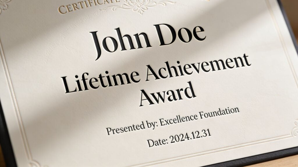
When everything on the page looks equally important, the reader has to work too hard. A certificate should guide the eye in a clear order. First the learner’s name. Then what they achieved. Then who issued it. Then the supporting details.
Start with the reading path
Think of hierarchy as a path through the page.
If I glance at a certificate for two seconds, I should immediately understand three things: who earned it, what it recognizes, and who stands behind it. If those answers don’t appear in that order, the design usually feels off.
The strongest visual anchor should be the recipient’s name. According to Certifier’s certificate font recommendations, the name should usually sit at 20-50 points, while body text works best at 10-14 points. That size gap helps readers notice the person first, and it also affects how valuable the credential feels when people share it online.
A simple blueprint that works
Here’s the sizing structure I come back to when I want a certificate to feel polished without overdesigning it.
| Certificate element | Recommended approach |
|---|---|
| Recipient name | 20-50 pt, most prominent text on the page |
| Certificate title | 14-30 pt, clear but secondary to the name |
| Supporting description | 10-14 pt, regular weight for easy reading |
| Issuer name or organization | Similar visual weight to the title or slightly smaller |
| Signature and date | Small and restrained, often 8-30 pt depending on style |
That doesn’t mean you must use the largest possible name every time. A short name can carry a larger size elegantly. A long name may need tighter control.
What matters is the contrast between levels.
If your eyes bounce around the page instead of landing on the learner’s name first, the hierarchy needs work.
Three fixes for common hierarchy mistakes
A lot of templates make the same avoidable errors.
- Oversized title text: “Certificate of Completion” gets so large that it competes with the learner’s name. Pull it back.
- Tiny issuer details: The organization name disappears even though it helps establish credibility.
- Decorative overload: Script text appears in multiple places, which weakens the focal point instead of strengthening it.
A quick example
Say you’re issuing a certificate for a course called Advanced Email Marketing Strategy.
A practical hierarchy might look like this:
- Recipient name: large serif or clean sans-serif, centered and dominant
- Title line: “Certificate of Completion” in a smaller uppercase or title case style
- Achievement line: “for successfully completing Advanced Email Marketing Strategy” in body size
- Issuer line: your academy or company name with enough weight to feel official
- Date and signature: visually present, but not competing with the name
The point isn’t to make every line beautiful in isolation. The point is to make the whole page easy to read in the right order.
Smart Font Pairing Strategies for Certificates
Font pairing sounds harder than it is. Most good certificates use a very simple formula.
Pick one statement font and one support font. If you want a third, make it a restrained accent, not another star.
That’s it.
Pair for contrast, not novelty
The easiest pairing for fonts for certificates is a serif plus a sans-serif. The serif gives the document ceremony. The sans-serif keeps supporting text tidy and readable.
A few combinations I’d trust for many course businesses:
- Garamond + Arial for a classic academic look with practical body text
- Baskerville + Calibri when you want formality without a stuffy feel
- Helvetica + a restrained script for the signature only when the certificate is mainly digital
- Times New Roman + Arial if you need dependable, familiar system fonts
You can also stay within one family and use different weights. That works well when you want a clean, modern certificate and you don’t want to manage font compatibility issues.
If you want more examples for online education branding, this guide to best font pairings for course creators is a solid next read.
What usually goes wrong
Most pairing mistakes come from one of three habits.
- Too many personalities: A serif title, a script subtitle, a different sans-serif body, and another decorative signature font. That’s four voices trying to speak at once.
- No contrast at all: Two fonts that are so similar the pairing looks accidental.
- Poor role assignment: The fancy font gets used for body copy, where readability matters most.
A certificate isn’t a movie poster. It needs calm structure more than dramatic typography.
Three pairing patterns I use often
Classic and credible
Use a serif for the title and learner name, then a sans-serif for the smaller supporting lines.
This works especially well for coaching certifications, instructor-led programs, or anything that benefits from a formal tone.
Modern and screen-friendly
Use a sans-serif throughout, then create hierarchy through size, weight, and spacing.
This is a good fit for tech, design, software, analytics, and digital marketing certificates that live mostly as PDFs.
Personal but controlled
Use a serif or sans-serif system for most of the certificate, then add one script font for the signature.
That gives the page warmth without sacrificing clarity.
A script font should behave like an accent piece. If it takes over the room, it’s doing too much.
The simplest rule to remember
If you’re stuck, use no more than three typeface styles on a single certificate. In practice, two is often enough.
Good pairings don’t call attention to themselves. They make the certificate feel coherent, which is why viewers often describe them as “professional” without being able to explain why.
Our Top Recommended Fonts for Any Certificate
When people ask me for the best fonts for certificates, they usually want one perfect answer. There isn’t one. The right choice depends on whether you want the certificate to feel traditional, modern, or lightly ceremonial.
Still, some fonts are reliable enough that I return to them often.
Classic serifs for authority
Garamond is one of my favorite choices when I want a certificate to feel refined without looking heavy. It has a literary, academic quality that suits completion certificates, honors documents, and premium coaching programs.
Baskerville feels a little firmer. I use it when I want more visible authority, especially for professional training and executive education.
Caslon has warmth and heritage. It’s less common in drag-and-drop templates, which can make your certificate feel more considered.
Times New Roman deserves more respect than it usually gets. It’s familiar, easy to render, and widely recognized. Sometimes “reliable” beats “interesting,” especially when certificates have to open cleanly across devices.
Modern sans-serifs for digital delivery
For screen-first certificates, sans-serifs often make life easier. According to Smallpdf’s guide to certificate PDF fonts, sans-serif fonts like Arial and Helvetica became standard for digital certificates because of their on-screen legibility. Arial appears on over 99% of computers, which helps rendering stay consistent, and these clean letterforms can support OCR scanning with up to 98% accuracy.
That matters if your learners upload certificates to employer portals, digital portfolios, or internal HR systems.
A few standouts:
- Arial: not glamorous, but dependable almost everywhere
- Helvetica: clean, neutral, and polished
- Calibri: softer and friendly, often useful for internal training certificates
- Verdana: wider, highly readable, especially on smaller screens
Script fonts for selective emphasis
Script fonts belong in careful hands. They can add elegance, but they also cause most readability complaints.
I’ll use something like Great Vibes only for a signature or occasionally for a short recipient name if the rest of the certificate is very restrained. It can look lovely in a premium or celebratory context, but it should never carry paragraphs of text.
If the course creator wants a certificate to feel luxurious, the better move is usually a classic serif plus generous spacing, not script everywhere.
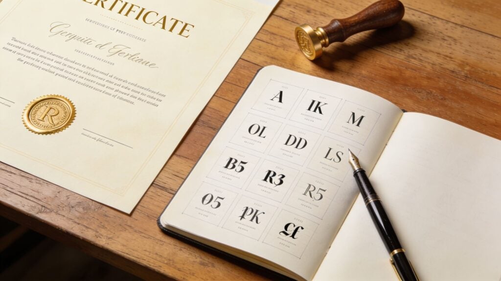
Here’s a quick visual explainer before I go deeper into use cases.

My practical shortlist by use case
| Use case | Font direction I’d choose |
|---|---|
| University-style or academic certificate | Garamond, Baskerville, Caslon, Times New Roman |
| Tech or digital skills course | Arial, Helvetica, Calibri, Verdana |
| Luxury coaching or milestone award | Serif foundation with a restrained script signature |
| Mobile-heavy learner audience | Sans-serif first, especially for smaller text |
| High compatibility needs | Arial or Times New Roman |
A few pairings I trust
- Garamond for the learner’s name + Arial for body text
- Baskerville title + Calibri support copy
- Helvetica throughout + script signature
- Times New Roman heading + Arial details
The best font is the one that still looks right in four places: your editor, a PDF, a phone screen, and a printed sheet on an ordinary office printer.
That’s not the most romantic design advice, but it saves people a lot of frustration.
Go Beyond Aesthetics with Accessibility and Licensing
A certificate can look gorgeous and still fail two professional tests. Someone can struggle to read it, or you can be using a font in a way your license doesn’t allow.
Both problems are common. Neither is minor.

Accessibility belongs in certificate design
A lot of certificate advice online stops at “pick something elegant.” That’s too shallow for digital learning businesses.
Your certificates are usually delivered as PDFs, downloaded on laptops, previewed on phones, and sometimes read by people with low vision, dyslexia, or other reading challenges. If your typography is thin, low-contrast, or overly decorative, the certificate becomes harder to use for the people who earned it.
The accessibility gap online is already massive. A WPLMS article on certificate fonts and accessibility cites a 2023 WebAIM report showing 96% of homepages fail WCAG font legibility guidelines. It also notes that fonts like Verdana have shown readability improvements of up to 30% for users with dyslexia.
That should get every course creator’s attention.
What accessible font choices look like in practice
You don’t need to turn your certificate into a plain government form. You just need to make smarter tradeoffs.
- Choose clear letterforms: Verdana, Arial, Calibri, and other readable sans-serifs are often safer for supporting text.
- Avoid thin weights: Light or hairline styles can disappear on some screens and printers.
- Keep contrast strong: WCAG-aware design depends on readable contrast between text and background.
- Use decorative fonts sparingly: They’re best kept to signatures or very short accents.
- Test the final export: View the PDF on mobile, desktop, and in print before sending it at scale.
If a learner has to zoom in and guess at a name, date, or title, the certificate isn’t finished.
Licensing is the hidden legal issue
I see this all the time. A creator downloads a beautiful font from a marketplace, installs it, uses it on hundreds of certificates, and never checks the license.
That’s risky.
Some fonts are free for personal use but not commercial use. Some allow print work but place limits on embedding in PDFs, apps, or web-based generators. Some are safe inside your design tool but not safe for exported assets you distribute to paying learners.
A few practical habits help a lot:
- Read the license before using the font in a course business
- Check whether PDF embedding is allowed
- Keep a copy of the license terms in your brand files
- Use well-documented libraries when possible, such as Google Fonts for broad commercial clarity
- Review your broader rights stack, not just fonts, with a resource like this copyright checklist for online course creators
My rule of thumb
If I’m issuing certificates at scale, I prefer fonts with clear commercial terms and predictable rendering. That often beats the thrill of a rare, stylish typeface.
Your certificate is part of your product. Accessibility protects your learners. Licensing protects your business. Both shape whether the final document feels professional.
Putting It All Together with Practical Tool Tips
Once your font choices are settled, execution becomes the main job. The same typeface can look great in a mockup and fall apart when exported, compressed, or opened on a phone.
That’s why I always test the certificate where learners will see it.
Canva, Word, and Adobe InDesign
Canva is the fastest option for many creators. I’d use brand kits to lock in a small set of approved fonts, then duplicate one master certificate template instead of designing from scratch every time. Canva is also where people tend to overdecorate, so it helps to decide roles upfront. One font for prominence, one for support, one accent at most.
Microsoft Word is less glamorous, but it can still produce a solid certificate if you keep the layout simple. Stick with dependable installed fonts, use text boxes carefully, and export to PDF before sharing. Word tends to reveal alignment issues late, so zoom out and check the full page often.
Adobe InDesign gives the most control. If you issue premium certificates or branded training documents regularly, it’s the best environment for spacing, optical balance, and precise hierarchy. It also gives you more control over packaging assets if other team members need to produce certificates consistently.
Be careful with signature fonts
The part that breaks most often is the signature.
According to Sertifier’s signature font checklist, scripts with stroke contrast ratios over 1:4 often fail in compressed PDFs or at small sizes on mobile, which makes them hard to read and weakens the professionalism of the credential. In plain English, if the font has hair-thin parts and very thick parts, it may look elegant in your editor and messy everywhere else.
So before you commit to a handwritten-style font:
- Test it at actual size, not zoomed in
- Export a PDF and email it to yourself
- Open it on a phone
- Print one copy on an ordinary printer
- Check whether enclosed letter shapes fill in or blur
Thin script fonts are like delicate icing on a cake. They look great until they get bumped around in transit.
Tips for automated certificate systems
If your LMS, membership tool, or certificate app generates PDFs automatically, your job shifts from designing one beautiful file to designing one resilient system.
Here’s what helps most:
- Use web-safe or broadly supported fonts when the platform has limited embedding control
- Keep text boxes flexible so long names don’t break the layout
- Limit decorative text in dynamic fields like learner names
- Run sample exports with short names, long names, accented characters, and mobile previews
- Standardize your background graphics so text contrast stays strong
If you’re also refining the visual side of the certificate background, badges, or branded overlays, this guide on how to create stunning images with OKZest has some useful ideas for the image layer that sits behind your typography.
And if automation is the bigger challenge, this resource on tools to automate course completion certificates can help you compare practical setup options.
My final production habit
I never approve a certificate from the editor view alone.
I approve it only after I’ve seen the exported PDF at normal zoom, on a phone, and on paper. That single habit catches more font issues than any design trick.
Frequently Asked Questions About Certificate Fonts
Can I use a decorative font for the whole certificate
I wouldn’t.
Decorative and script fonts are better as accents. They can work for a signature or occasionally a short learner name, but body text, course titles, and issuer details need easy readability. If every line is ornate, the certificate starts to feel theatrical instead of credible.
What if the learner has a very long name
Reduce the name size first, then adjust tracking and line breaks carefully. Don’t switch to a condensed novelty font just to force it onto one line.
I usually build certificates with enough horizontal space for names to breathe. Testing with long sample names early saves a lot of cleanup later.
What’s the best font for digital certificates
For digital delivery, I generally trust clean sans-serifs more than decorative styles. Arial, Helvetica, Calibri, and Verdana are practical choices because they tend to hold up well across screens and exported PDFs.
If you want more ceremony, combine a serif heading with a sans-serif support font rather than making the whole certificate ornate.
Should the learner’s name be in script
Sometimes, but only if it stays readable at real viewing size.
A script name can feel celebratory. It can also become hard to read on a phone or after PDF compression. If there’s any doubt, use a serif or sans-serif and let size, spacing, and layout create elegance instead.
Can I embed a custom font in a PDF certificate
Sometimes yes, sometimes no. It depends on the font license and the export tool.
That’s why I always tell creators to check license terms before they design at scale. A font being installed on your computer doesn’t automatically mean you can distribute embedded versions to learners.
What’s the safest choice if I’m unsure
Use one proven serif or sans-serif family, create a clear hierarchy, and keep decoration minimal.
That approach won’t win typography awards, but it will give you a certificate that looks professional, reads clearly, and holds up in real-world use.
If you’re building course assets beyond certificates, LearnStream shares practical guides for educators who want cleaner systems, better learner experiences, and tools that don’t waste time.