Storyboard Template for E-Learning Course Design
I know the feeling. You have a brilliant idea for a new e-learning course, and the urge to jump straight into your authoring tool is almost irresistible. You want to see your vision come to life. But I’m going to share a piece of advice that has saved me from countless late nights and costly redos. Always, always start with a storyboard.
It might feel like an unnecessary delay, but skipping this step is like a builder starting construction without a blueprint. You just wouldn’t do it.
Why a Storyboard Is Your Secret Weapon for Course Design
Think of it this way. A storyboard is the architectural plan for your course. It’s the document where you methodically map out every single detail before you ever touch a piece of software. It’s a comprehensive guide for each screen your learner will see.
This process forces you to think through the entire learning experience before you commit time and resources to development. It’s where I iron out all the crucial components for every single screen:
- On-Screen Text: The exact words your learners will read.
- Audio Scripts: The complete narration, word for word.
- Visuals and Media: Specific notes on images, videos, or animations.
- Interactive Elements: Detailed descriptions of quizzes, drag-and-drops, or branching scenarios.
The Blueprint for a Cohesive Course
This is where the magic really happens. Planning everything upfront allows you to build a logical, cohesive flow. You can see how each piece of content, each screen, each interaction, connects directly back to your core learning objectives. This ensures your course is actually effective, not just a random collection of information.
This structured approach is a fundamental part of solid instructional design for online courses.
When you plan screen-by-screen, you get a bird’s-eye view of the entire learner journey. This perspective is invaluable. It’s where you spot logical gaps, find weak points, and make sure the whole experience flows seamlessly before you’ve invested a single dollar in development.
Making Team Collaboration Effortless
And if you’re working with a team? A detailed storyboard is an absolute game-changer. Forget trying to explain your vision over a series of confusing emails and endless meetings. Just hand them the storyboard.
Your graphic designer will know exactly what visuals to create. Your developer will understand precisely how each interactive element needs to function. This level of clarity dramatically cuts down on back-and-forth communication and the expensive revisions that come from misunderstandings.
Ultimately, using a storyboard template for e-learning course design is a non-negotiable step in my process. It transforms a good idea into a polished, professional, and genuinely impactful learning experience. It might feel like extra work at first, but the time you invest upfront will pay for itself many times over during the development phase.
I’ve seen my fair share of storyboards over the years, and I can tell you this. A bad template creates more headaches than it solves. I’ve learned the hard way that a truly effective storyboard template for e-learning course design has to be a crystal-clear blueprint that leaves zero room for guesswork.

Let’s walk through the non-negotiable components I absolutely insist on including in my own templates. These are the fields that separate a confusing document from a roadmap that gets your course built right the first time.
The Foundational Building Blocks
Before you even think about content, every single screen in your course needs a few basic identifiers. Think of these as the project management essentials that keep everything organized and prevent chaos during reviews or handoffs.
These are the core elements you can’t skip:
- Screen ID: This is a unique code for every screen (like M1-S1 for Module 1, Screen 1). It’s critical for referencing specific parts of the course and ensuring everyone is talking about the same thing.
- Screen Title: A simple, descriptive title makes navigating the storyboard a breeze. Think “Welcome and Introduction” or “Knowledge Check 1.”
- Learning Objective(s): This is your North Star. Every screen must map back to a specific learning objective. This simple step ensures your course stays focused and purposeful, cutting out any fluff.
It sounds obvious, but you’d be amazed how many templates I’ve seen that miss these basics. A solid structure from the very beginning saves countless hours down the line.
The Core Content Columns
Now we get to the heart of the storyboard, the columns that spell out the actual learning experience. I’ve found that the only way to ensure total clarity is to separate what the learner reads, hears, and sees into dedicated spaces. It forces you to think about how these pieces will work together.
A great storyboard shows how the different pieces, like text, narration, visuals, and interaction, fit together to create a cohesive learning moment on a single screen.
Don’t forget that defining your course scope includes accessibility. A good storyboard prompts you to plan for things like alt text for images right from the start. If you need a solid reference point, a good WCAG compliance checklist is an invaluable resource to have on hand.
Here are the content columns I always use:
- On-Screen Text (OST): This is for the exact text learners will read on the screen. It covers everything from headings and body copy to button labels and instructions.
- Narration Script: This column holds the word-for-word script for any voiceover. It’s crucial to keep this separate from the OST, as what you say is often different from what you show.
- Visuals and Media Notes: This is where you paint a picture of what the learner will see. Be specific. Instead of “add an image,” describe it: “Image of a diverse team collaborating around a whiteboard. Use stock photo #12345 or similar.”
Planning for Action and Development
Finally, your template has to account for two more things. What the learner does and what the developer needs to build. These are the columns that transform a static document into a functional development guide.
I always include a dedicated column for Interactivity Notes. This is where you detail every single user action. Are they clicking a button, dragging and dropping an item, or typing in a response? Describe the interaction and what happens as a result.
The last piece of the puzzle is the Developer Notes section. This is an absolute game-changer for a smooth handoff. Use this space for any technical instructions, like “On final incorrect attempt, show ‘Try Again’ layer,” or “Variable ‘UserName’ should populate here.”
To pull it all together, here’s a breakdown of how these essential fields function in a real-world template.
Essential Fields for Your E-Learning Storyboard Template
This table breaks down the critical components every effective e-learning storyboard should include. Getting these right ensures clarity and a smooth design process from start to finish.
| Field Name | Purpose | Example |
|---|---|---|
| Screen ID | Provides a unique identifier for easy reference. | M2-S3 (Module 2, Screen 3) |
| On-Screen Text | Details the exact text learners will read. | “Click the ‘Next’ button to continue.” |
| Narration Script | Contains the full script for any voiceover. | “Now that we’ve covered the basics, let’s move on.” |
| Visuals/Media Notes | Describes all visual elements on the screen. | “Show animated icon of a lightbulb turning on.” |
| Interactivity Notes | Explains how learners will interact with the screen. | “Drag-and-drop. Correct answer is Option B.” |
| Developer Notes | Provides technical instructions for the build. | “Branch to screen M2-S5 upon correct answer.” |
By making sure all these elements are in place, your storyboard template for e-learning course design becomes a powerful tool that gets everyone aligned and ensures your vision is executed perfectly.
Translating Learning Objectives Into Engaging Screens
This is where the magic really happens. Your storyboard template is no longer just a blank document. It’s the canvas where abstract goals start taking shape as real, tangible learning experiences. I’m going to walk you through my exact process for taking a big-picture learning objective and breaking it down, first into lessons, and then into the individual screens that learners will see and interact with.
Let’s start with a classic e-learning goal. Imagine a stakeholder tells you they need to “Improve customer service response times.” That’s a solid business objective, but it’s far too broad for a single screen or even one lesson. You can’t just throw that at a learner. The key is to deconstruct it.
Faced with a goal like that, my first question is always, “What specific knowledge or skills does someone actually need to make that happen?” This line of thinking quickly leads to a list of smaller, more manageable topics.
- Understanding why speed matters in customer service.
- Learning to use the new ticketing software efficiently.
- Mastering pre-written templates for common questions.
- Knowing when to escalate a ticket to a manager.
Suddenly, you have the backbone of your course. Each of these bullet points can become a mini-lesson, ensuring your content is logically structured and builds on itself.
From Lesson to Screen: A Practical Example
Now, let’s grab one of those mini-lessons, “Mastering pre-written templates for common questions,” and see how it translates to your storyboard template for e-learning course design. This is where we start filling in those columns and making decisions.
I always think about this from the learner’s point of view. What do they need to see, hear, and do, screen by screen, to master this skill? A natural flow usually involves an introduction, an explanation of the core concept, a chance to practice, and a quick wrap-up.
Let’s imagine we’re storyboarding the very first screen for this lesson. Here’s how I’d start filling out the fields for a screen I’m labeling M2-S1 (Module 2, Screen 1).
Screen ID: M2-S1
Screen Title: The Power of Templates
Learning Objective: The learner will be able to explain why using templates improves both speed and consistency.
With the high-level details in place, it’s time to think about the actual content. This screen needs to hook the learner and not just dump information on them.
On-Screen Text:
- Heading: “Work Smarter, Not Harder”
- Body: “Did you know that using templates can reduce response times by up to 50%? Let’s explore how they help you answer customer questions faster and more consistently.”
Narration Script:
“In this lesson, we’re going to unlock a simple but powerful tool for improving your response times: templates. While it might seem like a small change, mastering templates will help you deliver high-quality answers in a fraction of the time, letting you focus on more complex customer issues.”
Visuals/Media Notes:
“An animated icon of a clock with its hands spinning quickly, which then morphs into a checklist icon. Keep the style clean and aligned with our brand’s color palette.”
See? This level of detail leaves nothing to chance. A graphic designer knows exactly what to build, and the developer understands the flow. Most importantly, the learner gets a clear and engaging introduction.
Mapping the Learner’s Journey
After that intro screen, you just keep the momentum going, always asking, “What’s next for the learner?” The following screens in this sequence might unfold like this:
- M2-S2 (Concept Screen): Present two or three core benefits of using templates. Use simple text and icons, maybe with a “click to reveal” interaction for each benefit to keep it from being static.
- M2-S3 (Example Screen): Show, don’t just tell. Put a poorly written, from-scratch response on one side of the screen and a polished, professional template-based response on the other. The contrast is powerful.
- M2-S4 (Practice Activity): This is where active learning kicks in. Give the learner a common customer question and three possible template responses. Have them drag and drop the best one into a reply box.
- M2-S5 (Feedback Screen): Based on their choice in the previous activity, provide immediate, specific feedback. Explain why their chosen response was the best option, or what was wrong with the others.
- M2-S6 (Summary Screen): End with a quick recap of the key takeaways from the lesson to reinforce the main points.
By planning out a sequence like this, you are intentionally designing a journey that moves from understanding (the ‘why’) to application (the ‘how’), which is the absolute foundation of effective instructional design.
Crafting learning objectives that naturally lead to this kind of flow is a skill in itself. If you want to get better at defining these goals upfront, you might find our guide on using Bloom’s Taxonomy to create powerful learning objectives really helpful. It’s a fantastic framework for making sure your course goals are clear, measurable, and actionable.
The beauty of a well-structured storyboard template for e-learning course design is that it forces you to think this way. It’s a constant prompt, pushing you to consider the visuals, the narration, and the interactions for every single step. This kind of meticulous planning is what separates an average, forgettable course from a truly exceptional one.
Using Your Storyboard to Design Interactive Scenarios
Let’s be real for a second. Nobody actually enjoys a static, click-and-read e-learning course. If you want to hook your learners and make the content stick, you have to build in some real interactivity. This is where your storyboard template for e-learning course design stops being just an outline and becomes your playground for creating powerful, scenario-based learning.
These interactive scenarios are especially brilliant for teaching soft skills. Think about thorny topics like leadership, sales negotiation, or conflict resolution. You can’t just tell someone how to handle a difficult conversation. They need to feel the pressure and practice making choices. Scenarios let them do just that by mirroring real-world decisions in a safe, controlled environment.
This simple flowchart shows how every screen you design, no matter how simple or complex, should flow from a high-level goal. It’s the absolute foundation for building any interaction.
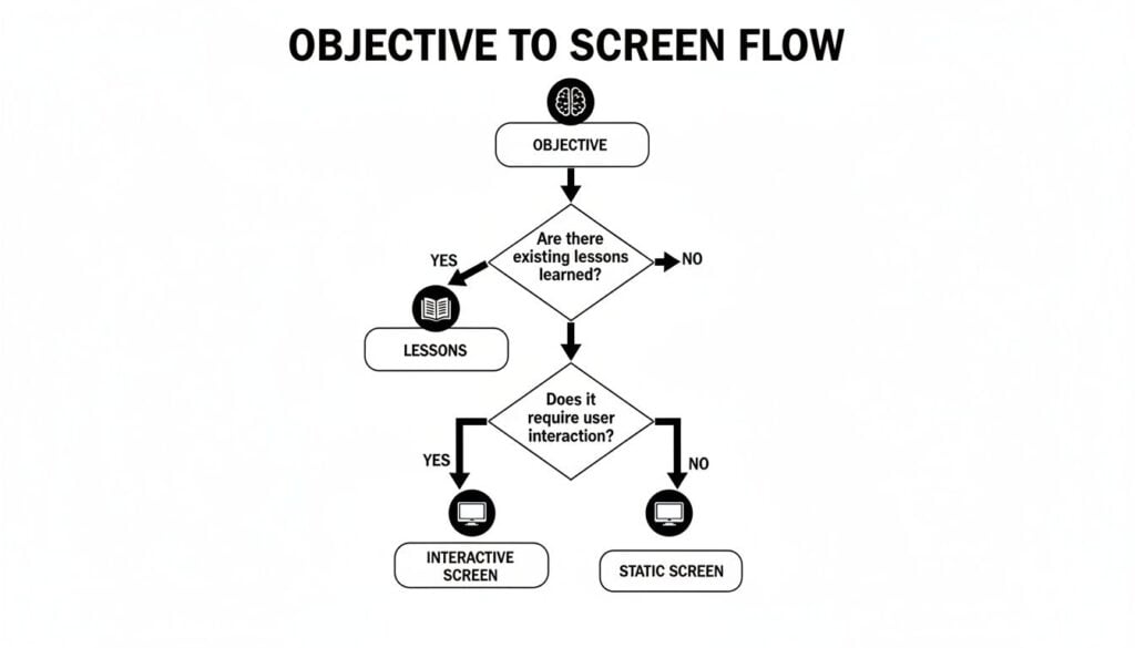
As you can see, every screen, whether it’s a basic text slide or a multi-path scenario, must trace back to a specific lesson and an overarching objective. No exceptions.
Mapping Out Branching Paths
The most effective scenarios use branching paths, where the story actually changes based on the learner’s choices. So, how do you map all this out in a storyboard without it turning into a tangled mess? I always start with a simple flowchart.
Before I write a single line of dialogue or on-screen text, I sketch out a basic decision tree. This gives me a bird’s-eye view of the entire interaction, helping me spot dead ends or confusing loops before I’ve invested too much time.
Let’s go back to our angry customer example. The scene opens with the customer’s complaint, and the learner is immediately presented with a choice.
- Choice 1: Respond with empathy.
- Choice 2: Get defensive.
- Choice 3: Respond with indifference.
Each choice sends the learner down a different path. My flowchart would clearly show that Choice 1 leads to a positive outcome, while Choices 2 and 3 spiral into negative consequences, maybe even forcing the learner to try again. With this map in hand, I can then jump into my storyboard and create a separate screen for each and every step in that flow.
Detailing Choices and Consequences
Once my flowchart is solid, I use the storyboard to flesh out the nitty-gritty details. This is where those “Interactivity Notes” and “Developer Notes” columns become your best friends. For each decision point, I create a unique screen in the storyboard.
Here’s exactly how I would document one of those paths:
Screen ID: M3-S4 (Choice Point)
On-Screen Text: The customer says, “Your product broke, and it ruined my whole project!” What do you do?
- A. “I’m so sorry to hear that. Let’s figure out how to make this right.”
- B. “Well, did you follow the instructions correctly?”
Interactivity Notes: Multiple-choice question. - If learner selects A, branch to screen M3-S5 (Positive Path).
- If learner selects B, branch to screen M3-S6 (Negative Path).
Planning out the feedback is just as crucial as planning the choices themselves. For every single path, you have to detail the consequence. Real learning happens when the user understands why their choice led to a specific outcome.
This method ensures nothing gets lost in translation. The developer knows precisely how to build the logic, and the script for every possible outcome is clearly defined. The data also backs it up. Scenario-based learning with well-designed branching paths can boost critical thinking and retention by up to 45% compared to standard linear content. The folks at iSpring Solutions have some great insights on how interactivity transforms course design.
Scripting Realistic Dialogue and Feedback
For a scenario to work, it has to feel real. The dialogue has to sound authentic. I spend a ton of time in the “Narration Script” column of my storyboard crafting lines that sound like something an actual human would say. Ditch the corporate jargon and stiff, formal language.
After a learner makes their choice, the feedback screen is your prime opportunity to reinforce the learning objective. Don’t just slap a “Correct” or “Incorrect” on the screen and call it a day.
- For a good choice: Explain why it was the right move. For example, “Great choice! By showing empathy first, you de-escalated the situation and showed the customer you’re on their side. This builds trust and opens the door for a real solution.”
- For a poor choice: Gently explain the negative impact and guide them toward a better approach. For instance, “While it’s important to get the details, asking a defensive question probably made the customer feel blamed. In these situations, it’s almost always best to start with empathy to show you’re on their team.”
By detailing all these elements, the branching logic, the specific choices, the authentic dialogue, and the targeted feedback, your storyboard transforms from a simple content outline into a true director’s script. You’re creating an engaging, interactive experience that actually makes learning stick.
Smoothing the Handoff to Developers and Your LMS
You’ve done it. The storyboard is complete, a perfect blueprint for your e-learning course. But here’s something I’ve learned the hard way. The project isn’t done. That next step, handing your masterpiece over to developers or getting it ready for the LMS, is where many projects go completely off the rails.
A messy handoff is a fast track to delays, endless back-and-forth emails, and expensive rework. A little bit of prep at this stage makes all the difference between a smooth launch and a frustrating mess.

Over years of collaborating with development teams, I’ve refined a simple handoff process. It’s all about eliminating guesswork and making sure your vision translates perfectly into a functional, finished course. The goal is to be the developer’s favorite instructional designer, not the source of their next headache.
Get Your Files and Folders in Order
The first thing I always do is get all the project assets organized. This means setting up a central, shared folder, think Google Drive, Dropbox, or SharePoint, that everyone on the project can access.
Inside that main folder, I create a set of subfolders that directly mirrors the structure of my storyboard template for e-learning course design. A typical setup for me looks like this:
01_Storyboards: This is where the final, signed-off storyboard document lives.02_Images: All images, custom icons, and any other graphics for the course.03_Audio: The final, edited voiceover files, never the raw takes.04_Video: Any video clips that need to be embedded in the course.05_BrandAssets: This folder is a lifesaver. It holds logos, font files, and the official brand style guide with color hex codes.
Naming conventions are everything. I make sure every single file is named logically. Instead of a generic name like image1.png, I tie it directly to the storyboard. A file name like M1-S3_collaboration_photo.png tells a developer exactly where that asset belongs without them ever having to ask.
Write Developer Notes That Leave No Room for Doubt
That “Developer Notes” column in your storyboard is your most powerful communication tool during the handoff. This is where you need to be obsessively specific and anticipate every possible question. When it comes to this part of the process, it helps to be good at writing product requirements, as clear instructions prevent costly misunderstandings down the line.
Think through every single interaction, animation, and transition. Don’t assume anything is obvious.
Your storyboard should answer questions before they are even asked. If a developer has to stop and ask for clarification on an animation or a button’s function, you haven’t provided enough detail.
Here are a few real-world examples of the kinds of notes I include:
- Animation Timing: “Fade in heading text over 0.5 seconds. Body text appears 1 second later, fading in over 0.5 seconds.”
- Button States: “Next button: Normal state #007BFF. Hover state #0056b3. Disabled state #C0C0C0 until slide audio completes.”
- LMS Tracking: “Track completion for this screen. When user clicks Submit on the quiz, send the variable
Quiz1_Scoreto the LMS.”
This level of detail is what separates a good plan from an executable one. It ensures the final course looks and functions exactly the way you envisioned it.
And once your course is built, you still have to get it into your learning platform. If you want to get a head start on that final piece of the puzzle, check out our guide on how to import SCORM files into an LMS. Taking these extra steps at the handoff stage guarantees a smoother process and a much better final product.
Your Storyboard Questions Answered
When you start using a storyboard template for your e-learning course design, a few questions inevitably bubble up. That’s perfectly normal. Over the years, I’ve heard the same handful of queries from instructional designers and course creators time and again, so I’ve pulled together some straight-up answers to clear the air.
What Is The Best Software For Creating A Storyboard Template?
Honestly, you absolutely do not need expensive, specialized software to get started. I, and many other pros, often just fire up Microsoft Word or a Google Doc. They’re perfect for creating simple tables to structure your content, and just about everyone on your team already knows how to use them.
This low-tech approach works beautifully for text-heavy courses where your main focus is nailing down the on-screen text and narration script. A simple table with a few columns, Screen ID, On-Screen Text, Narration, and Visual/Programming Notes, is often all you need to build a rock-solid foundation.
Now, if you’re mapping out a course with more complex interactions like branching scenarios, other tools can definitely make your life easier.
- For visualizing flow: Something like Miro or even good old PowerPoint is fantastic. They let you draw connections between screens, helping you and your team literally see the learner’s journey through a decision tree.
- For all-in-one solutions: Authoring tools such as Articulate Storyline have storyboarding features built right in. This can be handy if you prefer to build and design within the same ecosystem.
My best advice? Just start. The tool is far less important than the thinking that goes into planning the course. Don’t let the hunt for the “perfect” software become an excuse for procrastination. A well-organized Google Doc that actually gets used is infinitely more valuable than a fancy tool you never open.
How Detailed Should My Storyboard Be?
That’s a great question, and the answer really boils down to one thing. Who is going to use it? The level of detail you need is all about your audience.
If you’re a one-person show, writing, designing, and developing the entire course yourself, your storyboard can be pretty lean. You might get away with bullet points for the narration script and some rough notes for visuals because you’re the only one who needs to translate it. You can keep a lot of the specifics in your head.
But if you’re handing this document off to a team of developers, graphic designers, and voice-over artists, it needs to be airtight. It should be a completely foolproof blueprint.
A good rule of thumb I live by is this. Someone who knows absolutely nothing about your project should be able to pick up your storyboard and build the course exactly as you envision it without having to ask you a single question.
To get to that level of clarity, you need to include:
- Every single word of the on-screen text and the narration script, written out verbatim.
- Hyper-specific visual notes, maybe even with links to reference images or rough sketches you’ve made.
- Crystal-clear interactivity instructions that detail what happens on every click, hover, or drag-and-drop action.
More detail upfront always, always means fewer mistakes and painful revisions down the line. The time you invest here will pay you back tenfold during the development phase.
Can I Skip Storyboarding For A Short Microlearning Course?
I would strongly, strongly advise against it. You might even argue that storyboarding is more critical for a five-minute microlearning module.
With microlearning, you have an incredibly short window to make your point. Every second and every pixel of screen space counts. There is zero room for fluff. A storyboard forces you to be absolutely ruthless with your editing.
It’s the tool that helps you pinpoint the one key takeaway you want learners to remember. It pushes you to design the one meaningful interactive element that reinforces that takeaway and to write the one powerful summary sentence that sticks.
Think of it this way. For a short course, the storyboarding process itself is also short. You might only be mapping out a handful of screens. But the return on that small time investment is massive because it ensures your brief lesson hits its mark perfectly. Without a storyboard, it’s just far too easy for a short course to become a jumbled, unfocused mess that fails to achieve its one specific goal.