
LMS Reporting Dashboards Explained for Beginners
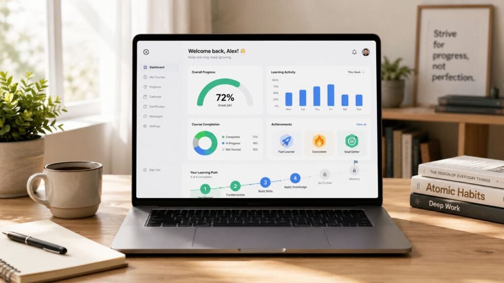
You open your LMS after launching a course, and the dashboard greets you with charts, filters, status labels, and activity logs. People have enrolled. Some have started. A few have finished. Others seem to have disappeared halfway through. You know the information matters, but it doesn’t yet tell a clear story.
That’s the point where many course creators and training managers get stuck.
When I walk a new client through an LMS for the first time, I usually say this. Your dashboard isn’t there to impress you with data. It’s there to help you decide what to do next. Once you start reading it that way, the whole thing feels a lot less intimidating.
What Is an LMS Reporting Dashboard Anyway?
Think about your car dashboard for a second. You don’t need to be a mechanic to know what the fuel gauge, speedometer, or warning light mean. The dashboard gives you a quick read on what’s happening so you can act before a small issue becomes a bigger one.
An LMS reporting dashboard works the same way. It gives you a visual view of your learning data so you can track learner activity, course performance, and signs that something needs attention.
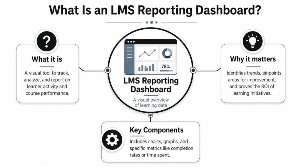
For beginners, the easiest way to understand this is as a layered system. Docebo’s explanation of LMS analytics describes descriptive analytics as the most surface-level view because they show what happened, then diagnostic analytics help explain why it happened. In day-to-day dashboard use, that usually starts with a few basic signals like learner retention rate and completion rate.
What a beginner should expect to see
Most dashboards answer a few simple questions first:
- Who enrolled: The basic reach of your course or program
- Who is active: Which learners are showing up and moving
- Who finished: Whether people got to the end
- Where they stopped: The point where progress starts to fade
That’s why I tell people not to think of the dashboard as a reporting chore. Think of it as a course health check.
If you’re still getting your bearings with LMS platforms in general, it helps to understand the different setups and use cases first. This guide to types of learning management systems gives useful context for why one dashboard may look very different from another.
A good beginner dashboard should answer practical questions fast, not bury you in widgets.
Why this matters in real life
A dashboard becomes useful when it changes your next move. If you can see that learners are active but not finishing, that points to one kind of problem. If hardly anyone logs in after enrollment, that points to another.
That’s why LMS reporting dashboards explained for beginners should never stop at definitions. Its primary value is in turning a screen full of numbers into a short list of decisions.
Decoding the Key Metrics on Your Dashboard
Most LMS platforms can show a lot of data. Beginners don’t need all of it at once.
I usually start with a small set of metrics that tell you whether learners are participating, progressing, and struggling. Once those make sense, the rest of the dashboard becomes easier to read.
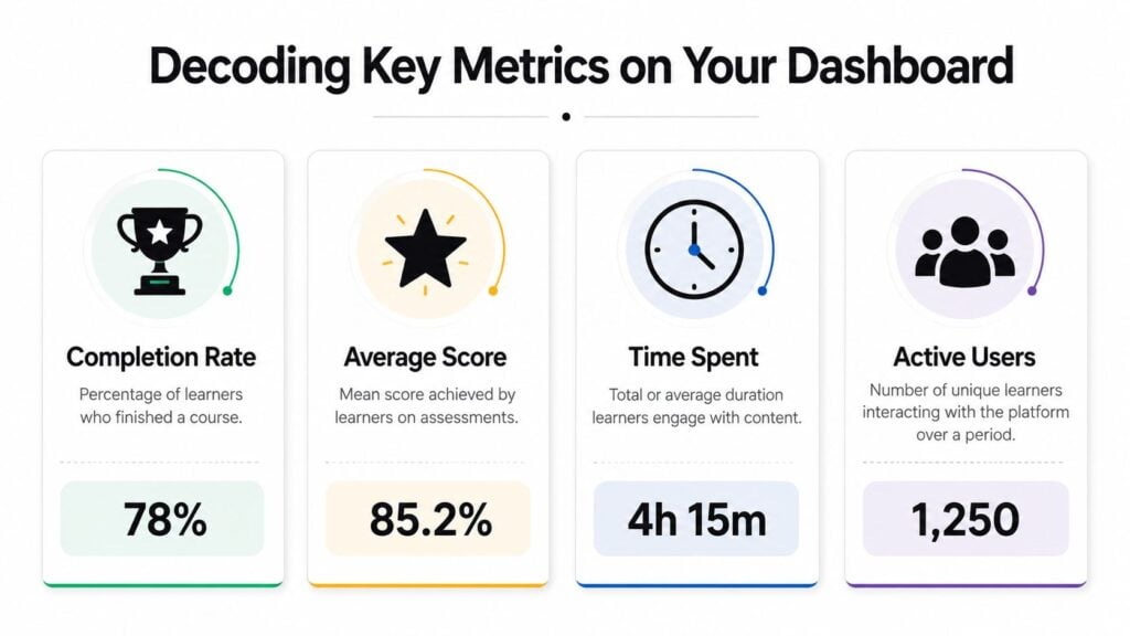
iSpring’s LMS reports guide notes that common dashboard fields include learner progress, course completions, overdue assignments, assessment performance, and even device usage. That’s helpful because it reminds you that a dashboard is doing more than tracking pass or fail.
The metrics that deserve your attention first
Here’s the short version I use with new teams:
| Metric | What it tells you | Why it matters |
|---|---|---|
| Completion | Who finished the course | Shows whether learners make it to the end |
| Progress | How far people have moved through the content | Helps you spot stalls and drop-off points |
| Assessment performance | How learners are doing on quizzes or tests | Reveals where understanding may be weak |
| Overdue work | What mandatory items are late | Useful for compliance and follow-up |
| Device usage | What learners used to access training | Can expose access or usability issues |
How to think about each one
Completion is the most familiar metric. It sounds simple, and it is simple. But it’s also easy to misread. If completion is low, that doesn’t automatically mean the course is bad. It means something is getting in the way, and you need to find out what.
Progress gives you more texture. You might have lots of learners who start strong and then stop in the middle. That tells a different story from a course where hardly anyone starts at all.
Assessment performance helps you see whether the learning is landing. If many learners hit the same question and struggle, the problem may be the lesson, the quiz wording, or both.
Practical rule: Read metrics in pairs. A single number rarely tells the whole story.
Overdue assignments matter most when training has deadlines. This metric helps you move from broad reporting into targeted follow-up. You can contact the right people instead of sending reminders to everyone.
Device usage surprises many beginners. If your dashboard shows learners using phones, tablets, or computers, that can explain behavior that looked confusing at first. A lesson that works fine on desktop may feel clumsy on a phone.
Where people get confused
Beginners often ask me what counts as a “good” dashboard number. That sounds sensible, but it usually sends people in the wrong direction.
Your first job isn’t to chase an abstract perfect number. Your first job is to understand your own baseline. Are people moving through the course? Are they stopping in the same place? Are scores dropping on the same topic? Those patterns matter more than staring at one isolated metric.
How to Read and Interpret LMS Reports
Reading a report well is less about math and more about pattern recognition.
When I review an LMS dashboard with a client, I’m usually asking a chain of simple questions. Where are learners moving smoothly? Where are they slowing down? Is that slowdown matched by failed assessments, overdue tasks, or a drop in logins?

Apps 365’s LMS reporting overview makes this point clearly. The practical value comes from comparing data points. Matching progress drop-off points with assessment failures helps you work out whether the issue is course design, length, or a technical problem.
A simple way to read the story
Let’s say you’re looking at one course report.
You notice that learners start the course without much trouble. Then progress slows sharply at one module. In the same area, quiz performance drops, and time spent jumps. That combination suggests friction. Learners are not just leaving randomly. They’re getting stuck at a specific point.
Here’s how I’d interpret that:
- If progress drops and scores drop too, the content may be unclear or too difficult
- If progress drops but scores stay fine, the issue may be length, motivation, or poor pacing
- If activity disappears suddenly across many learners, check for a technical or access problem
- If one group struggles more than another, segment by role, location, or team before changing the course for everyone
The detective mindset helps
Beginners can often relax a bit here. You don’t need to “know the answer” the moment you open a report. You need a working hypothesis.
For example, if one department completes more slowly than another, I wouldn’t assume that team is less engaged. I’d ask whether their schedule is different, whether manager follow-up is weaker, or whether they’re using a device that makes the course harder to move through.
If you want to get better at tracing learner behavior in detail, this guide to auditing LMS user activity is a useful next step.
When several signals point to the same lesson, trust the pattern and inspect that lesson first.
What not to do
Don’t jump straight from one report to a full redesign.
Start smaller. Review the lesson. Check the quiz. Test the links. Open the course on a phone. Ask whether the module feels longer or denser than the others. A report should guide your investigation, not replace it.
That’s the shift that makes LMS reporting dashboards useful. You stop staring at data and start asking better questions.
Turning Data Into Action with Real Examples
Dashboards then start paying for themselves.
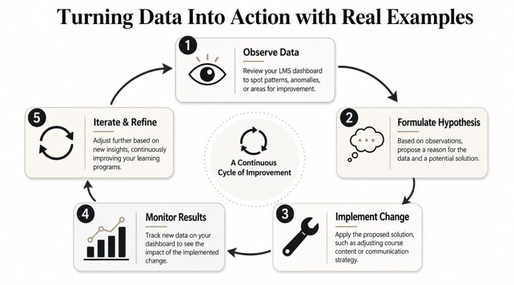
A beginner mistake is to treat reporting as observation only. You look, you notice something odd, and then you move on. A better approach is to use the dashboard as a trigger for small, testable changes.
One of the most helpful ideas for this comes from this discussion of exception-based LMS reporting. The strongest dashboards don’t just show averages. They flag outliers like overdue mandatory training or repeated failed assessments, so you can see exactly where learning is breaking down.
Example one with a course drop-off
Problem
Learners begin the course, but many stop at the same lesson.
Data signal
Your dashboard shows a visible drop-off point in one module, while earlier modules look healthy.
Action
Review that lesson for length and structure. Break a long video into shorter chunks. Add a downloadable summary. Insert a quick knowledge check to reset attention. If the course serves younger learners or exam prep audiences, adaptive pathways can also help. A practical example of that learning design approach appears in MasteryMind’s piece on ace your GCSEs with adaptive learning.
Example two with repeated quiz trouble
Problem
A batch of learners keeps failing the same assessment area.
Data signal
You see repeated failed attempts tied to one assessment or topic.
Action
Check whether the question itself is confusing. Then review the lesson that teaches that concept. If the wording in the training and the wording in the quiz don’t match, learners may understand more than the report suggests. Rewrite the item, add one worked example, and monitor the next round.
Small-win mindset: Change one thing, then watch what happens before changing five more.
Example three with overdue mandatory training
Problem
A required course has a pocket of learners who still haven’t completed it.
Data signal
The dashboard flags overdue training by team, role, region, or location.
Action
Don’t send a generic reminder to everyone. Segment the issue. If one location is behind, check access and scheduling first. If one team is behind, involve the manager. If people started but stalled, look inside the course. If they never logged in, the barrier may be operational, not instructional.
This is also where broader reporting starts to matter. If you need help connecting these training signals to business value, this guide on measuring ROI on training gives a practical framework.
A simple action loop
I like to keep the process tight:
- Notice the signal
- Make a best-guess explanation
- Change one thing
- Watch the next report
- Keep or revise the change
That rhythm keeps reporting grounded in decisions, which is the whole point.
Simple Best Practices for LMS Reporting
Most beginners don’t need a bigger dashboard. They need a calmer routine.
One of the most useful beginner takeaways from SkillQ’s LMS reporting guidance is that more widgets can reduce clarity. A few recurring signals, reviewed on a weekly or biweekly cadence, are often more useful than checking everything every day.
Start with a reporting rhythm
If you open your dashboard constantly, you’ll end up reacting to noise.
I suggest a simple routine. Pick one recurring time each week or every other week. Look at the same small set of indicators. Compare them with the previous check. Make notes on anything unusual.
That rhythm helps you spot trends instead of overreacting to one odd day.
A beginner checklist that’s enough
Use a short checklist like this:
- Completion check: Are learners finishing as expected, or are you seeing a fresh slowdown?
- Drop-off check: Is there one lesson, module, or activity where people are stopping?
- Assessment check: Are the same topics or questions causing trouble again?
- Exception check: Are there overdue learners or repeat failures that need follow-up?
That’s enough to build good habits.
Keep the dashboard clean
A messy dashboard creates bad decisions. If your LMS allows customization, remove charts you never use. Group reports by purpose. Keep learner-level, course-level, and team-level views separate if possible.
If your platform includes metadata or content quality checks, pay attention to them. Missing role fields, broken links, duplicate course names, and unpublished modules can all distort what you think you’re seeing.
Share the right view with the right person
Managers, HR teams, and course owners don’t all need the same report.
A team manager might need progress and overdue training. A course designer might need drop-off and assessment patterns. Leadership may only want a short summary with business relevance. The cleaner the view, the more likely someone is to use it.
Common Questions About LMS Dashboards
Beginners usually end up with a few practical concerns after the first dashboard walkthrough. These are the ones I hear most often.
What if my LMS has a very basic dashboard
That’s fine. Start with what you do have.
If your platform only shows completions, progress, and quiz results, you can still do useful work. Look for the point where learners stop moving. Compare that with assessment trouble if available. Even a modest dashboard can help you identify friction and follow up with the right learners.
How do I know whether my data is good or bad
Don’t judge your course from one isolated snapshot.
Look for patterns over time. A number becomes meaningful when it keeps showing up in the same way. If one lesson repeatedly loses learners, that matters. If one group regularly falls behind, that matters. Trends tell you more than a single report ever will.
The most useful benchmark for a beginner is your own recent history.
What’s the single most important metric to watch
If I had to pick one starting point, I’d watch completion first.
Completion gives you the clearest signal about whether learners are getting through the experience you built. From there, you can drill into progress, assessment performance, overdue work, and access issues to understand why completion looks the way it does.
That’s why a lot of LMS reporting dashboards explained for beginners should begin with one practical question. Are people making it to the end of the learning journey?
If not, the dashboard is already giving you your next job.