10 Good UX Practices to Boost Your Online Course in 2026
If you have ever built an online course or a membership site, you know the real challenge isn’t just creating great content. It is getting people to stick around, complete the lessons, and feel like they got their money’s worth. This is where user experience, or UX, becomes so important. A thoughtful design keeps your learners focused on the material, not on figuring out how to use your website.
I have spent years helping creators fine-tune their platforms, and I have seen firsthand what works. It is all about making your learning environment feel intuitive, accessible, and genuinely helpful. Forget confusing layouts and clunky navigation. We are talking about applying good UX practices through small, intentional changes that lead to huge wins in learner engagement and retention. A positive experience reduces frustration and makes learning feel less like a chore and more like an achievement.
In this guide, I am sharing 10 of the most impactful good UX practices you can implement right now. We will cover everything from making your site a joy to use on a phone to building trust with new students and designing for microlearning. Think of this as your practical checklist for creating a digital learning experience that not only looks professional but also keeps your members coming back for more. Let’s get started.
1. Implement Clear Information Hierarchy and Navigation
Imagine walking into a library where the books are scattered on the floor with no signs or sections. Finding what you need would be impossible. Your digital learning platform is that library, and without a clear structure, your learners will get lost and frustrated. This is why establishing a logical information hierarchy is one of the most fundamental good UX practices you can implement.
It’s all about organizing your content, from broad course categories down to individual lesson files, so learners can find what they need intuitively. This reduces cognitive load, meaning they spend less mental energy trying to figure out your platform and more on actually learning. When navigation is effortless, learners feel more in control and confident. This directly impacts their motivation and course completion rates.
How to Get It Right
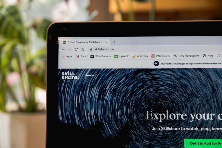
A strong navigation system makes your content predictable and easy to explore. Think about how major platforms guide users. Skillshare, for example, uses a powerful filtering system that lets learners discover courses by category, topic, and even class length. This helps them quickly narrow down a huge library to find exactly what they’re looking for. Similarly, Udemy uses a breadcrumb trail (e.g., Course > Section 2 > Lecture 5) so you always know where you are.
For your own course, a platform like Teachable provides a great model. Its sidebar navigation clearly lists all modules and lessons, allowing students to see the entire course structure at a glance and jump to any part they need.
Key Takeaway: Your navigation is the primary tool your learners use to make sense of your content. A clear structure builds confidence and keeps them on track.
Actionable Tips for Your Platform:
- Test Your Sitemap: Before you build anything, sketch out a simple sitemap or flow chart of your content. Ask a few people who have never seen your course to look at it. Can they predict where a specific lesson or resource would be? Their feedback is gold.
- Keep Your Main Menu Simple: Stick to a maximum of 5 to 7 items in your main navigation bar. Too many choices can be overwhelming. If you have more sections, group them under a logical heading like “Resources” or “Community.”
- Use Progressive Disclosure: Don’t show every single option at once. Hide advanced or less-used features in submenus. For instance, a “Settings” or “Account” dropdown can contain links for profile editing, billing, and notifications without cluttering the main interface.
- Make Navigation Persistent: Your main menu should be visible on every single page. Learners should never feel trapped or have to hit the “back” button repeatedly to find their way home.
2. Design Mobile-First Responsive Layouts
Picture your learners trying to complete a lesson while on their daily commute, holding a smartphone in one hand. If the text is tiny and the buttons are impossible to tap, they will quickly give up.
Designing for mobile devices first isn’t just a trend. It’s an essential approach that acknowledges how most people access content today. This is why a mobile-first strategy is one of the most important good UX practices for any digital learning platform.
It means you design the experience for the smallest screen first, then adapt it for larger screens like tablets and desktops. This forces you to prioritize what is most important, ensuring the core learning experience is clean and functional on a phone. When your platform works perfectly on mobile, learners can engage with your material anytime, anywhere, boosting course completion and overall satisfaction.

How to Get It Right
A great mobile experience feels natural and intuitive, not like a shrunken-down website. Look at how top-tier platforms handle this. Coursera’s course interface is fully responsive, meaning lectures, quizzes, and readings all adjust perfectly to whatever device you are on. MasterClass takes it a step further with a dedicated mobile app featuring large, touch-friendly playback controls that make watching on the go a pleasure.
For community-focused platforms, Circle.so provides an excellent model. It ensures that discussions, events, and member profiles are just as easy to navigate on a phone as they are on a desktop, so your community stays active no matter how members log in.
Key Takeaway: A mobile-first approach is about prioritizing content and creating a focused, accessible learning path that works for everyone.
Actionable Tips for Your Platform:
- Test on Real Devices: Browser emulators are helpful, but they don’t replicate real-world conditions. Test your platform on actual iPhones and Android devices to check performance, touch accuracy, and how it feels on a slower mobile network.
- Make Buttons Tappable: Frustration mounts when you can’t hit the right button. Ensure all interactive elements like buttons and links have a minimum touch target size of 48×48 pixels to prevent accidental taps.
- Optimize Your Images: Large images can slow down your site on mobile connections. Use modern image formats like WebP, which offers excellent quality at a smaller file size, to ensure your pages load quickly.
- Use CSS Media Queries: This is the technical backbone of responsive design. Media queries allow you to apply different styles based on screen size, so your layout automatically adapts to phones, tablets, and desktops.
3. Prioritize Fast Page Load Times and Performance
Think about the last time you waited for a slow website to load. You probably clicked away after just a few seconds. Learners on your platform are no different. A slow, clunky experience is a recipe for frustration and high dropout rates. This makes platform performance one of the most critical good UX practices to master.
Performance is all about speed. It means your course pages load quickly, videos stream without buffering, and interactive quizzes respond instantly. When your platform is fast, learners can stay focused and in the flow state, absorbing information without technical interruptions. A speedy site feels professional and reliable, which builds trust and directly supports enrollment and retention.
How to Get It Right
A high-performance learning platform feels invisible. It just works. Consider how YouTube delivers video. Its adaptive streaming technology automatically adjusts video quality based on your internet speed. This ensures a smooth playback experience for almost everyone. This is the gold standard for video-heavy course platforms.
Similarly, platforms like Teachable use preloading strategies so that the next lesson in a sequence starts loading in the background while the student is finishing the current one. Skillshare also excels here, with highly optimized video streaming and auto-selection for quality, so learners spend less time waiting and more time doing.

Key Takeaway: Speed is a core feature. Every second a learner has to wait is a moment they might decide to leave. Optimizing performance is a direct investment in learner satisfaction and course completion.
Actionable Tips for Your Platform:
- Measure Your Baseline: Use free tools like Google PageSpeed Insights and GTmetrix to see how your site performs right now. This will give you a benchmark and highlight the most urgent issues to fix.
- Set a Performance Budget: Aim for a clear target, like having your main pages load in under 3 seconds. A budget keeps you focused and prevents your site from getting slower over time as you add more content.
- Compress Your Images: Large image files are a common cause of slow load times. Before you upload any visuals, run them through a compression tool like TinyPNG or ImageOptim to shrink their file size without losing quality.
- Use a Video CDN: Don’t host your course videos on the same server as your website. Use a dedicated Content Delivery Network (CDN) for video. This distributes your content across servers worldwide, ensuring fast, reliable streaming for all your students, no matter where they are.
4. Create Consistent and Accessible Visual Design
Imagine reading a book where the font size, color, and style change on every page. It would be disorienting and make it nearly impossible to focus on the story. Your digital learning platform is no different. A consistent and accessible visual design system creates a predictable, professional, and trustworthy environment that helps learners focus on the content, not the interface.
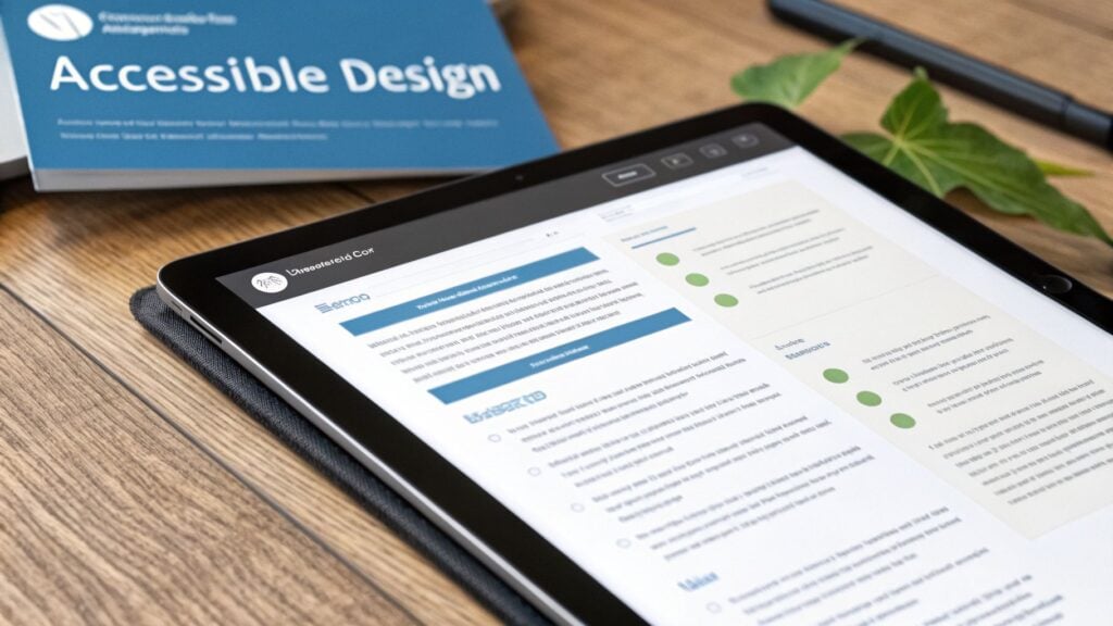
This practice is about establishing a cohesive look and feel with consistent branding, typography, and color schemes. It also means making sure your platform is usable by everyone, including learners with visual, auditory, or motor impairments. Adhering to standards like the Web Content Accessibility Guidelines (WCAG) 2.1 AA is a core part of providing an equitable learning experience.
How to Get It Right
Strong visual systems create a seamless experience. Khan Academy, for example, is a leader in accessible design, using strong color contrast and providing captions on all its videos. This commitment ensures learners with visual or hearing impairments can engage fully. LinkedIn Learning also excels here, offering a fully WCAG-compliant interface that includes complete video transcripts and keyboard-only navigation.
Another great model is Udacity, which uses a consistent component library across its entire catalog of Nanodegree programs. Whether you’re in a course on AI or web development, the buttons, cards, and interactive elements look and behave the same. This predictability reduces cognitive friction and reinforces the brand’s professionalism.
Key Takeaway: Consistent design builds trust and reduces confusion, while accessibility opens your doors to every learner. These are essential for creating an inclusive and effective educational platform.
Actionable Tips for Your Platform:
- Create a Simple Design System: You don’t need a massive corporate document. Start small by defining your primary colors, font choices (for headings and body text), and button styles. Keep this guide handy to ensure consistency as you build.
- Check Your Color Contrast: Use a free tool like the WebAIM Contrast Checker to test your text and background color combinations. This simple step makes your content more readable for everyone, especially those with low vision.
- Provide Video Alternatives: Always include captions for your video content. Services like Rev can automate this, or you can write them yourself. Also, offer full transcripts so learners can read the content at their own pace or use screen readers.
- Test with Your Keyboard: Try to navigate your entire platform using only the “Tab” and “Enter” keys. Can you access every button, link, and form field? This is a crucial test to ensure your site is usable for people who can’t use a mouse.
5. Implement User Feedback and Testing Mechanisms
Designing your platform in a vacuum is like trying to navigate a maze blindfolded. You might eventually find the exit, but you’ll hit a lot of dead ends along the way. Your learners hold the map, and gathering their feedback is one of the most powerful good UX practices for building a platform that truly works for them.
Continuously collecting feedback helps you identify friction points, discover what learners love, and validate your design choices with real data instead of assumptions. To truly implement effective user feedback and testing, it’s essential to understand and apply user-centered design principles from the outset. This iterative process turns your platform into a living product that evolves with your users’ needs, making them feel heard and valued.
How to Get It Right
Successful platforms build feedback directly into their experience. Think about how Coursera prompts you for feedback on course quality after you’ve engaged with the material. This data helps them and their partners refine content. Platforms like Teachable offer built-in analytics that show you exactly where students are getting stuck or dropping off, giving you a clear signal on which lessons need improvement.
Similarly, community platforms like Circle.so actively use member feedback to guide their feature roadmap. By creating dedicated spaces for suggestions and bug reports, they empower their community to co-create the platform, which builds incredible loyalty. These mechanisms are not just nice to have. They are essential for long-term success.
Key Takeaway: Your users are your most valuable source of truth. Create simple, direct channels for them to share their experiences and use that data to drive every decision you make.
Actionable Tips for Your Platform:
- Start Small with User Testing: You don’t need a huge budget. Begin with just 5 to 8 participants for a round of usability testing. Their insights will reveal the most critical issues.
- Time Your Surveys: Don’t interrupt the learning flow. Send post-lesson or post-course surveys a day or two after completion. This gives learners time to reflect and provide more thoughtful feedback.
- Use Visual Analytics Tools: Install tools like Hotjar or Microsoft Clarity. Heatmaps and session recordings show you exactly what users are clicking, ignoring, and struggling with on a visual level.
- Test One Thing at a Time: When running an A/B test on a button, headline, or layout, change only one variable. Let the test run for at least one to two weeks to get reliable data before making a final decision.
- Close the Feedback Loop: When you implement a change based on user feedback, announce it. Post an update in your community or send an email. Showing users you’re listening is a powerful way to build trust.
6. Minimize Cognitive Load Through Progressive Disclosure
Imagine trying to teach someone calculus by handing them a single, 1,000-page textbook and saying “good luck.” They’d be instantly overwhelmed. Your digital learning platform can have the same effect if you present every course, feature, and resource all at once. This is where progressive disclosure becomes one of the most effective good UX practices you can apply.
The idea is simple. Show learners only what they need at any given moment, and reveal more complex options as they become relevant. By reducing the amount of information on the screen, you lower the mental effort required to use your platform. This allows learners to focus on the core learning path without getting sidetracked or intimidated by advanced settings or a mountain of supplementary materials.
How to Get It Right
Progressive disclosure helps guide your learners through a complex environment. Notion is a master of this, with its expandable toggles and nested pages. You start with a clean slate and can build incredible complexity, but that complexity is always hidden until you choose to reveal it. This makes the tool feel simple for beginners but powerful for experts.
Similarly, Slack doesn’t throw every feature at you on day one. It introduces new capabilities through contextual tips and tutorials over time, as you start using the app more. A course platform like Teachable does this by tucking advanced course settings, like custom code snippets or enrollment caps, behind an “Advanced” toggle. You don’t need them to publish your first course, so they stay out of sight until you do.
Key Takeaway: Don’t overwhelm new learners with every option. Guide them by revealing complexity gradually, which builds their confidence and keeps them focused on making progress.
Actionable Tips for Your Platform:
- Define the Core Path: Map out the absolute essential steps a new student must take. This might be watching the welcome video, downloading the workbook, and completing the first lesson. Make this path obvious and hide everything else.
- Apply the 80/20 Rule: Identify the 20% of features that 80% of your learners will use regularly. These should be visible by default. The other 80% of features can be tucked away in menus or advanced settings.
- Use Contextual Tooltips: Instead of a long help document, use small, inline help icons (?) that provide a quick explanation of a feature right where the learner needs it.
- Test for Overwhelm: Run “think-aloud” user tests. Ask a new user to complete a task and have them voice their thought process. If they say, “I’m not sure what to click here, there are too many options,” you know you have a cognitive load problem.
7. Establish Clear Call-to-Action Hierarchy and Conversion Paths
Imagine setting up a beautiful storefront with amazing products in the window, but you forget to put a door handle on the entrance. People might admire your display, but no one can get inside to buy anything. Your platform’s calls to action (CTAs) are those door handles. Without clear, compelling CTAs, even the most interested learners won’t know how to take the next step. This is why establishing a clear CTA hierarchy is one of the most critical good UX practices for driving action.
This practice is about intentionally guiding learners toward key actions, whether that’s enrolling in a course, signing up for a membership, or simply completing a lesson. A well-defined conversion path removes friction and hesitation, making it effortless for users to move from interest to action. When learners know exactly what to do next, you see higher enrollment, better feature adoption, and a healthier business.
How to Get It Right
A strong CTA hierarchy makes the most important action obvious. Think about how top platforms draw your eye. MasterClass, for instance, uses a prominent “Join Today” button, often paired with a trust-building money-back guarantee, to make the enrollment decision feel secure and simple. Teachable does a great job of placing its primary “Enroll” button in multiple strategic locations. It places one at the top of the page, within the course preview, and at the bottom, catching users at every stage of their decision-making process.
When designing interactions that guide users and minimize cognitive load, understanding user experience design best practices for high-converting forms can be particularly insightful. These principles help ensure that when a user does click your CTA, the next step is just as frictionless.
Key Takeaway: Your CTAs are signposts that direct user behavior. A clear hierarchy tells learners what you want them to do, making their journey and your business goals much easier to achieve.
Actionable Tips for Your Platform:
- Use Contrasting Colors: Your primary CTA (like “Enroll Now”) should visually pop. Use a color that stands out from your brand’s primary palette. Test it with an accessible colors tool to ensure it’s readable for everyone.
- Place Your Main CTA “Above the Fold”: The most important action a user can take should be visible without any scrolling on key pages like your homepage or a course sales page.
- Simplify Your Sign-Up Forms: Don’t ask for a user’s entire life story upfront. Stick to a maximum of 3 to 4 essential fields like name, email, and password. You can always ask for more information later.
- Add Trust Signals Nearby: Place elements like student testimonials, money-back guarantees, or security badges close to your main CTA to build confidence and reduce last-minute hesitation.
- A/B Test Your Button Text: Don’t just guess what works. Test different versions of your CTA copy. See what performs better: “Enroll Now,” “Start Learning,” or “Join the Course.” The results might surprise you.
8. Design for Microlearning and Modular Content Structure
Attention spans are shorter than ever, and your learners are likely juggling your course with work, family, and other commitments. Expecting them to sit through a 90-minute video lecture is a recipe for disengagement. Designing for microlearning means breaking your content into small, focused, and easily digestible pieces that respect your learner’s time.
This modular approach organizes these bite-sized lessons into a logical sequence, allowing learners to make steady, visible progress. It makes your content feel less intimidating and helps improve knowledge retention. For busy students, being able to complete a lesson during a coffee break or commute is a game-changer. This is one of the most effective good UX practices for modern learning environments because it aligns with how people actually consume information today.
How to Get It Right
Successful platforms have mastered this technique. Look at Duolingo, which built its entire model around 5-minute daily lessons. This strategy helped them achieve an impressive 42% yearly retention rate. People can learn a language without feeling like it’s a huge commitment. Another great example is LinkedIn Learning, where courses are broken down into short 3 to 5-minute videos, each focused on a single skill or concept. This makes it easy for professionals to learn something specific without having to scrub through long videos.
For your own course, this structure makes it easier to plan and deliver content. You can even drip-feed modules weekly to keep learners coming back.
Key Takeaway: Break your expertise into small, manageable wins. A modular structure respects your learner’s time, boosts their sense of accomplishment, and makes complex topics feel approachable.
Actionable Tips for Your Platform:
- Stick to a Timeframe: Aim for individual lessons to be between 5 and 15 minutes long. This is the sweet spot for maintaining focus and ensuring the learner absorbs the key information.
- End with a Clear Takeaway: Each lesson should conclude with a single, clear point or an action item. This helps solidify the learning and gives students something concrete to apply.
- Show Progress Visually: Use progress bars or checkmarks to show module and overall course completion. Seeing how far they’ve come is a powerful motivator for learners to continue.
- Structure Modules Progressively: Organize your modules to build on one another. Start with foundational concepts and gradually move to more advanced topics to create a smooth and logical learning path. You can find more microlearning best practices to help you build out your course structure.
9. Build Trust Through Transparency and Social Proof
Would you buy a product from a faceless website with no reviews, no company information, and vague promises? Probably not. Your digital learning platform is no different. Before learners commit their time and money, they need to trust that your course is credible and will deliver on its promises. Building this trust through transparency and social proof is one of the most essential good UX practices for converting visitors into enrolled students.
It’s all about providing evidence that your course is a worthwhile investment. This means showing who you are, what other students have experienced, and exactly what learners will get. By being open and honest, you reduce purchase anxiety and build a strong foundation of confidence. When potential students see that others have succeeded with your material, they feel much more secure in their decision to join.
How to Get It Right
Showing proof is more powerful than just making claims. Think about how Skillshare highlights instructor profiles, complete with their professional portfolios and student counts, giving you a clear picture of their expertise. Coursera often provides free preview videos, allowing you to sample the teaching style and content before you enroll. This “try before you buy” approach is a fantastic way to build confidence.
For your own platform, look at how Teachable landing pages prominently feature student testimonials. Many successful course creators also use community platforms like Circle.so to showcase member success stories, which acts as living proof of the program’s value.
Key Takeaway: Trust is the currency of online education. By being transparent and showcasing social proof, you answer your audience’s biggest unspoken question: “Is this really worth it?”
Actionable Tips for Your Platform:
- Display Instructor Credentials: Don’t be shy about your qualifications. Prominently feature your experience, certifications, or relevant achievements right on the landing page.
- Showcase Real Results: Ask students for testimonials and, with their permission, feature their before-and-after results. Case studies highlighting specific achievements are even more powerful.
- Offer a Money-Back Guarantee: A 7 or 14-day money-back guarantee can significantly reduce purchase anxiety for new students. It shows you are confident in the value you provide.
- Publish Your Stats: If you have strong numbers, use them. Course completion rates and student satisfaction scores can be very persuasive. You can learn more about using social proof to boost your course sales.
10. Personalize Learning Paths and Adaptive Content Delivery
A one-size-fits-all approach to teaching rarely works in a physical classroom, and it’s even less effective online. Learners come to your platform with different skill levels, goals, and learning speeds. Ignoring this diversity can lead to boredom for advanced learners and frustration for beginners. Personalizing their journey is one of the most powerful good ux practices for boosting engagement and results.
This means tailoring course content, pacing, and recommendations to the individual. Adaptive learning systems can adjust the difficulty of quizzes based on performance, suggest what to study next, and even serve different types of content based on user preferences. When a platform seems to understand a learner’s needs, it builds a powerful sense of connection and makes the experience feel uniquely valuable.
How to Get It Right
Many top platforms use personalization to keep users hooked. Think about Duolingo, where the lesson difficulty increases as you consistently get answers right, keeping you challenged but not overwhelmed. LinkedIn Learning uses your professional profile and viewing history to create a “Recommended for You” section that feels incredibly relevant.
You can see this in action on membership sites, too. A platform using Teachable might suggest a specific course sequence to a new member based on the goals they selected during signup. This guidance prevents newcomers from feeling lost in a large content library. These systems work by turning user data into a smarter, more responsive learning environment.
Key Takeaway: Personalization makes learners feel seen and understood. When you adapt the path to the person, you give them the most efficient and motivating route to success.
Actionable Tips for Your Platform:
- Start with Goal-Setting: The easiest entry point to personalization is asking learners about their goals during onboarding. Use their answers to recommend a starting point or a specific learning path.
- Create Learner Personas: Define 2-3 key learner types (e.g., “The Career Changer,” “The Hobbyist,” “The Skill Updater”). Design distinct learning paths that cater to the most common goals and needs of each persona.
- Use ‘Social Proof’ Recommendations: Implement a simple feature that shows “Learners who completed this lesson also liked…” This uses community behavior to guide users toward relevant content.
- Balance Guidance with Discovery: While personalized recommendations are great, always provide an easy way for learners to browse your entire library. This prevents “filter bubbles” and allows for unexpected discoveries. You can learn more about how to structure these systems by exploring different types of adaptive learning software.
Top 10 UX Practices Comparison
| Item | Implementation complexity | Expected outcomes | Ideal use cases | Key advantages |
|---|---|---|---|---|
| Implement Clear Information Hierarchy and Navigation | Medium | Faster course discovery; reduced learner friction and support requests | Large course catalogs, membership sites with many modules | Improved findability, higher completion and lower support volume |
| Design Mobile-First Responsive Layouts | Medium–High | Better mobile engagement, lower bounce, improved SEO | Mobile-heavy audiences, on‑the‑go learners, apps | Enhanced accessibility, future-proofed UX, higher reach |
| Prioritize Fast Page Load Times and Performance | High | Faster load/streaming, improved retention and conversions | Video-heavy courses, global/low-bandwidth audiences | Better retention, SEO gains, lower infrastructure costs |
| Create Consistent and Accessible Visual Design | Medium | Inclusive access, increased trust and comprehension | Platforms needing WCAG compliance or broad accessibility | Expanded audience, reduced legal risk, stronger brand trust |
| Implement User Feedback and Testing Mechanisms | Medium | Data-driven improvements, earlier detection of friction | Iterative product development, course quality optimization | Validated design decisions, improved retention and UX |
| Minimize Cognitive Load Through Progressive Disclosure | Low–Medium | Reduced overwhelm, clearer focus on core tasks | Complex platforms, multi-level memberships, onboarding flows | Better onboarding, increased engagement, supports varied skill levels |
| Establish Clear Call-to-Action Hierarchy and Conversion Paths | Low–Medium | Higher enrollment and conversion rates | Landing pages, sales funnels, monetization-focused pages | Increased conversions and revenue, reduced decision friction |
| Design for Microlearning and Modular Content Structure | Medium–High | Higher completion and retention, mobile-friendly lessons | Busy professionals, drip-fed memberships, reuseable content | Improved retention, content reusability, supports spaced repetition |
| Build Trust Through Transparency and Social Proof | Low–Medium | Increased conversions, reduced purchase hesitation | New courses, high-ticket offerings, marketplace platforms | Stronger credibility, social proof drives enrollments |
| Personalize Learning Paths and Adaptive Content Delivery | High | Improved retention, tailored pacing, higher satisfaction | Large user bases, long-term memberships, skill progression | Higher LTV, individualized learning, better outcomes |
Your Next Step: From Good to Great UX
We’ve explored a lot today, walking through ten fundamental principles that can take your digital learning product from functional to fantastic. From the foundational importance of clear navigation and mobile-first design to the more advanced strategies of personalized learning paths and microlearning structures, each point is a piece of a larger puzzle. The goal is to create an experience so seamless that the learner forgets about the platform and focuses completely on the content.
The core message I want you to walk away with is this: implementing good ux practices is not a one-time project you can check off a list. It’s an ongoing commitment to your users. It’s a cycle of building, measuring, learning, and iterating. Your platform is a living thing that grows and adapts alongside your community of learners.
Making It Real: Your Action Plan
Feeling a bit overwhelmed? That’s completely normal. The secret is not to try and do everything at once. True progress comes from small, consistent steps.
Here’s a practical way to start:
- Choose Your “One Thing”: Look back at the ten practices we discussed. Which one jumps out as the most urgent need for your course or membership right now? Is it your confusing navigation? The lack of social proof? The fact that your pages take forever to load on a phone? Pick just one.
- Define a Small Win: Don’t aim to completely overhaul your entire site this week. Instead, define a small, achievable goal. For example, if you chose user feedback, your goal could be to create and send a three-question survey to ten recent students. If you chose accessibility, it might be adding captions to your three most popular videos.
- Schedule It: Block out a specific time in your calendar to work on this one task. Protect that time. Making small, dedicated pockets of time for UX improvements ensures they actually happen instead of staying on a forgotten to-do list.
By focusing on one small win at a time, you build momentum. Each improvement, no matter how minor it seems, contributes to a more positive and effective learning environment. This is how you build a product that people not only use but genuinely love and recommend.
Why This Matters More Than Anything
In the crowded market of online education, a superior user experience is your greatest competitive advantage. It’s what separates a course that gets completed from one that gets abandoned. It’s what turns a one-time buyer into a loyal, long-term member of your community.
Investing in these good ux practices is a direct investment in your learners’ success. When you remove friction, clarify paths, and make learning more engaging, you empower them to achieve their goals. Their success becomes your success. It leads to better completion rates, stronger testimonials, higher retention, and a more sustainable business for you.
You’re not just building a course or a website. You’re building a relationship with every single person who enrolls. Good UX is the foundation of that relationship, built on trust, respect, and a genuine desire to see them succeed.
So, take this knowledge and put it to work. Don’t wait for the “perfect” time or a bigger budget. Start small, start now, and listen closely to what your users are telling you, both with their words and their actions. You have the roadmap. Now it’s time to start the journey and build something truly remarkable.