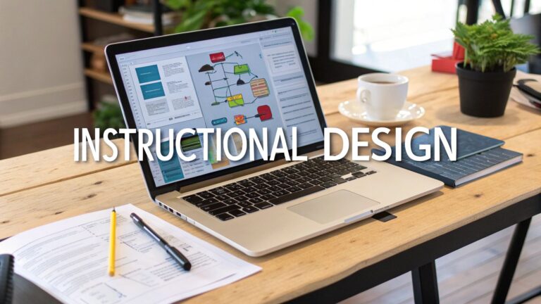
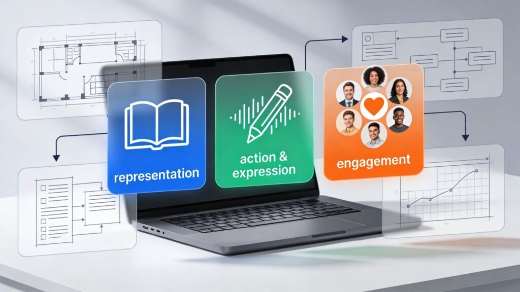
8 Universal Design for Learning UDL Examples in E-learning
You can build a course that looks polished, sounds smart, and still lose people by module three.
That usually stings more when you know the content is good. You recorded clean videos. You mapped the lessons carefully. You probably even added worksheets and a welcome email. Then the completion numbers stay soft, discussions feel quiet, and buyers who seemed excited at checkout never really get moving.
I see this all the time with online courses and memberships. The issue often isn’t the teaching itself. It’s the way the learning experience is packaged. A course can be clear for one kind of learner and full of friction for everyone else.
That’s where universal design for learning UDL examples in e-learning become practical, not theoretical. UDL gives you a way to remove common points of friction before they turn into drop-off. It helps you design for real learner behavior, which means different schedules, different processing speeds, different attention spans, different confidence levels, and different ways of showing progress.
This matters for accessibility, obviously. It also matters for business. When people can use your course the way their life allows, they stay longer. They finish more often. They’re more likely to renew a membership, recommend the program, or buy the next offer.
You do not need a university budget or a full instructional design team to use UDL well. You need a sharper eye for where learners get stuck, then you add options that reduce that friction.
1. Multiple Means of Representation Through Multimedia Content Delivery
A member opens your lesson on a phone during a commute, then comes back later on a laptop with the sound off while a child is asleep in the next room. The lesson needs to work in both moments. That is the practical side of UDL. Give learners more than one way to take in the same idea, and you remove friction that hurts completion.
For membership sites, this is not just an accessibility upgrade. It is a retention tactic. Learners stay active when they can keep going in imperfect real-life conditions instead of waiting for the ideal time, device, or attention level.
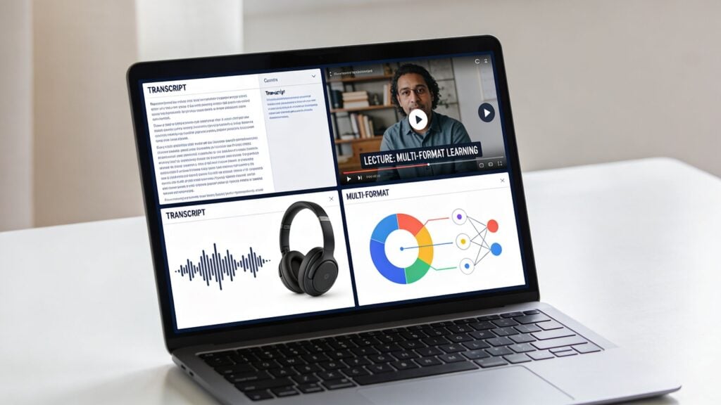
A strong setup is simple: one lesson, several usable formats. Video can carry the main teaching, captions support focus, a transcript helps skimming and search, downloadable notes help review, and a visual summary helps learners recall the core point fast.
What this looks like in a real course
If you teach email marketing, a lesson on welcome sequences should do more than play a talking-head video.
Add a transcript under the player so learners can scan for the part they need. Turn the framework into a one-page checklist they can use while writing their own sequence. If you include a chart about open rates or conversions, write a plain-language explanation below it so the learner does not have to infer the takeaway from the visual alone.
Large course platforms use this pattern for a reason. Different formats serve different moments of use. Someone may watch first, another learner may read first, and a busy member may return later just to review the summary before applying the lesson.
I have seen transcripts pull more weight than course creators expect. They help learners who process text faster than audio. They help members with weak internet. They also make your library easier to search, which matters in memberships where value often comes from finding the right answer quickly. Faster access to useful material usually means better engagement, lower churn, and more perceived value over time.
Practical rule: If budget is tight, start with transcripts and captions. They are usually the fastest improvement for access, review, and lesson reuse.
What works in practice
The cleanest production workflow starts with one core lesson asset and repurposes it carefully.
- Record once, publish in layers: Use the lesson video as the source, then create captions, a cleaned transcript, and a short notes version from the same material.
- Write for skimming: Break transcripts into sections with clear subheads so learners can jump to the exact concept they need.
- Explain visuals directly: Add short text under charts, diagrams, and screenshots that states the point in plain language.
- Keep the page ordered: Put the primary lesson first, then supporting formats in a predictable layout so choice does not become clutter.
- Offer download-friendly formats: A PDF checklist or notes sheet helps members who want offline review or a quick reference during implementation.
There is a trade-off here. More formats can improve access, but they also create production overhead and page complexity. The fix is not to publish everything you can think of. The fix is to publish the few formats learners use at key points: watch, skim, review, and apply.
What usually fails is a lesson page stuffed with options and no hierarchy. A video, three PDFs, a full transcript, bonus links, and extra reading all competing for attention will slow people down. Good UDL design gives people choice without making them sort through a pile of content first.
2. Interactive Assessments and Flexible Demonstrating Progress
A lot of courses lose people at the assessment stage.
Not because the learners didn’t understand the material, but because the only way to prove understanding felt awkward or high pressure. A rigid quiz can punish people who know the answer but freeze in test mode. A required essay can slow down a learner who’d rather show competence through a screen recording, mockup, presentation, or short walkthrough.
UDL gives you a better option. Keep the learning goal fixed, but loosen the format.
Better ways to check progress
If you run a design membership, let a learner submit a mini portfolio instead of a written reflection. If you teach consulting skills, let them upload a short client pitch video or a slide deck. If you’re teaching software, ask for a working demo or annotated screenshot sequence.
That kind of flexibility often improves motivation because learners can use a format that matches the skill itself. It also keeps momentum up in memberships, where people stick around when they feel capable, not just informed.
The practical upgrade here isn’t complicated.
- Low-stakes checks: Use quick, auto-graded quizzes with explanations so learners get feedback fast.
- Clear success criteria: Publish the rubric before the assignment opens.
- Revision built in: Let people resubmit after feedback when the goal is mastery.
- Format choice: Offer two acceptable submission types when the format isn’t part of the learning objective.
James Cook University in Australia used several UDL-inspired strategies in online teaching, including discussion forums, gamified elements like interactive quizzes, and multimedia content. The reported result was improved student engagement, satisfaction, and academic performance, with broader benefits extending beyond learners with disabilities according to the Digital Learning Institute’s discussion of universal design principles in online learning.
When learners know what “good” looks like and get feedback while they still have time to improve, they stay in the game longer.
What usually fails is the opposite. One giant final project. Vague grading. Feedback that arrives too late to matter. That setup doesn’t just measure learning. It drains motivation.
3. Adaptive Learning Paths and Personalized Course Navigation
Not every learner needs the same route.
One person joins with prior experience and wants to skip the basics. Another person buys the exact same course and needs extra support in the first week. Putting both people on the same straight path is like forcing every traveler onto the same train, even when some need a bus and others are already at the next station.
Start with simple branching, not fancy AI
You don’t need an expensive adaptive engine to make a course feel more responsive. Rule-based branching already goes a long way.
A simple setup could look like this. If a learner scores poorly on a short diagnostic quiz, you send them to a support lesson, glossary, and worked example. If they score well, you direct them to the advanced workshop or bonus implementation task. That’s still UDL because you’re adjusting the experience around learner variability instead of pretending everyone starts from the same place.
If you’re exploring tools built for this, LearnStream has a useful breakdown of adaptive learning software.
You can also see a related use case outside traditional LMS platforms in building speaking confidence with AI partner Nora, where guided practice changes based on learner interaction rather than a static sequence.
The trade-off most creators miss
Personalization sounds impressive, but it can turn into a maintenance headache fast.
What works is keeping the branch points obvious and limited. For example, beginner path, standard path, and advanced path. Or support track versus fast track. Those are manageable. You can map them clearly, explain them straightforwardly, and update them without rebuilding the entire course.
What doesn’t work is overengineering hidden logic that learners can’t understand. If the system keeps moving people around without clear explanation, they lose trust.
A good adaptive experience should still feel like a map, not a maze.
- Define the objective first: Branch around skill gaps, not random content preferences.
- Show the learner their route: Let them see why they were suggested a path.
- Allow override where sensible: Some people want to challenge themselves.
- Review behavior: If everyone is getting sent to the same support lesson, the issue may be your earlier teaching, not the learner.
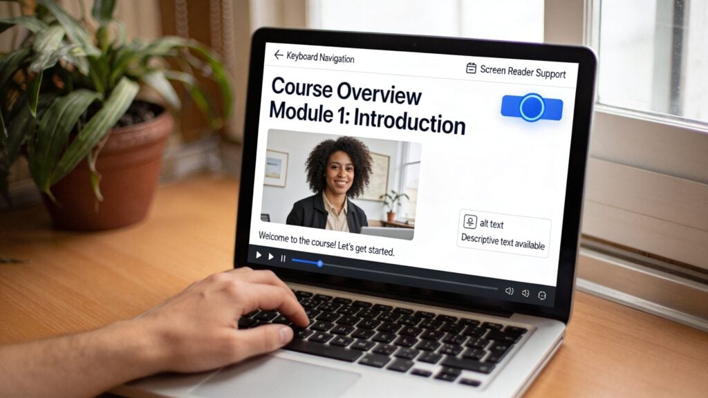
4. Accessible Course Design with WCAG Compliance and Keyboard Navigation
Accessibility isn’t a bonus feature. It’s part of whether the course works at all.
A surprising number of online courses still break at the most basic level. Buttons that can’t be reached by keyboard. Headings that are just bold text instead of real heading structure. Low-contrast slides. PDFs that screen readers struggle with. Tiny clickable areas on mobile. These issues push people out before the lesson even begins.
The baseline I’d fix before launch
If I were auditing a membership today, I’d check these first.
- Keyboard access: Can someone move through the lesson and activate controls without a mouse?
- Heading structure: Are pages organized so screen reader users can understand their structure logically?
- Alt text: Do images explain function or meaning where needed?
- Captions and transcripts: Are audio and video usable without sound?
- Contrast and focus states: Can learners see where they are and read the text comfortably?
That foundation supports UDL because it removes access barriers before you start layering in richer options. If you’re working through the mechanics, LearnStream’s guide to making e-learning accessible for disabled learners is a useful place to start.
For a broader product perspective, I also like seeing examples such as Kogifi’s approach to accessible enterprise platforms, because it reminds course creators that accessibility isn’t only about schools. It’s a digital product standard.
A mixed-methods study on student perceptions of UDL in virtual learning environments found that virtual study groups had the highest mean UDL score at 32.96, compared with 30.52 for online courses and 30.21 for independent study. The difference between virtual study groups and online courses was statistically significant according to the study published on PubMed Central. One practical read on that finding is simple. Design quality changes with the delivery environment, and interaction often improves how UDL shows up in practice.
Accessibility also needs to be visible to the learner, not hidden in your intentions.
Here’s a helpful explainer if you want to think through the basics in plain language.

What tends to go wrong
Creators often retrofit accessibility after complaints arrive. That costs more time, creates awkward workarounds, and leaves holes behind. The University of Oregon notes that retrofitting inaccessible content costs more than designing accessibly from the start in its Universal Design for Learning teaching resource.
Build accessibility into templates, lesson defaults, and upload workflows. Retrofitting every module later is the expensive version of the same work.
5. Microlearning and Chunked Content Delivery
Long lessons feel efficient when you’re making them. They often feel heavy when you’re taking them.
This is one of the easiest universal design for learning UDL examples in e-learning to apply because it solves a few problems at once. Shorter modules reduce cognitive overload, fit messy schedules better, and make progress feel visible. That’s useful for almost every learner, especially in memberships where people are squeezing learning in between work and life.
How to chunk without watering things down
Think in terms of one meaningful outcome per lesson.
If you teach sales, don’t title a module “Closing.” Break it into smaller pieces like handling objections, asking for commitment, and following up after a call. If you teach photography, separate exposure basics from white balance and composition. Learners can complete one part in a short sitting and come back without losing the thread.
Platforms like Duolingo and LinkedIn Learning built strong habits around this pattern. The content feels doable because each step is small, clear, and connected to the next one.
What works well in creator-led courses is a consistent rhythm.
- One concept per lesson: Keep the promise of the lesson tight.
- Quick recap: End with a short summary or implementation prompt.
- Searchable labels: Name modules by outcome, not by vague theme.
- Visible roadmaps: Show how small lessons build toward a larger skill.
The business upside is practical
Chunked content makes resumption easier. That’s huge.
A learner who has ten free minutes can finish a short lesson and feel momentum. A learner who sees a forty-minute video often postpones it, then postpones it again. In subscriptions, that difference matters because progress is one of the strongest reasons to stay active.
The catch is that microlearning can become fragmented if you cut too aggressively. I’ve seen courses turn into a pile of tiny clips with no narrative. The fix is simple. Keep the modules short, but group them into clear sequences so the learner still knows where they’re going.
6. Synchronous and Asynchronous Learning Options with Flexible Scheduling
A member joins your program because the topic solves a real problem. Then life gets in the way. A live workshop lands during school pickup, a shift change, or the middle of the night in another time zone. If that session holds the best teaching, many paying learners fall behind for reasons that have nothing to do with motivation.
That is why UDL pushes course creators to offer more than one way to participate. In a membership business, this is not only about access. It protects completion rates, reduces churn, and increases the value members feel they are getting each month.
Live learning does a few jobs really well. It creates momentum, gives members a reason to show up, and lets you answer the question behind the question. Asynchronous learning solves a different problem. It lets people make progress on their schedule, revisit tricky parts, and keep going even when their week falls apart.
The strongest setup usually blends both.
Use live sessions for work that improves with real-time interaction, such as coaching, critique, office hours, and discussion. Put core instruction, repeatable lessons, and foundational walkthroughs in an on-demand format. That split respects different schedules without lowering the quality of the learning experience.
A simple structure tends to hold up well:
- Live sessions for interaction: Q and A, hot seats, feedback, coaching, discussion
- Recorded lessons for core teaching: step-by-step instruction, demos, frameworks, templates
- Replay library with structure: clear titles, dates, short summaries, and timestamps
- Attendance flexibility: make the replay a true alternative, not a lower-tier version
I have seen one mistake hurt otherwise strong memberships. The sales page says “self-paced,” but value often sits inside unrecorded calls. Members notice fast. They stop attending, feel behind, and start questioning the subscription.
A better approach is to treat every live session like an asset. Record it. Clean up the title. Add a short note on what was covered. Mark the useful moments with timestamps so a learner can jump straight to the five minutes they need. A replay library should work like a well-organized knowledge base, not a junk drawer.
There is a trade-off. Live sessions build intimacy, but too many of them can turn a flexible course into a calendar commitment. On the other side, a course that is only self-paced can feel lonely and easier to postpone. UDL helps you balance those pressures by giving learners options instead of forcing one ideal schedule on everyone.
For membership sites, that balance matters commercially. Members stay longer when they can keep learning during busy seasons. They are more likely to complete lessons when missing one event does not break the whole experience. And when people can join from different schedules and time zones, the product serves a wider market without adding a second course.
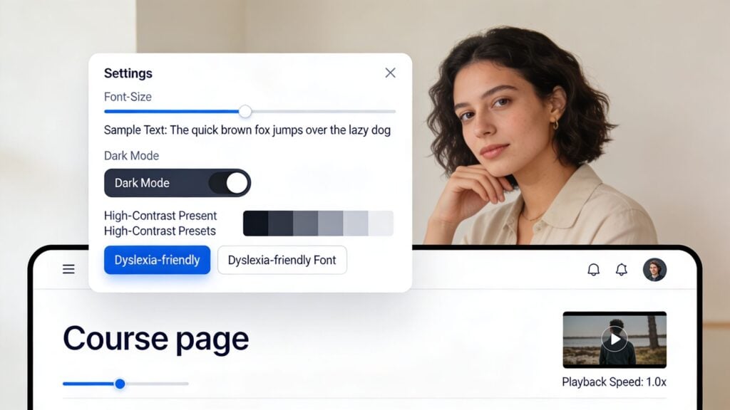
7. Customizable Interfaces and Learner Control Over Presentation
Some friction has nothing to do with the lesson content. It comes from how the interface feels.
Tiny text. Harsh contrast. No dark mode. A transcript panel that can’t be resized. Video controls that are too limited. These all sound minor until you stack them together. Then the course becomes tiring to use.
Give learners a few controls that actually matter
You don’t need a massive settings dashboard.
The high-value controls are usually font size, playback speed, transcript visibility, contrast options, and a clean way to reduce visual noise. Canvas and Blackboard both show how useful preference controls can be when they’re easy to find. Reading products like Medium and many e-readers have taught users to expect this kind of flexibility already, so bringing it into courses feels natural.
This part of UDL is especially helpful for learners with low vision, ADHD, dyslexia, sensory sensitivities, or simple fatigue after a long workday.
A course interface should adapt like a car seat, not a museum exhibit. Small adjustments change whether the whole thing feels usable.
What to prioritize first
If you’re working with limited development time, I’d start here.
- Playback speed: Let people slow down or speed up video without hacks.
- Transcript toggle: Some learners want it visible. Others don’t.
- Readable type: Choose fonts and spacing that hold up on desktop and mobile.
- Theme control: Light and dark options solve more friction than most creators expect.
- Persistent preferences: Save settings so learners don’t have to reset them every visit.
What doesn’t help is burying accessibility controls in obscure menus or labeling them with technical jargon. If the learner has to hunt for “presentation modifiers” or “visual rendering options,” you’ve already lost them. Call it Display or Accessibility, and put it somewhere obvious.
8. Collaborative Learning and Peer Interaction Features
The lonely course problem is real.
A learner buys with good intentions, opens a few modules, gets stuck on one idea, and then disappears. No one notices. No one replies. No one pulls them back in. This is why community is such a retention lever for memberships when it’s designed well.
Collaboration is more than “add a forum”
A dead discussion board doesn’t create engagement. Structure does.
The strongest setups give learners a reason to talk. That could mean weekly prompts, small peer groups, project critiques, study sessions, accountability threads, or peer review with a clear rubric. Platforms like Circle, Mighty Networks, Kajabi, and Skillshare all use some form of this to keep learning social instead of purely individual.
If you’re building a course community from scratch, LearnStream’s article on what social learning is is a smart companion read.
The research backs the design choice too. In that mixed-methods study on UDL in virtual learning environments, virtual study groups came out ahead of other modalities on UDL compliance, which fits what many creators already notice in practice. Learners often stay engaged longer when the environment supports shared discussion, mutual support, and visible participation.
What makes peer interaction actually useful
I’ve found that peer features work best when they have guardrails.
- Clear prompts: Ask specific questions that invite real examples.
- Moderation: Someone needs to steer the room, especially early on.
- Small-group options: Big communities can feel noisy and anonymous.
- Feedback models: Show examples of useful peer responses.
- Recognition: Highlight strong contributions so members know what good participation looks like.
What fails is assuming community will self-start. It usually won’t. Early-stage communities need hosting, prompts, and momentum. Once the norms are there, members begin carrying more of the interaction themselves.
8-Point UDL e-Learning Comparison
| Approach | Expected outcomes | Ideal use cases | Key advantages |
|---|---|---|---|
| Multiple Means of Representation (MMR), Multimedia content delivery | Improved accessibility, higher retention, learner choice | Inclusive courses, diverse sensory needs, scalable memberships | Multi-sensory engagement; accessibility compliance; learner choice |
| Interactive Assessments and Flexible Demonstrating Progress | Better mastery, actionable feedback, increased engagement and retention | Skill-based courses, portfolio assessments, membership programs needing motivation | Reduces test anxiety; rich learner data; supports varied expression |
| Adaptive Learning Paths and Personalized Navigation | Higher completion, faster mastery, targeted interventions for at‑risk learners | Large-scale courses, mixed-ability cohorts, adaptive remediation | Personalized pacing; predictive support; efficient differentiated instruction |
| Accessible Course Design (WCAG, keyboard nav) | Legal compliance, broader reach, improved UX for all users | Any public-facing course, regulated sectors, accessibility-first platforms | Ensures inclusion; reduces legal risk; benefits all users (universal UX) |
| Microlearning and Chunked Content Delivery | Higher completion rates, better retention for bite-sized tasks, mobile engagement | Busy professionals, just‑in‑time training, drip‑course membership models | Short, focused modules; easy updates; mobile‑first and time‑efficient |
| Synchronous + Asynchronous Options (Flexible scheduling) | Broader reach, community formation, flexible engagement patterns | Hybrid cohorts, global audiences, memberships combining events and library | Flexibility; live community benefits plus evergreen, scalable content |
| Customizable Interfaces & Learner Control over Presentation | Improved comfort, accessibility, learner autonomy and focus | Neurodivergent learners, reading-heavy courses, platforms prioritizing UX | Low-cost, high-impact personalization; supports diverse reading needs |
| Collaborative Learning & Peer Interaction Features | Stronger engagement, social learning, higher retention and LTV | Membership communities, cohort‑based courses, professional networking courses | Community-driven retention; peer feedback; network effects increasing value |
Start Small, Build Inclusively
Looking at all these examples can feel like a lot. That’s normal.
Most creators read about UDL and imagine a huge rebuild. New platform. New content library. New workflows. New budget line. In practice, the best improvements usually start much smaller than that. You find one point where learners stall, then you give them one more workable option.
That could be transcripts under your videos.
It could be a choice between submitting a short video or a written reflection. It could be recording your live calls and organizing the replay library properly. It could be breaking a long module into shorter lessons with clearer outcomes. It could be adding better headings, captions, keyboard-friendly navigation, or a transcript toggle that stops the lesson page from feeling rigid.
Those are not cosmetic tweaks. They change whether a learner can keep going.
This is the part many course businesses miss. UDL isn’t just a framework for serving learners with documented disabilities, although it absolutely matters there. It also supports the busy parent watching at midnight, the professional learning on a train, the student who needs to pause and replay explanations, the member who learns best by discussing ideas with peers, and the buyer who loses motivation when every assessment feels like school all over again.
That broader usefulness matters commercially. When more people can engage with your course in a way that fits their life, completion becomes more achievable. When completion improves, satisfaction usually follows. And when learners feel progress, they are more likely to renew, recommend, participate, and trust your next offer.
If you run a membership, this compounds. One accessibility-minded design decision can improve the day-to-day experience for a large slice of your audience, not just a small edge case. That is good design. It is also good retention strategy.
If I were choosing a starting point this week, I’d pick the friction point that’s easiest to fix and most likely to help everyone. For many creators, that’s multimedia access. Add transcripts. Clean up captions. Break a long lesson into smaller parts. Then watch where learners stay longer, reply more often, or finish.
You do not need to become a UDL purist overnight.
You need to build a course that more people can use successfully. That’s the version they complete. That’s the version they talk about. And that’s the version that grows a real learning business.