Accessibility for Online Courses
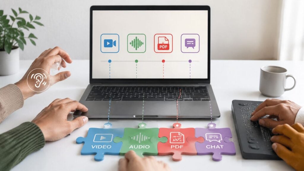
You’ve probably had this happen in a course you built or inherited. A learner opens a video and the captions are scrambled, or they get stuck on a quiz because the submit button never receives focus, or they download a PDF and their screen reader treats it like one giant image. None of that feels dramatic in the authoring tool, but it becomes the entire course for the person who can’t move past it.
That’s why accessibility for online courses has stopped being a nice extra. Online learning was already mainstream by the early 2010s, when a 2011 survey cited by the ADA National Network found that 71.6% of all college students surveyed had taken online courses, and 34% of respondents with a documented disability had enrolled in an online degree program (ADA National Network research brief). In other words, accessibility was already part of normal course delivery, not a corner case.
The part many creators miss is that accessibility problems usually show up during the actual learning moment, not in a policy document. A course can look polished and still break for someone trying to use a keyboard, a screen reader, or a small laptop on a slow connection.
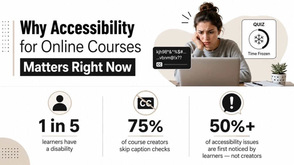
Why Accessibility for Online Courses Matters Right Now
A course can pass the casual glance test and still fail the learner who needs it most. I’ve seen that happen when a video lesson looks fine on a desktop, but the captions are wrong enough to make the explanation useless, or when a quiz looks simple until a learner tries to tab through it and never reaches the finish button.
The scale of the issue is bigger now because online learning itself is bigger. A later review reported that in 2021, more than 51% of students were enrolled in an online course, up from 37% in 2019 (Open Praxis review). The same discussion noted that a study of 500 institutions found 50% of PDFs used in online courses contained accessibility problems (Open Praxis review). When course delivery grows and half of a core file type has issues, accessibility turns into daily quality control.
What this means for a real course creator
The practical lesson is simple. If you build accessibility in from the start, you can template it, train it, and reuse it. If you wait until after launch, every fix becomes a scramble across videos, slides, PDFs, quizzes, and the LMS itself.
Practical rule: the earlier you bake accessibility into templates, the less time you spend chasing the same mistake through every module.
That matters for learners, but it also matters for your workflow. A course creator who checks accessibility at upload time is working at the source. A creator who fixes it after complaints is working under pressure, with students already blocked.
What Accessibility Actually Means in a Course Context
People often hear WCAG 2.1 Level AA and picture a dense legal manual. In practice, it’s a design standard that tells you whether learners can use what you published. For online courses, that baseline applies to the LMS interface and to course content like syllabi, videos, slides, PDFs, forms, and student-service portals (OLC guidance).
The clearest way I think about it is this. Accessible course design gives learners the same information and the same interactions with substantially equivalent ease of use (California Community Colleges accessibility guidance). That doesn’t mean every learner uses the course in the exact same way. It means no learner should have to fight the format just to get to the lesson.
A useful mental model
I like to think of accessibility like a building with multiple entrances. One person comes through the front door, another uses a ramp, another uses an elevator, and another needs clear signs to get from the lobby to the room. The destination is the same, but the path is different.
That’s what good course design does. It doesn’t assume one perfect path through the material. It gives people a workable route through the lesson, the quiz, the discussion, and the certificate page.
A recent review of accessible and inclusive online learning in higher education names alternative text for images, accurate captions, consistent course navigation, plain language, and compatibility with assistive technologies across devices as core accessibility features (Springer review). That list is useful because it turns the abstract standard into concrete building blocks.
What falls under the standard
The course content itself matters, but so do the systems around it. That includes the LMS menu structure, page headings, embedded media players, form fields, document formatting, and any portal a learner touches on the way to the course. If a student can read your slides but can’t submit the assignment, the course still has an access problem.
Accessibility works best when you treat it as a whole-course condition. That’s the useful shift, from “fix the media” to “make the whole learning path usable.”
The Barriers Learners Actually Run Into
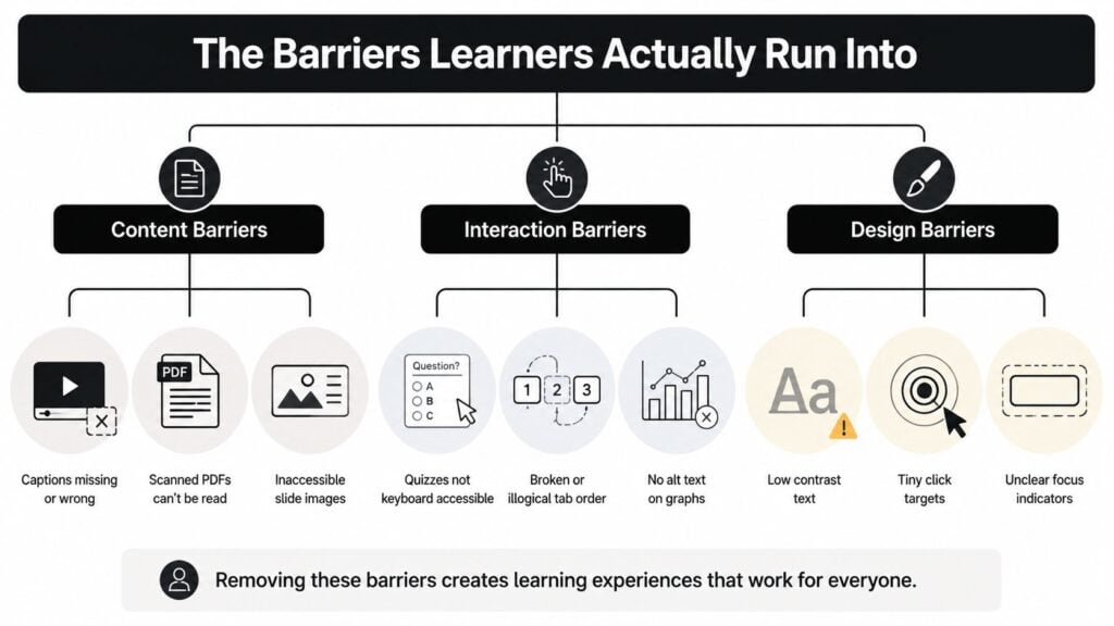
The most common accessibility failures in online learning fall into a few buckets, and they don’t all look the same. A learner may hit a content barrier, an interaction barrier, or a design barrier, and each one creates a different kind of dead end.
The research on deaf students is a good reminder that breakdowns happen in layers. It identifies LMS barriers, course content and materials barriers, and communication barriers as separate problems in online learning (ERIC study). That distinction matters because a course can be fine in one layer and still fail in another.
Content barriers
These are the obvious ones, but they still get missed. Uncaptioned videos, scanned PDFs, and slide decks built from images are hard stops for many learners. If the text is baked into a screenshot or a scan, assistive tech may have nothing usable to read.
Interaction barriers
These show up when a learner can see the material but can’t work with it. A quiz that only responds to mouse clicks, a form with unlabeled fields, or a discussion board that traps focus can leave someone unable to move through the page at all. Technical guidance for e-learning consistently calls for keyboard-only usability, clear labels, visible focus states, and meaningful alt text so the course doesn’t depend on pointer precision or visual-only cues (online course accessibility guide).
Design barriers
These are the quieter frustrations. Low contrast text, tiny click targets, and unclear focus indicators can make a page feel exhausting even when nothing is technically broken. Learners with magnifiers, switch devices, or vision fatigue feel those problems fast.
There’s also the access gap that has nothing to do with disability labels. Literature on nontraditional students points to internet access problems, outdated devices, and low familiarity with digital tools as major barriers, especially for older adults, rural learners, incarcerated learners, military learners, and working adults (Nontraditional student access review/03:_Practicing_Inclusivity_in_OWI/10:_Nontraditional_Student_Access_to_OWI)). That’s why a course that works only on a fast connection and a new laptop still leaves people out.
Fixing Videos, Audio, Text, and PDFs
Most accessibility work starts with the content people can see, hear, and download. That’s a good instinct, but the fix has to be specific. “Add captions” is too vague to be useful. “Make the captions accurate and keep the transcript in sync with the audio” is the kind of instruction a creator can use.
For video, I look for accurate captions, a transcript, and audio descriptions when important visual information isn’t spoken aloud. If the lesson depends on a chart, a diagram, or a screen recording that’s not verbally explained, then a learner who can’t see the screen needs that information another way. If you want a practical workflow for captions for muted feeds, that kind of resource can help course teams think through caption timing and readability.
For audio-only lessons, the transcript does the heavy lifting. Clear recording quality matters too, because garbled audio creates the same barrier as missing text. The transcript should read like the lesson, not like a messy auto-export with half the punctuation missing.
For text pages, the work is often structural. Use headings in order, describe the link destination instead of writing “click here,” and keep the language plain enough that a learner doesn’t have to decode the page before learning the content. A well-organized page helps everyone, but it’s especially useful for screen-reader users who jump by headings.
For PDFs, the mistakes are usually hidden. The file might look fine in a browser, yet still fail because the headings aren’t tagged, the reading order is wrong, or images don’t have meaningful alt text. If you’re choosing between rebuilding a document and leaving it as a flat scan, rebuild it. A tagged document is usually much easier to use than a pretty scan.
I’d also be careful with AI-generated subtitles or document conversions. Tools can speed things up, but they still need human review for names, jargon, and context. A practical overview of AI subtitle generators for course videos can help you compare shortcuts without trusting them blindly.
| Content Type | Minimum Accessibility Check | Common Mistake to Avoid |
|---|---|---|
| Video | Captions, transcript, audio description where visuals matter | Uploading auto-captions without review |
| Audio | Transcript, clear recording, logical segmenting | Treating audio as accessible without text support |
| Text pages | Headings, descriptive links, plain language | Building content as one long block of text |
| Tagged headings, correct reading order, alt text for images | Posting a scanned image as if it were text | |
| Images | Meaningful alt text, decorative images left empty | Describing every image the same way |
A lot of creators still think accessibility fixes live in the final export stage. They don’t. They live in how you draft, label, format, and publish the material in the first place.
Setting Up Your LMS, Assessments, and Community Tools
A course can have clean videos and tagged PDFs and still fail in the platform layer. That’s where people get stuck on navigation, forms, discussion tools, or enrollment steps that don’t play nicely with assistive tech.
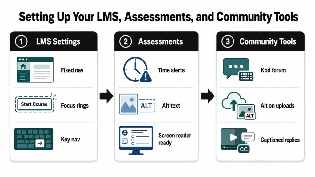
The best technical baseline for online courses is still WCAG 2.1 Level AA in most contexts, and in some public-sector U.S. settings WCAG 2.2 Level AA is part of the picture too (OLC guidance). What matters day to day is how that translates inside the LMS. Fixed navigation, visible focus states, and keyboard-reachable menus reduce the chances that a learner gets lost before they even reach the lesson.
Where assessments break
Quizzes and assignments are a frequent failure point because they mix text, timing, form controls, and feedback. Unlabeled fields, drag-and-drop interactions, and unclear time-limit warnings can block a learner even when the question content itself is simple. If the quiz editor or template isn’t screen-reader friendly, the whole assessment becomes brittle.
Where community tools break
Live chat, discussion boards, and enrollment systems need attention too. Research on deaf students points to communication barriers as a distinct layer, and accessibility guidance keeps showing the same recurring failures, including inaccessible live chat, discussion boards, scanned-image documents, uncaptioned videos, and enrollment systems that don’t support assistive technology well (ERIC study). A learner doesn’t experience those as separate features. They experience them as one broken journey.
What to inspect first
If I’m reviewing a course shell, I start with the flow a learner follows.
- Navigation: Can every main area be reached with the keyboard alone?
- Focus order: Does the tab sequence make sense, or does it jump around?
- Forms: Are labels attached to every field and button?
- Discussion tools: Can a screen reader parse posts, replies, and attachments?
- Uploads: Do student-added images and files have a way to be described or tagged?
That last point matters more than people think. A community space becomes less usable the moment learners start sharing files and screenshots without structure.
Tools can help here. Platforms with built-in accessibility feedback make it easier to catch issues early, and some course teams use LearnStream alongside their LMS and content checks to keep the workflow organized. The key is not the tool itself, it’s whether the platform lets you find the broken interaction before a student does.
Testing, Fixing, and Keeping It That Way
Accessibility testing works best when it’s routine and boring. That sounds unglamorous, but it’s what keeps a course from regressing every time someone uploads a new lesson or swaps a file.
I start with the checks that catch the most breakage fastest. Use the keyboard alone and try every clickable element. Open one module with a screen reader and listen for heading order, labels, and landmarks. Run a contrast check on text that sits over images or colored blocks. Then watch a short stretch of video with the captions on and look for errors, missing speaker changes, or timing problems.
A simple audit rhythm makes this easier to sustain.
Keep the sequence consistent: keyboard test first, media check second, document check third. That order catches the most common failures before you spend time on deeper review.
The tooling can stay lightweight. Screen readers help you hear what your learners hear. Contrast checkers show where visual design falls short. Accessibility linters catch missing structure in pages and documents before publication. If you want a compliance-oriented companion guide, the internal walkthrough on Section 508 compliance for e-learning content fits well with a document-and-platform review process.
What to log after each review
I’d keep the log short enough that people use it.
- Page or module name: So the fix goes back to the right place.
- Problem type: Caption, contrast, keyboard trap, missing label, or bad reading order.
- Owner: The person who can make the update.
- Status: Open, fixed, or needs retest.
That kind of record stops the same mistake from reappearing in the next batch of lessons.
If you want a deeper testing routine, pick one module and repeat the same sequence every time. The point is consistency, not perfection. Over time, you’ll spot patterns in your course structure, and those patterns tell you where your templates still need work.
Building a Course That Stays Accessible Over Time
The easiest courses to keep accessible are the ones built with prompts and habits, not heroic cleanups. I like templates that remind authors to add alt text, captions, and heading structure before they publish. I also like training collaborators on caption accuracy so nobody treats auto-generated text as finished work.
A maintenance mindset helps here. Review accessibility during launch, not after launch. Fold it into your normal publishing steps, the same way you already check links, dates, and broken assets. If you want examples of how accessibility can sit inside a broader design approach, the internal overview on universal design for learning examples in e-learning pairs naturally with that habit.
The easiest progress signals are the ones you can see without building a huge dashboard. Track whether key lessons pass a basic screen-reader check. Track whether learners are reporting the same access barrier more than once. Track whether your templates are making the right thing easier to do.
Accessibility gets easier when it becomes part of the way you build, not a separate cleanup project. If you’re updating a course this week, start with one module, check the keyboard path, fix the captions, and review the PDF or slide deck before you touch anything else. That small pass gives you a real baseline, and it’s a good time to send your next learner-facing lesson through the same routine.