
Master How To Create A Course Catalog In Your LMS

You’re probably here because your “course catalog” isn’t really a catalog yet.
It might be a long LMS page with no filters. It might be a folder structure only your admin understands. It might still be a spreadsheet passed around over email with tabs named “Final,” “Final v2,” and “USE THIS ONE.” I’ve seen all three, and they create the same problem. Learners can’t find the right course fast enough, so they stop looking.
That’s why learning teams get frustrated. They’ve already invested time creating the training, buying the LMS, and uploading content. Then the catalog underperforms because nobody made the discovery experience usable.
If you want to understand how to create a course catalog in your LMS, start before the LMS setup screen. The smart work happens earlier, when you decide how courses will be grouped, described, filtered, and maintained. Get that part right, and the technical build becomes much easier. Get it wrong, and you’ll spend months cleaning up titles, tags, broken categories, and confused learner journeys.
Your Course Catalog Is More Than Just a List
A learner opens your LMS, types “manager training,” and gets 47 results with titles like “Leadership Pathway,” “Supervisor Essentials,” “Mgmt Core,” and “Module 3 Revised.” They pick one, realize it is for the wrong audience, back out, and email your team. I see that pattern all the time in first-time catalog builds. The problem is rarely the LMS screen itself. The problem started earlier, when nobody decided how courses should be grouped, labeled, filtered, and maintained.
A catalog is the front door to your learning offer. If that door is confusing, the quality of the training behind it barely matters.
The shift from storage to storefront
Early LMS platforms gave organizations a place to publish courses. Over time, the better systems turned that course list into a discovery experience with search, categories, enrollment rules, and public or internal browsing. That change matters for one reason. Learners judge the usefulness of your training library long before they start a course.
In practice, a strong catalog does two jobs at once. It helps learners find the right course quickly, and it gives administrators a structure they can keep clean as the library grows. If either side breaks, adoption drops. Learners stop browsing, and admins start patching problems by hand.
I also tell clients to be careful about treating the catalog as a feature you can fix later. Some LMS products make taxonomy, metadata, and permissions easy to manage. Others make even simple changes painful. If you are still comparing systems, review the catalog and governance implications while you evaluate LMS selection criteria. I have seen teams buy a platform based on course delivery features, then spend months working around a weak catalog structure.
As noted by Instructure’s course catalog overview, organizations use dedicated catalog tools to improve visibility and enrollment for professional development. That lines up with what happens in real implementations. Once courses are organized in a way learners can scan and trust, usage rises without constant hand-holding from HR or L&D.
What a good catalog does
A useful catalog works like a storefront for your learning ecosystem. It helps learners answer the questions that decide whether they enroll or leave:
- What is relevant to my role
- What should I take first
- How much time will this take
- Do I meet the enrollment requirements
- What will I be able to do after I finish
Clear answers reduce hesitation. They also reduce support requests, duplicate enrollments, and the common problem of learners choosing the wrong version of a course.
A messy catalog makes a strong training library look thin, confusing, and harder to trust.
Where teams usually go wrong
The first mistake is usually structural.
A team uploads everything under one broad category such as “Learning” or “Professional Development,” then hopes search will do the rest. It will not. Search can only work with the titles, descriptions, tags, and rules you give it.
The second mistake is writing for internal stakeholders instead of learners. Course names like “OPS-204 Rev B” or “Annual Compliance Track 2” may make sense to admins, but they fail at the moment of choice. Learners need plain-language titles and summaries that tell them who the course is for, why it matters, and what comes next.
The third mistake is ownership. Once the initial upload is done, nobody is assigned to retire outdated courses, replace broken thumbnails, update instructors, or merge duplicates. Catalog quality slips fast. I have seen perfectly good launches become cluttered within a quarter because no one owned the cleanup process.
Treat the catalog like a product with rules, not a page with courses on it. That mindset prevents a lot of expensive cleanup later.
Blueprinting Your Catalog for Success
Most catalog problems start before anyone logs in.
The team gets excited about layout, branding, and button clicks inside the LMS, but skips the planning work that makes the catalog usable. Then six months later they’re trying to untangle bad categories, duplicate tags, and search results that return nonsense.
Start with audience and purpose
Before you build anything, decide who the catalog is for.
An internal employee catalog works differently from a public catalog for paid courses. A university continuing education catalog works differently from a compliance catalog. A membership training hub works differently from partner enablement.
That sounds obvious, but teams blur these use cases all the time.
Ask these questions first:
- Who is the primary user
- What are they trying to do
- What action should the catalog drive
- What should they understand before enrolling
- Who will maintain the content after launch
If those answers are fuzzy, your catalog will be fuzzy too.

Build your taxonomy before your LMS structure
This is the part often skipped, and it’s the part that saves the most time later.
Taxonomy is just your system for organizing courses. Categories, subcategories, tags, labels, and other metadata all sit inside it. If your taxonomy is sloppy, your filters will be sloppy. If your filters are sloppy, learners won’t trust search.
A strong taxonomy usually includes a few stable fields:
Topic or domain
Examples include leadership, onboarding, cybersecurity, customer service, or product training.Audience or role
Manager, new hire, sales rep, instructor, member, partner.Skill level
Beginner, intermediate, advanced.Format
Self-paced, webinar, workshop, cohort, certification prep.Duration
Short, half-day, multi-week, or a time estimate in minutes or hours.Status markers
New, updated, required, optional, archived.
What doesn’t work is mixing all of those into one field. I’ve seen teams use categories for topics, roles, and formats all at once. The result is a category menu that looks like this: “Leadership,” “2 Hours,” “Managers,” “Video,” “Required.” That isn’t a taxonomy. It’s clutter.
Choose categories that learners understand
Your categories should reflect how learners think, not how your department stores files.
A 2024 Brandon Hall Group study found that organizations with searchable, categorized catalogs saw 42% higher learner engagement and 28% improved course completion rates, and thematic structures aligned to skills gaps, such as leadership development, can cut learner search time by 40%, according to GOLS guidance on designing an effective course catalog.
That’s why themes usually work better than internal org charts.
Here’s a practical comparison:
| Organization choice | Usually works? | Why |
|---|---|---|
| By department owner | Rarely | Learners often don’t know which team produced the course |
| By business function | Often | People understand sales, operations, HR, leadership |
| By learner goal | Very often | “Get promoted,” “Complete onboarding,” “Stay compliant” is easy to navigate |
| By content format only | Sometimes | Useful as a filter, weak as a primary structure |
Decide your metadata rules early
Metadata drift is one of the most common cleanup jobs I deal with.
One admin writes “Beginner.” Another writes “Introductory.” A third writes “Level 1.” The LMS treats them as different values, which means your filter menu gets messy and your reports get unreliable.
Set rules before anyone starts entering data:
Use a controlled vocabulary
Pick approved values for skill level, format, language, and audience.Define naming conventions
Decide whether titles will include course codes, version numbers, or dates.Separate display fields from admin fields
Learners should see clean titles. Admins can still have internal IDs in a hidden field.Write a one-page metadata guide
This sounds boring. It prevents endless rework.
Practical rule: If two different admins could describe the same course in different ways, create a standard and document it.
Plan around your LMS limits
Every LMS has strengths and awkward edges. Canvas Catalog, Learn365, LearnDash, Academy of Mine, and Moodle don’t all handle categories, storefronts, permissions, and filters the same way.
In Learn365, for example, creating a course catalog requires the right Microsoft 365 permissions, typically a global or SharePoint admin role, and the catalog is initiated through the admin center. The creator becomes the admin automatically. That matters because catalog design decisions are often constrained by platform permissions and governance.
This is also where platform selection matters. If you’re still deciding, it’s worth reviewing how to choose an LMS with catalog requirements in mind, especially if filters, public enrollment, or role-based visibility are important for your use case.
A simple blueprint to draft before build
I usually want clients to have this on paper before setup begins:
- Primary audiences
- Main catalog categories
- Required metadata fields
- Optional tags
- Enrollment rules
- Ownership and update workflow
- Archive rules for retired courses
Once that exists, the LMS build stops feeling like guesswork.
Designing a Catalog Learners Actually Want to Use
A good backend structure can still produce a bad learner experience.
I’ve seen beautifully planned taxonomies hidden behind cramped layouts, weak search, and course cards that all look the same. If the front end makes discovery feel slow, people won’t care how elegant your metadata model is.
Pick the layout that fits your content
Most LMS platforms give you some version of a grid, list, or mixed layout. None of them is universally best. The right choice depends on how your learners browse.
Here’s how I usually frame it:
| Layout Type | Best For | Pros | Cons |
|---|---|---|---|
| Grid | Visual catalogs, public catalogs, course marketplaces | Strong thumbnails, easy browsing, good for featured content | Can hide details and force extra clicks |
| List | Internal training, large catalogs, repeat users | Fast scanning, more metadata visible, easier comparison | Less visually engaging |
| Mixed or featured layout | Blended catalogs with priority content | Lets you spotlight key programs while keeping browse depth | More setup work and easier to over-design |
A public-facing catalog that sells courses often benefits from a grid because visuals help people browse. An internal compliance catalog usually works better as a list because employees want speed, not marketing.
Search and filters are where the catalog becomes useful
Your earlier planning pays off now.
If learners can’t search by plain-language keywords, your titles have to do too much work. If filters don’t match real decision points, they won’t help. I usually recommend keeping filter sets tight and meaningful.
Good filters often include:
- Topic
- Role or audience
- Skill level
- Format
- Duration
- Language
- Required or optional status
Bad filters are the ones nobody would intentionally use, like internal owner names or confusing course codes.
I also like to test search behavior with real phrases. Don’t search the exact title. Search the way a learner would. “New manager training” tells you more than testing “Leadership Essentials for First-Time People Managers.”
If you want a useful design lens for this part, the core UX design principles from Figr are worth reviewing. They map well to catalogs because clarity, hierarchy, feedback, and reduced friction are exactly what learners need during course discovery.
If a learner has to understand your internal system before they can use your catalog, the catalog is doing the opposite of its job.
Course cards and listing pages need real information
The listing view should answer basic questions without forcing a click into every detail page.
At minimum, I want each course card or row to show:
- A clear title
- A plain-language summary
- Duration
- Format
- Audience or level
- Any major prerequisite or enrollment restriction
What I don’t want is a wall of identical cards with stock photos and vague summaries like “Enhance your professional capabilities.”
That kind of language kills browsing.
Learning paths need a conscious choice
Some training should be freely browsable. Some training should be sequenced. Don’t leave that decision until the end.
For compliance, certifications, or hierarchical skill building, you may need rigid sequential learning journeys. For broader professional development, flexible self-navigation paths often feel better. Those options depend on whether your LMS can enforce prerequisites and completion tracking, as explained in TalentLMS guidance on course structure and dependencies.
I’ve seen this go wrong in both directions.
Teams sometimes lock everything down, including courses that don’t need a strict order. That creates bottlenecks and lowers exploration. Other teams leave advanced content completely open, then wonder why learners get lost or fail assessments because they skipped the basics.
What usually works best
In practice, the strongest catalogs combine:
- Open browsing for discovery
- Structured paths for programs that require order
- Featured collections for high-priority learning
- Simple search with filters that match learner intent
That combination gives people freedom without chaos.
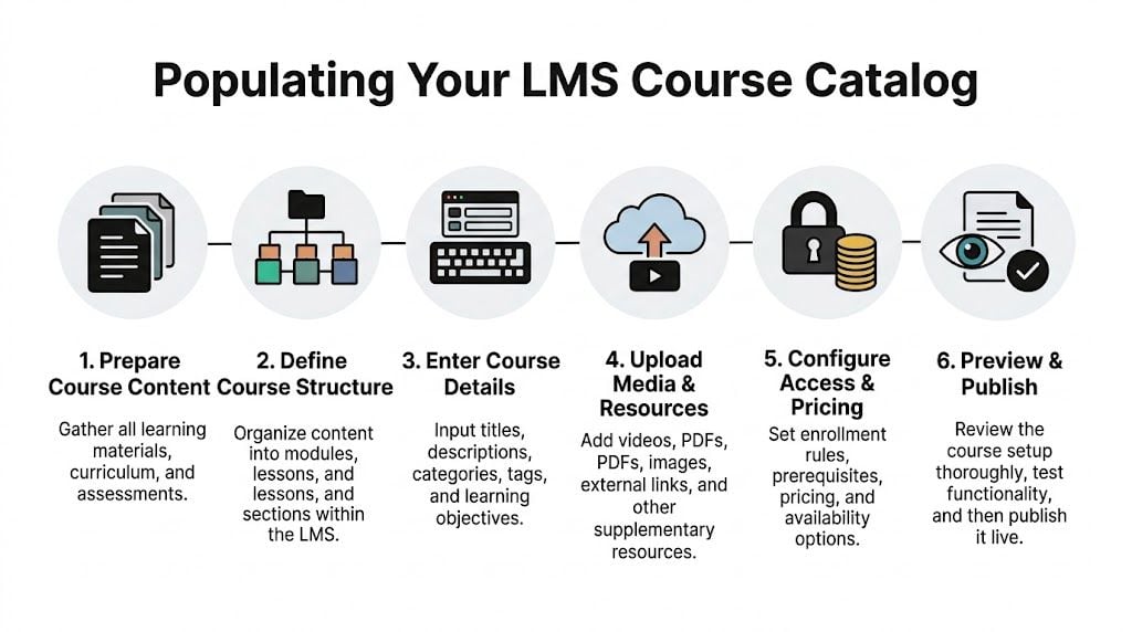
Getting Your Courses into the Catalog
Once the structure is solid, the core population work starts. This is the point where many teams discover they don’t have clean course data.
Titles are inconsistent. Descriptions are missing. Thumbnail images are scattered across shared drives. Someone forgot to track prerequisites. Half the durations are in minutes and the other half say things like “short.”
That’s normal. It’s also why loading content takes longer than people expect.
Choose the right input method
There are three common ways to populate a catalog.
Manual entry works best when you have a small catalog, you’re still testing structure, or every course needs custom attention. It’s slower, but sometimes that’s fine.
Bulk import is the right choice for larger libraries. If you already have course information in spreadsheets, a CSV import can save a lot of time.
API-based sync makes sense when another system is the source of truth and the catalog needs regular updates. That setup takes more planning and usually more technical support, but it reduces repetitive admin work later.
Prepare your CSV like a real dataset
A CSV import only feels easy when the source file is clean.
I recommend building a master spreadsheet with one row per course and one column per LMS field. Typical columns include:
- Course title
- Short description
- Long description
- Primary category
- Secondary tags
- Audience
- Skill level
- Format
- Duration
- Prerequisites
- Instructor name
- Enrollment type
- Status
- Thumbnail file reference
- Course ID
Keep hidden admin fields separate from learner-facing display fields if your LMS allows it.
A few common formatting problems cause most import errors:
Inconsistent values
“Beginner,” “beginner,” and “Beg.” become three separate values in many systems.Comma-heavy descriptions
CSVs don’t love messy punctuation if fields aren’t properly handled during export.Broken image references
A course card with no image may be acceptable. A broken image icon looks careless.Missing required fields
If your LMS requires a category or enrollment setting, blank values can halt imports.Duplicate identifiers
Reused course IDs create confusion fast, especially during updates.
Manual entry is slower but sometimes safer
For first builds, I often suggest manually entering a small pilot set before doing a bulk upload.
That pilot shows you whether your taxonomy holds up in the interface. It also reveals awkward fields, bad labels, and missing metadata before you commit a whole library to the structure.
Build ten courses first. If the eleventh still feels easy to place, your structure is probably sound. If you’re already making exceptions, stop and fix the model.
Handle media and package files carefully
A catalog entry is only one part of the setup. You may still need to upload SCORM packages, videos, PDFs, quizzes, certificates, or external links depending on how your LMS works.
If your catalog includes packaged e-learning content, this guide on how to import SCORM files into an LMS is useful to review before you start loading at scale. It helps avoid the classic problem where the catalog entry looks correct but the actual learning object fails after enrollment.
When an API makes more sense
An API approach is worth considering if your course data changes constantly, or if you’re managing learning across several tools.
For example, if pricing, availability, or course ownership updates in another system first, a manual sync becomes error-prone. In that setup, the catalog should pull from the source system rather than relying on an admin to remember every change.
Still, don’t jump to an API because it sounds more advanced. If your team can barely maintain a spreadsheet, automation won’t save you. It’ll just automate inconsistent data.
A practical loading sequence
This order tends to reduce cleanup:
- Load categories and taxonomies first
- Create or import a small pilot batch
- Review display quality in the live interface
- Fix metadata rules before full upload
- Import the rest in batches
- Check media, prerequisites, and enrollments
- Archive or hide incomplete entries until they’re ready
That last step matters. An unfinished course in the catalog creates confusion faster than no course at all.
Advanced Tips for a High-Performing Catalog
A catalog launch is the start of maintenance, not the end of the project.
The teams that get the best results keep tuning discovery, polishing content quality, and watching how learners browse. They treat the catalog like a living product.

Make public-facing catalogs searchable beyond the LMS
If your catalog is available on the public web, basic SEO matters.
That doesn’t mean turning course pages into keyword spam. It means writing titles and descriptions that match what real people search for. Clear naming, useful summaries, descriptive page headings, and sensible internal linking all help.
If your team needs outside help on the marketing side, a practical place to start is understanding what goes into choosing the best SEO company. That’s especially useful when your catalog doubles as a course storefront and search visibility affects enrollment.
For internal catalogs, SEO matters less than findability inside the LMS. But the writing principles still carry over. Plain language beats jargon every time.
Accessibility should be part of the build, not a cleanup task
I still see catalogs where accessibility was treated like a later phase. That usually means it never gets done properly.
At minimum, check these items:
- Alt text for course images
- Readable contrast
- Keyboard-friendly navigation
- Clear link labels
- Consistent heading structure
- Captions or transcripts where relevant
- No critical information hidden only in images
This isn’t just compliance housekeeping. Accessibility improvements usually make the catalog easier for everyone to use.
Personalization works best when it stays balanced
Recommendation engines are getting more attention for good reason. A 2025 GOLS LMS report says 68% of learners abandon catalogs lacking personalized suggestions, while only about 22% of LMS platforms fully implement AI filters for skill level, progress, or interests. The same source says AI personalization can boost enrollment by 35%, but a 2024 study also found 41% of users still prefer manual browsing, which is why a hybrid approach tends to work best according to this discussion of AI personalization in course catalogs.
That matches what I’d recommend anyway.
Use AI suggestions to narrow choices, surface relevant content, and reduce noise. Don’t let automation hide the full catalog or trap learners in narrow recommendation loops.
A simple hybrid model usually works better:
- Recommended for you
- Popular in your role
- Recently updated
- Browse all
That gives learners guidance without taking control away.
A quick walkthrough can help when you’re thinking about AI-supported learning experiences:

Track behavior, then make small fixes
The best optimization work is rarely dramatic.
You review search terms. You notice people keep using words that don’t appear in your titles. You add synonyms. You see one category getting ignored because its label is too internal. You rename it. You notice a featured collection gets more interaction than the general list, so you improve merchandising.
Good catalogs improve through maintenance, not heroics.
That’s usually enough to keep discovery healthy over time.
Your Final Checklist Before Going Live
Launch week exposes all the decisions you made earlier. If the catalog structure is sound, this review feels boring. If taxonomy, metadata, and ownership were left loose, the problems show up fast.
I’ve seen the same pattern more than once. The catalog looks fine in an admin preview, then a learner opens it on mobile, search returns a retired course, or a regional audience sees training they should never have access to. None of those are big technical failures. They’re planning gaps that become visible at launch.
The pre-launch review I actually use
Run the catalog like a first-time learner with a real task. Start with a simple prompt such as “Find compliance training for new managers” or “Locate the advanced product course in under a minute.” That test tells you more than clicking around randomly as an admin ever will.
Use this checklist:
Search test
Search for common phrases, synonyms, and partial terms. If your LMS supports fuzzy search, test misspellings too. Good metadata usually matters more here than search settings.Filter test
Try the combinations learners are likely to use, not just single filters. Check whether results stay logical and whether empty categories or dead-end filters clutter the experience.Card and detail page review
Check titles, descriptions, durations, instructor names, thumbnails, prerequisites, and enrollment calls to action. A catalog card should help someone decide, not force them to guess.Link validation
Test external resources, attachments, certificates, launch buttons, and registration links. Broken handoffs are one of the fastest ways to lose trust.Mobile review
Open the catalog on a phone and tablet. Responsive layout is not the same as usable layout.Role-based visibility
Log in as different user types if the catalog changes by role, location, business unit, or permission level.Archive check
Confirm retired, draft, and incomplete courses are hidden or clearly labeled. Old content has a way of resurfacing when status rules are inconsistent.Analytics readiness
Make sure search behavior, enrollments, and page usage are being captured inside your LMS or reporting stack. If no one can see what learners are doing, the first round of improvements turns into guesswork.
The expensive mistakes I see most often
These issues usually start small. Then they become support tickets, credibility problems, and cleanup work nobody budgeted for.
Inconsistent metadata
This is the quiet failure. The catalog can look organized on day one while the underlying tags and labels are already drifting. Six weeks later, filters stop making sense because one admin used “HR,” another used “Human Resources,” and a third skipped the field entirely.
Set a controlled vocabulary before launch. Then document it, train the people adding courses, and review it on a schedule.
Overdesigned layouts
Teams often add homepage banners, long welcome copy, promotional graphics, and too many featured sections because they want the catalog to feel polished. What learners usually need is faster scanning and a clear path to the right course.
Clean beats impressive here.
Weak ownership
Someone needs to own quality after launch. That includes updating descriptions, archiving stale content, reviewing new submissions, and deciding when categories need to change. If those responsibilities sit with “everyone,” they usually sit with no one.
Assign one accountable owner and a basic approval workflow.
Multi-system catalog confusion
This gets messy fast when content lives across two or three platforms. Titles drift. Versions fall out of sync. A learner clicks into one system and finds a different description than the one shown in the main catalog.
The fix is operational before it is technical. Decide which system is the source of truth for titles, descriptions, thumbnails, tags, and status. If your setup needs synchronization, use standards or automation deliberately. Don’t rely on copy and paste as a long-term process.
Sloppy implementation
A strong catalog can still fail if launch tasks are handled casually. Permissions get skipped. Redirects are forgotten. Stakeholders approve screenshots instead of the live experience.
If your team is small, this LMS implementation checklist for small teams is a useful companion because it covers the rollout details that often get missed under deadline pressure.
Launching fast feels good for a week. Launching clean saves months.
What “ready” actually looks like
You’re ready when a learner can land on the catalog, recognize how it’s organized, find a relevant course quickly, understand what they’re clicking into, and start without asking for help.
That standard is higher than “the pages load.” It means the structure makes sense, the metadata is clean, and the experience holds up outside the admin view.
That’s the true go-live test.
Your Course Catalog Questions Answered
How should I handle a multilingual course catalog
Start with your metadata model.
Decide which fields need translation and which should remain standardized for administration. Course title, description, and learner-facing labels usually need localization. Internal IDs, taxonomies, and workflow fields usually should not. If your LMS supports language variants, use them. If it doesn’t, create a consistent naming and tagging convention so learners can filter by language cleanly.
Don’t mix translated and untranslated values randomly. That gets messy fast.
How do I measure ROI from a catalog
Look at behavior before and after launch, then keep the analysis grounded in your goals.
For an internal catalog, I’d usually track discoverability, enrollments, course starts, completion patterns, support requests, and search behavior. For a paid catalog, I’d also track product-page performance, enrollment conversions, and whether better navigation leads to more purchases or fewer abandoned visits.
You don’t need a fancy dashboard on day one. You do need a baseline and a habit of reviewing it.
What’s different between an internal and external catalog
The biggest difference is user intent.
An internal catalog helps employees or members find the right training quickly. It usually needs role-based visibility, prerequisite logic, and straightforward navigation. An external catalog has to do all of that while also selling credibility. That means stronger course pages, better merchandising, cleaner marketing copy, and often a more polished payment or registration flow.
Internal catalogs should remove friction. External catalogs should remove friction and build trust.
If you’re building or cleaning up your LMS setup, LearnStream publishes practical guides on learning platforms, digital course operations, and scalable training systems. It’s a good place to keep going when you’re ready for the next decision after your catalog goes live.