How to Make Presentations Interactive
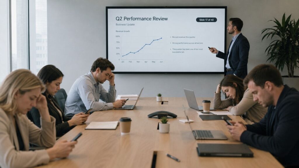
You can spot the problem fast. The presenter is moving through slide 19, then slide 20, and the room has gone quiet in the wrong way. A few people are still looking at the screen, but a bigger share are checking email, messages, or the clock, which is exactly when a good session starts to leak value.
That moment is why how to make presentations interactive matters. Interactivity isn’t decoration. It’s the difference between a one-way slide deck and a session where people answer, reflect, decide, and remember.
What Interactivity Really Means in a Presentation
The easiest way to see the difference is to watch a room drift. A speaker keeps talking, the slides keep changing, and the audience keeps receiving. There’s motion on the screen, but there’s no real participation in the room. That kind of presentation can look polished and still leave people with very little to do.
Interactivity changes the role of the audience. Instead of only listening, people vote, type, choose, discuss, or solve something in the moment. That shift matters because older presentation advice focused on keeping slides visual and one idea per slide, while newer interactive design adds live polls, quizzes, breakout discussion, open prompts, and post-session analytics that help you see what people understood and where they got stuck. Duarte’s presentation guidance captures that shift well, from static slide deck to measurable learning event, especially for educators and trainers who need evidence of engagement, not just attendance (Duarte).
Passive viewing versus active participation
Passive viewing is simple. You show a slide, explain it, and move on. Active participation asks the audience to respond while the idea is still fresh.
Practical rule: if your audience only has to absorb, your session is passive. If they have to decide, rank, write, vote, or explain, you’ve moved into interactive territory.
That’s the gut check I use before I publish any session. If the deck could be delivered exactly the same way with the audience muted, hidden, and absent, it probably isn’t interactive enough yet.
For online learning and webinar settings, this matters even more. Passive listening is easy to lose when people are one tab away from something else, so the interaction itself becomes part of the teaching, not a bonus feature.
Setting Learning Objectives Before You Touch a Slide
A deck gets a lot sharper when the learning objective comes first. I’ve seen too many sessions with clever polls and flashy visuals that never answered a real question about what the audience should know or do afterward. When that happens, the interaction feels lively but drifts away from the actual lesson.
Start with one or two measurable learning objectives. Not “understand the topic,” but something you can hear, see, or check later. If the audience should identify a concept, apply a framework, or choose a better response in a scenario, write that down before you build anything else.
Match the interaction to the kind of learning
Different goals need different forms of participation. A poll works well when you want to surface baseline knowledge or opinions. A branching scenario fits decision-making because people have to choose a path and live with the consequence. A short reflection prompt suits attitude shifts, because you’re asking people to think differently before you ask them to act differently.
That’s where many presenters get stuck. They pick the tool first, then try to force the learning objective into it. The cleaner approach is to ask, “What would prove this objective is moving?” Then choose the interaction that gives you that proof.
For a practical framework on objective setting, I often point colleagues to Bloom’s taxonomy learning objectives, because the language helps separate recall, application, and analysis in a way that’s easy to use while planning.
A simple objective is easier to test than a vague one. If you can’t describe the change in behavior, you probably can’t choose the right interaction yet.
A quick worksheet I like to use in planning meetings looks like this.
- Objective from my last session: write it in one sentence.
- What would people do differently if it worked? add the behavior.
- Two interaction types that would test it: name them side by side.
One more useful reference point is a short video walkthrough from LearnStream’s own library, which sits well next to objective mapping for course and session design, especially if you’re shaping a session for repeat use.
Presentation guidance commonly recommends starting with an interactive opener in the first 2 minutes and including 3 to 5 interaction moments in a 30-minute session, or 5 to 7 in a 60-minute session because attention drifts quickly without a reset (AhaSlides).
Storyboarding Your Session With Engagement Reset Points
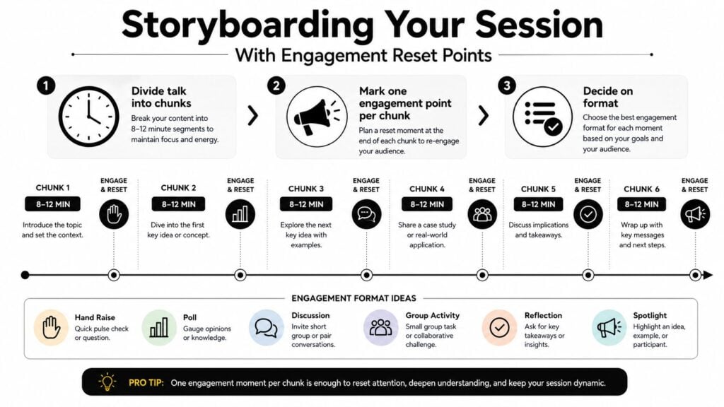
Once the objective is clear, I map the session as a chain of short attention loops. I break the talk into chunks, then place an engagement reset point at the end of each one. That habit keeps participation from being pushed to the last five minutes, when people are already mentally checked out.
A 30-minute soft-skills example
Here’s the structure I’d use for a 30-minute soft-skills training on giving feedback.
Minute 0 to 2, open with a quick question or poll. That pulls people in right away and reduces the reflex to sit back and watch. Minute 2 to 10, teach the core model with one idea per slide. Minute 10, pause for a pair-share or chat response, then bring the room back together. Minute 10 to 20, show a worked example and let people choose the better response in a scenario. Minute 20, ask a checkpoint question or quick Q&A. Minute 20 to 28, handle common mistakes and show a second example. Minute 28 to 30, close with a commitment prompt, so people leave with a concrete next step instead of a vague thank-you.
That pattern matches a practical workflow from presentation guidance, which recommends pre-mapping 2 to 3 interaction points, then inserting an engagement moment every 8 to 12 minutes while keeping each slide to one idea so the audience is not overloaded. A storyboard like that gives the room a rhythm. People can sense when a reset is coming, which lowers the awkwardness of the first live interaction.
If you already build learning content in a storyboard format, find design storyboard practices can help you shape the sequence before you open PowerPoint or Keynote. For course-based planning, LearnStream’s storyboard template for e-learning course design fits the same habit, turning the session into a plan you can rehearse.
The pacing rule I keep using
The most useful change is not a flashy feature. It is pacing. Alternate formats so the audience does not get poll fatigue, and end with a prompt that asks for a decision, commitment, or next action.
Collect questions as you go, then answer them at natural breaks. A free-for-all Q&A at the end usually creates a pile-up, not a discussion.
One more planning note matters here. If you have never used the interactive feature before, rehearse it before the live session. A clear storyboard helps only if the timing, transitions, and tool behavior hold up when real people are watching.
Picking the Right Interaction Format for Each Moment
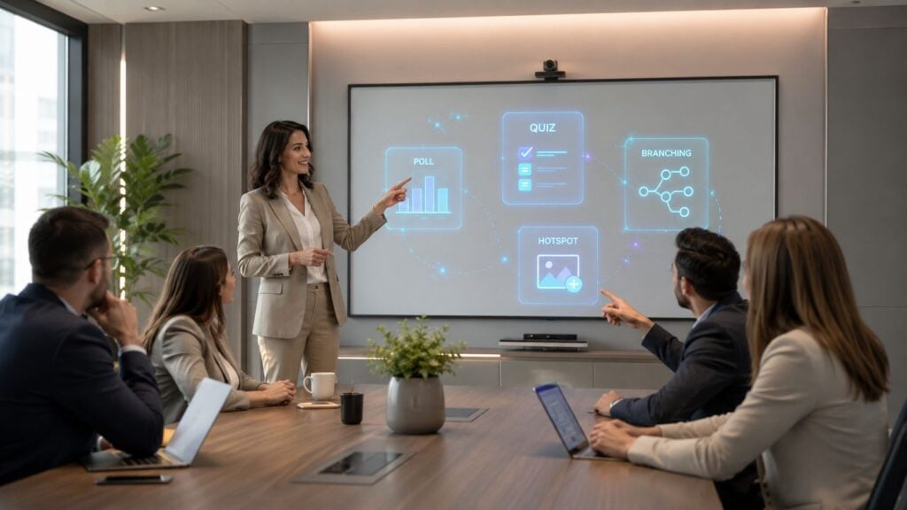
Many guides get too broad. They list interaction formats, but they don’t say which one serves which kind of thinking. I like to treat formats as tools with different jobs.
| Interactive Formats at a Glance | Best For | Watch Out For |
|---|---|---|
| Live poll | Quick pulse checks, opinions, baseline knowledge | Too many polls can feel repetitive |
| Word cloud | Showing themes in the room fast | Can get noisy if the prompt is vague |
| Multiple-choice quiz | Recall checks and light reinforcement | Narrow answer choices can flatten discussion |
| Open-ended question | Discussion, reflection, and richer ideas | Needs moderation or a clear prompt |
| Branching scenario | Applied thinking and decision-making | Takes more setup than a simple poll |
| Hotspot or clickable diagram | Exploring a process, product, or visual map | Works poorly if the visuals are cluttered |
| Shared whiteboard | Co-creation and brainstorming | Can become messy without a tight question |
| Chat-based Q&A | Supporting shy participants and remote groups | Off-topic chat can drift fast |
Match the format to the audience behavior you want
A poll is perfect when I want a quick temperature check. A quiz works when the goal is recall, because people have to retrieve a fact rather than just react to it. A branching scenario is stronger when the point is judgment, since the learner has to make a choice and see consequences.
Open-ended prompts deserve special care. Open-ended questions create more space for discussion than yes-or-no prompts, and broad multiple-choice options keep the room from shutting down too early (Jotform). That matters when you need people to explain, not just signal agreement.
Use format limitations on purpose
Every tool has a downside.
- Live polls: great for speed, weaker for depth.
- Quizzes: strong for recall, weaker for nuance.
- Whiteboards: useful for co-creation, messy when the prompt is loose.
- Hotspots: excellent for exploration, weak if the visual is crowded.
- Chat Q&A: safe for quiet participants, but easy to let it sprawl.
If you need a product family that already includes quizzes, polls, calculators, and branching scenarios for course or membership content, LearnStream users usually compare tools that can embed those elements cleanly into a lesson flow. The fit matters more than the novelty.
The smartest choice is the one that reveals the learning objective without adding noise. If the audience needs to think, don’t trap them inside a yes-or-no prompt. If they need to practice, don’t stop at a poll.
Designing Slides That Hold Attention Between Interactions
I have seen interactive moments fall flat for a simple reason, the slides between them did too much work. The first time this happened in one of my trainings, the opening poll went well, then the next stretch of slides packed in so much text that the room never fully reset. People were still decoding the previous screen when the next question arrived, and the energy dropped before they could rejoin.
Keep the visual load low
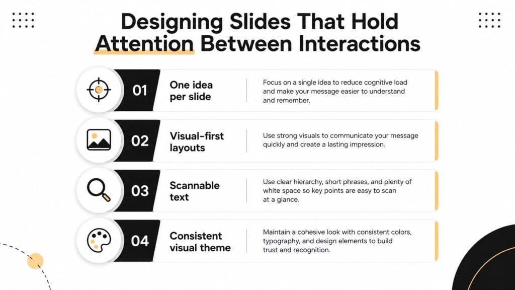
One idea per slide keeps attention anchored. Visual-first layouts help people grasp the point faster than text-heavy screens, and scannable copy works better than paragraphs when the audience needs to stay oriented between activities. A steady visual theme also reduces the effort of re-learning the deck every few minutes.
That breathing room matters. Interactive teaching works better when the slides between activities feel like a clear path, not a second assignment. If every screen asks for too much decoding, the next interaction feels forced instead of like the natural next step in the lesson.
Design for the device people actually use
A good portion of the room is usually on a smaller screen, so mobile-friendly design is part of the learning experience, not a nice extra. Use strong contrast, readable font sizes, and alt text for images. If you use video, add captions. If you use motion, keep it restrained so it supports the teaching point instead of competing with it.
Audio needs the same discipline. PowerPoint music playback settings can help if you are adding sound to a reveal or transition, but I treat audio as a supporting layer. The deck still has to make sense when sound is off and attention is split.
Rehearse the interaction flow before you go live. The biggest failures I’ve seen came from using a feature for the first time in front of an audience.
That warning matches practical guidance that recommends testing interactive features ahead of time and rehearsing timing, tooling, and transitions before the session begins. I keep a short dry-run checklist for that reason.
- Trigger every poll: make sure it loads and closes correctly.
- Check every slide change: confirm the audience sees the right cue.
- Test every link or embedded element: catch login issues early.
- Watch the timing: leave room for people to answer.
The cleanest deck often wins. Clear slides give the audience just enough structure to stay with you, and that matters more than a presentation that looks busy. If you want a tighter way to connect slide design to outcomes, how to measure training effectiveness is a useful companion for the post-session review.
Measuring Whether Interactivity Actually Worked
The part most guides skip is measurement. A room can feel lively and still learn almost nothing. If the audience laughed, clicked, and typed a few answers, that’s a start, but it isn’t proof.
The easiest way to measure is to tie every interaction back to the objective from the planning stage. If the objective was recall, use a quick baseline check and a closing check. If the objective was decision-making, review the quality of the choices people made in the scenario. If the objective was behavior change, ask what action they’ll take and look for follow-through later.
Research-oriented presentation guidance emphasizes going beyond headcount by looking at engagement metrics and post-session feedback, including survey responses and Q&A data, to see whether the design changed understanding or behavior (Powtoon). That’s the true test. Not whether the session felt active, but whether it changed something useful.
The simple measurement loop I trust
Start with a baseline poll, capture open-ended responses during the session, and close with a commitment prompt. Then compare what changed in the answers, the questions, or the follow-up task. If you want a more detailed way to connect learning design to outcomes, how to measure training effectiveness is a useful companion guide for the post-session side of the work.
If you’re tracking learner behavior in video-based or asynchronous content, find vitelnk analytics when you want a toolset that shows how viewers move through content and where attention drops. I like tools like that because they make the session feel less like a black box.
The most useful outcome measures are usually plain. Did people recall the concept better? Did they finish the task? Did they ask smarter questions later? Those answers are much more helpful than “the room seemed engaged.”
Quick Checklist and Troubleshooting Common Live Failures
Before I run a session, I still use a short checklist. Define one objective. Pick two interaction formats. Storyboard reset points every 8 to 12 minutes. Design for mobile. Rehearse the flow. Decide on two metrics. That’s enough to prevent most avoidable problems.
When something breaks, I look at the cause, not just the symptom. A poll that won’t load is usually a tool or setup issue. Silence from the audience usually means the prompt was too vague, too hard, or too fast. Off-topic chat usually means the room needed a tighter question and a clearer lane for response.
A login wall is a friction problem, so I remove it before the session or switch tools. A Q&A pile-up at the end usually means I waited too long to collect questions, so I move questions into the session earlier and answer them at natural breaks.
I’ve found that the best interactive presentations are rarely the first version. They get better when you tighten the objective, simplify the timing, and trim the parts that only looked good in rehearsal. If you do that, the next session usually feels calmer for you and more active for the audience.