Psychology and Tech in Digital Learning: A Practical Guide

It's 9 pm. You've got a course tab open, a 40-minute video you meant to finish, and your phone buzzing on the desk. You tell yourself you'll just check one message. Ten minutes later the video is still paused and the lesson feels heavier than it did at 8:50.
I've sat with that moment a lot, both as a designer and as a learner. The tools we build don't just carry content. They pull on attention, mood, and the decision to come back tomorrow. Psychology and tech meet in that pull. If we only chase clicks, we can grow a number while the learning thins out.
Where Psychology Meets Technology in Digital Learning
Say that learner is one of yours. The laptop shows the lesson. The phone shows everything else. Psychology is the plain account of how people pay attention, remember, feel, and decide. Technology is the room those processes run in. Notifications, progress bars, timers, and autoplay are the furniture.
I picture a learning platform as a classroom where the building designer and the teacher are the same person. The layout, the bell schedule, and the seating all nudge what people do next. A progress bar can feel like a finish line. Autoplay can feel like someone else holding the remote.
Three words will carry the rest of this guide.
Attention is what the learner keeps focused on, right now, instead of the other tabs.
Motivation is why they start and why they keep going after the first win wears off.
Engagement is the visible part. Clicks, comments, time on page, quiz attempts. It is not the same thing as learning.
Those can move in opposite directions. A learner can click through every quiz, pick the first option, and never read the feedback. Your dashboard looks healthy. Their memory does not.
I'll walk through the principles platforms already use, then attention, rewards, examples that hold up, the point where use turns harmful, chatbots, and how to measure without rewarding a tap habit.
Before you change a single setting, mark the spot in your own course where learners most often leave. That drop-off is the design problem worth fixing first.
Core Psychology Principles and the Tech That Uses Them
Each row below is a principle with a long research trail, plus a feature most platforms already offer. Scan for the match, then read the last column before you turn anything on.
| Psychological principle | What it means for learners | Common digital feature | Watch out for |
|---|---|---|---|
| Spacing effect | Memory improves when study is spread over time | Drip modules and spaced review emails | Releasing content too slowly can make learners forget earlier lessons |
| Retrieval practice | Recalling information strengthens memory more than rereading | Quizzes, flashcards and reflection prompts | Quizzes that only check recognition add little real recall |
| Cognitive load | Working memory holds only a few new items at once | Chunked lessons, progress bars and clean layouts | Decorative animation adds load without teaching anything |
| Autonomy | People engage more when they feel in control of their path | Choice of learning path and self-paced modules | Too many choices can cause paralysis and drop-off |
| Competence feedback | Feeling capable sustains effort over time | Instant feedback and skill-based badges | Vague or always positive feedback loses its meaning |
| Social belonging | Connection with others supports persistence | Discussion boards, cohorts and peer review | Forced posting can feel like pressure rather than support |
| Variable rewards | Unpredictable rewards hold attention strongly | Streaks, points and surprise unlocks | Rewards can build a habit of tapping instead of learning |
How to read a row
Pick the two principles that match the course goal. Then check the pitfall before you add the matching feature. A row is a trade, not a shopping list.
The spacing effect goes back to Ebbinghaus in the 1880s. Memory fades, then a return visit after a gap makes the next recall stronger. A drip schedule does that job when the gap is short enough that people still remember the last lesson. Stretch the gap too far and they feel lost, not practiced.
Retrieval practice is the opposite of rereading the transcript. A prompt that asks someone to produce an answer from memory does more than a multiple-choice item they can spot by shape. If your quiz only tests recognition, you have the feature and you missed the principle.
Cognitive load is the tight one. Working memory holds only a few new chunks at once. A clean lesson respects that limit. A bouncing icon does not. If you want a fuller walkthrough of layout choices, our guide to cognitive load theory in e-learning design stays on the layout side of this table.
Practical rule: Add a feature only after you can name the principle it serves and the failure mode in the last column.
A streak on the wrong course
Say you run a skills-based coding course and you bolt on a daily streak because a language app made it look normal. Learners open the app, tap a lesson, and close it to protect the streak. They are not writing code. The variable-reward row warned you. The course needed competence feedback, a check that they can write a loop, not a calendar that panics them for missing Tuesday.
Ask this of your own platform. Which principle is the course already using without intent, and which one is missing entirely? Most memberships I look at already drip content and already nag with points. Few ask for real recall, and fewer still let people choose a path without drowning them in menus.
How Digital Tools Pull on Attention
The American Psychological Association's 2016 Stress in America survey of 3,511 U.S. adults found that 86% constantly or often checked email, text messages, or social-media accounts. Those constant checkers reported an average overall stress level of 5.3 on a 10-point scale, compared with 4.4 among adults who checked less frequently. The survey was observational and relied on what people said they did, so it shows an association. It does not prove that checking causes the higher stress.
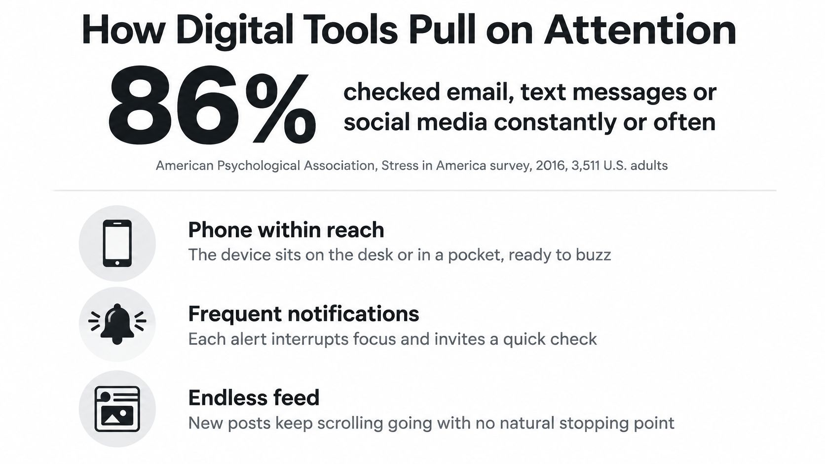
That pattern still matters for a course. Your learner is often that constant checker, with a phone in reach and a feed that has no natural end. Each alert takes a slot in working memory. Most adults can hold only a few new chunks at once, so a pop-up, a chat ping, or a flashing badge steals space from the sentence they were trying to understand.
Three design moves
Batch the alerts. Turn notifications off during a timed lesson, or hold them until the activity ends. A badge that can wait should wait.
Bound the activity. Tell people how long the piece is and what "done" looks like. An open-ended scroll invites the same checking habit the survey described.
Pause on purpose. Before the next chunk, ask for a one-line summary in their own words. The pause gives working memory a place to put the idea.
Compare two builds of the same topic. One is a 45-minute module with chat, badges, and email alerts embedded in the player. The other is three 12-minute modules with a short pause between them and alerts held until the end. The second is easier to finish because each piece has an edge. People can see the end, and nothing in the middle asks them to leave.
Count the interruptions in one lesson per 10 minutes. Cut the one that adds the least teaching value.
Very young learners
Lesson length is a different problem when the learner is a toddler. A longitudinal study of 2,441 mothers and children, covered in the APA Monitor, linked greater screen time at 24 and 36 months with poorer behavioral, cognitive, and social-development screening results at 36 months. Another analysis in that same reporting tied more than 1.5 hours of direct daily screen time at age 2 to below-average language and educational ability, and above-average peer problems, at age 4.5.
For early learning, I keep pieces short, and I put conversation and offline play in the plan on purpose. A tablet can show a picture. It cannot replace the back-and-forth that builds language. If your audience includes parents of very young children, say that out loud in the lesson, and give them an offline activity they can do with the child after the screen goes off.
Motivation, Streaks and Rewards in Learning Apps
Rewards feel like the obvious fix when completion sags. I don't buy that as a default. People tend to keep working when three needs are met. In self-determination theory those needs are autonomy (a real choice), competence (the feeling of being capable), and relatedness (a connection with other people). A point can support competence. It can also crowd the other two out.

When a prize shrinks interest
Psychologists call this the overjustification effect. In a 1973 study, Lepper, Greene, and Nisbett watched children who liked to draw. Children who were promised a reward for drawing later drew less during free play than children who had not been promised one. The prize made the drawing feel like a job. Once the prize stopped, the interest dropped with it.
A streak that resets after one missed day does a similar job on adults. Miss Monday and the counter hits zero. Guilt shows up. People open the app to stop the feeling, not to practice. A weekly goal, or a built-in skip day, keeps the habit without the panic. The person still knows they are on track. They do not have to tap at 11:58 pm to save a number.
Two products, two kinds of progress
A language app that cheers every daily tap is very good at bringing people back. It is weaker at proving they can hold a conversation. A coding course that opens the next project only after a skills check is slower and often less flashy. It builds lasting competence, because access means "you can do this," not "you showed up."
If you want the wider menu of points, badges, and levels, and the places they backfire, the piece on gamification for elearning lays those choices out without treating a streak as the goal.
The same caution shows up with children who are still building language. A short, purposeful game can help, and a feed of random rewards can train tapping. Talkio Kids has a useful take on helping early readers retain new words that keeps the practice tied to the words, not to a spinning prize.
Three changes you can make this week
Tie points to understanding. Award them for a correct explanation or a working example, not for opening the lesson.
Let learners pick the goal. A choice of "three sessions this week" or "one project by Friday" feeds autonomy. A single daily demand does not.
Show skill, not a lesson count. "Can write a loop" tells them more than "completed 14 lessons."
This short talk is a clean reminder that motivation is a design choice, not a personality trait you hope your learners already have.

Pick one reward in your course and either remove it or reshape it so it marks understanding. If you can't explain what the learner can now do, the reward is decorating a click.
Real Digital Learning Examples That Hold Up
A 12-week course that releases one module per week beats a dump of every file on day one. People finish the week in front of them. They are not staring at a library and closing the tab.
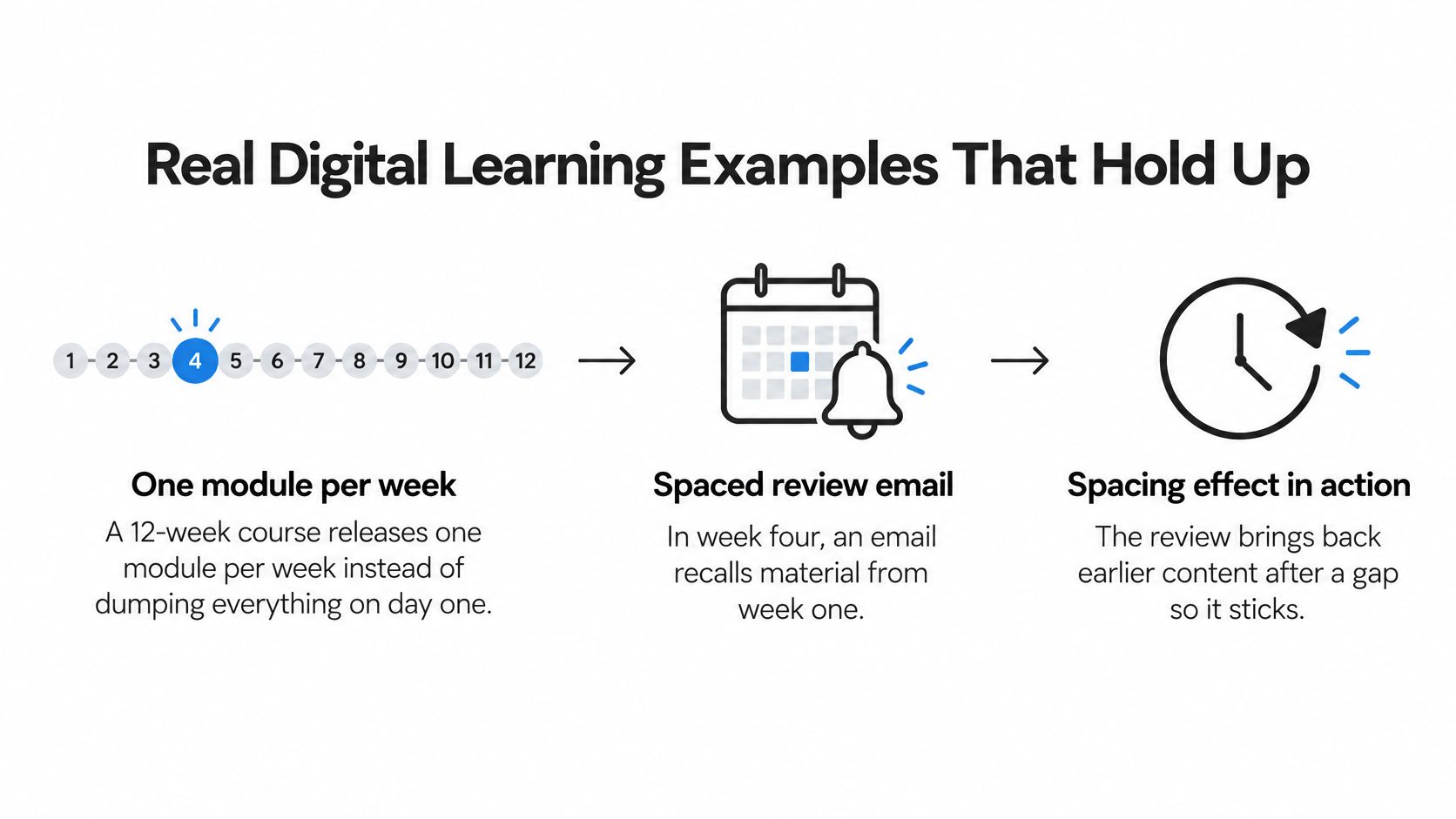
In week four, a short email asks them to recall a point from week one, before they open the new module. That gap is the spacing effect Ebbinghaus measured in the 1880s, applied to a normal course calendar. The email is not a newsletter. It is a retrieval cue.
Short lessons still need a question
Microlearning fits busy adults when each lesson is about 3 to 5 minutes and has one goal. Length alone does not make it stick. Each piece still needs a recall question, something they answer without looking. "What would you try first?" beats "Which of these did we just say?"
Guided programs, not a pile of videos
A review of more than 100 controlled trials, published in 2016 and discussed in the APA Monitor's account of digital care, found therapist-guided internet treatments effective across a wide range of psychological conditions, with especially strong evidence for anxiety, stress, and depression. The same reporting notes that by 2021 the FDA had certified approximately half a dozen digital therapeutics, after clearing reSET in 2017 as the first prescription digital therapeutic for substance-use disorder.
The lesson for course builders is narrower than the clinic. A structured digital program works when it follows a method that has already been tested. Putting the files online does not create that method. Quality still depends on a clear sequence, guidance where it matters, and a way to see whether people can do the thing you taught.
A four-step redesign for one course
- Name one learning goal. Write what the learner can do at the end, in a sentence a stranger could grade.
- Chunk the content. Break it into short lessons with one job each.
- Space the review. Bring an earlier idea back over several days, not only inside the same sitting.
- Add a recall question after each chunk, answered from memory.
Run that on a single module. Compare how people recall the key idea before the redesign and after it. If recall doesn't move, the chunks are still too passive.
Where Learning Tech Turns Harmful
A learner finishes three modules after midnight. The streak ticks up. The dashboard looks like a win, and sleep is what got spent.
A rising chart records activity. Engagement, treated as a psychological outcome, also asks whether attention stayed on the lesson and whether sleep, work, and relationships stayed intact. Pushing the number higher will miss that difference.
The DSM-5-TR framework for Internet Gaming Disorder lists nine indicators: preoccupation, withdrawal, tolerance, inability to stop, continued use despite problems, deception about time spent, using the activity to relieve negative moods, risking relationships or school or work, and loss of significant relationships or opportunities.
A learner who loves the course and spends a focused evening on it does not match that picture. The signals are impaired control, negative consequences, and real disruption to daily life. Time on site is not one of the nine. The nine work like a smoke alarm. They mark harm, not minutes in the kitchen.
Signs worth noticing in a course
Streak panic at night. They stay up late to protect a streak, then show up tired to work or class.
Hidden time. They downplay how long they were in the platform when someone asks.
Offline anxiety. They feel uneasy when they can't open the app, even with nothing due.
Skipped basics. They cut sleep, meals, or a shift to finish a module that could have waited.
One sign is not a pattern. A late night before a deadline happens to careful people. A pattern is several of these, repeating, with the rest of life getting smaller.
This list is for noticing and reaching out. It is not a diagnosis.
If a learner shows several of these signs, point them toward a counselor or a support resource the organization already trusts. Coaching that pattern inside a discussion thread tends to fail. Another badge rewards the same use that is already costing them sleep.
When AI Chatbots Help Learners and When They Cross the Line
Learners already paste course questions into a chatbot. An APA poll of 2,201 U.S. adults found that 17% had used an AI chatbot to discuss mental health. That number is about care, not homework, and it is why a course assistant needs a fence.
Lower-risk uses
Reflection prompts, plain-language explanations of course terms, practice questions, coping reminders, and help preparing questions for a human instructor all sit on the safer side. The learner is still doing the thinking, or they are getting ready to talk to a person.
Students who need a study partner for sources, not a therapist, can also look at affordable AI help for college research. That kind of use stays inside the assignment.
Higher-risk uses
Crisis support, diagnosis, medication decisions, and prolonged reassurance-seeking do not belong in a course bot. A learner who keeps asking "am I okay?" is not asking for a glossary. If the bot keeps answering, it starts to stand in for care.
Three design moves
- Label the limits. Say, in the interface, what the assistant can do and that it is not a counselor.
- Route distress. When a message shows crisis language, send the person to human help instead of generating more chat.
- Make them check. Ask learners to compare the AI answer with the course material before they treat it as correct.
Which AI feature in your course could drift into a substitute for care? If you can't answer that in a sentence, the label isn't clear enough yet.
Measure Healthy Engagement and Set Your Next Step
Minutes online are a weak picture of learning health. A 2025 qualitative study of adolescents, published in the Journal of Adolescent and Youth Psychological Studies, found that healthy technology use was characterized less by total screen time than by intentionality and contextual fit. Participants talked about boundaries, purposeful use, emotional self-regulation, digital empathy, privacy awareness, and keeping offline relationships.
I use that same lens on a membership or a cohort. A long session can be deep work or it can be someone stuck and refreshing. The metric has to say which.
| Metric | What it tells you | What it can miss |
|---|---|---|
| Minutes online | Total time spent in the course | Says nothing about quality, stress or understanding |
| Daily streak length | Consistency of the habit | Rewards pressure to tap rather than learn |
| Voluntary return rate | Learners come back without a prompt | Can still hide compulsive checking |
| Learning transfer | Skills used outside the course | Needs a follow-up task or project to measure |
| Reflection quality | Depth of thinking in written answers | Harder to score consistently at scale |
| Learner-reported control | Whether learners feel in charge of their pace | Depends on honest survey answers |
| Offline-boundary prompts accepted | Respect for rest and offline life | Low uptake does not always signal a problem |
| Privacy literacy | Whether learners understand what data is collected | Needs a short check to confirm understanding |
A small dashboard
Don't track all eight. Pick three that can disagree with each other. I like voluntary return, learner-reported control, and one transfer check, such as a short task they do in their own work the following week. If return is high and control is low, people may be coming back because the product nags them. If transfer is flat, the lessons are being consumed and not used.
Privacy literacy belongs in that set when you collect more than a login. On our side, personal data is kept only as long as the purposes in the Privacy Policy require, and usage data is kept for internal analysis. A one-question check ("what do we store, and for how long?") tells you whether learners know that, which minutes online never will. If you want a fuller set of course measures beyond these eight, start with how to measure student engagement and then drop any metric that only rewards a tap.
Do this in the next module
Pick one metric you do not track yet. Add one reflection question and one offline-boundary prompt to the next module. Something like "what will you try at work this week?" and "you can stop here and come back tomorrow." Review the three numbers after four weeks. If the new metric only rises when you add pressure, change the prompt, not the learner.
If you want a second pair of eyes on the drop-off you marked at the start, write to us through the contact page. Jason Webber started this blog to share what he has learned about how people learn with technology, in a way that stays digestible and a bit fun. Tell us the one metric you are adding and what your learners are doing when they disappear. We'll help you read it as a learning problem, not a streak to rescue.