Membership Site Design That Keeps Members Paying

You’ve probably done the exciting part already.
You know what your membership will offer. Maybe it’s a course library, a paid community, a resource hub, coaching access, templates, software, or some mix of those. You’ve got the expertise. You can picture the sales page. Then you sit down to plan the website and realize you’re not building a normal site at all.
A membership site asks people to do more than visit. It asks them to join, trust you with recurring payments, learn how the space works, keep coming back, and decide every billing cycle that staying is worth it. That changes the design job completely.
I’ve seen smart creators spend weeks refining hero sections and pricing cards while barely touching the member dashboard, the billing area, or the cancellation flow. That usually shows up later as support tickets, confused members, and quiet churn. The homepage matters, sure. But membership site design succeeds or fails in the full journey after the sale.
Great Membership Site Design Is More Than Just a Pretty Homepage
A familiar scenario plays out like this. A creator launches with a sharp homepage, a clean pricing table, and checkout that works. A month later, support inboxes fill up with questions about where to start, how billing works, how to change plans, and whether cancelling means losing access right away.
Those questions are design feedback.
Membership sites used to be treated like gated content. Put a paywall in front of a few pages and call it done. That approach breaks down fast once members expect a usable product, not just restricted access. Good membership site design has to cover the full operating experience. Signup matters, but so do the dashboard, renewal reminders, billing controls, paused memberships, and cancellation flow.
That is why strong membership design borrows from effective UX principles for websites. People need clear next steps, predictable controls, and enough context to trust what will happen after each click.
Design shapes retention
The first questions members ask are rarely complicated. They are practical.
- What did I just get access to
- Where should I start
- Is my subscription active
- When will I be charged again
- Can I switch plans or cancel without contacting support
If the interface answers those quickly, members feel oriented. If it makes them hunt, they hesitate. In a recurring revenue business, hesitation turns into skipped logins, avoidable support tickets, failed renewals, and churn that looks mysterious until you inspect the user journey.
A useful standard is simple. The logged-in area should feel easier to understand than the marketing site.
That changes the brief. Visual polish still matters, but it sits alongside onboarding flow, account settings, mobile usability, page speed, and the clarity of every screen tied to payment and access. A membership site that looks premium but makes renewal or cancellation confusing is not well designed. It is borrowing trust it has not earned.
The site’s core purpose
A membership works like a venue with a front desk, clear signs, and staff who know where things are. The homepage gets people through the door. The member area determines whether they stay, return, and keep paying.
Clients often underinvest in the parts members see after signup because those screens feel administrative. In practice, they do retention work. A clean account page reduces support load. A renewal notice that explains timing and access rules lowers billing disputes. A cancellation flow that is respectful and easy to understand preserves goodwill, and that goodwill often leads to reactivation later.
Good membership site design supports the whole relationship, not just the sale. That includes the attractive public pages and the less glamorous screens where members manage their plan, solve a problem, or decide whether the next billing cycle is still worth it.
The Blueprint Your Core UX and Information Architecture
A member signs up, logs in, and immediately asks a simple question: where do I go first?
Your architecture should answer that within seconds. Before the visual design starts, map the paths people need to take from first visit to repeat use, and from active membership to renewal, pause, or cancellation. That is the core blueprint. It shapes conversion, support load, and retention long after the homepage stops doing the heavy lifting.
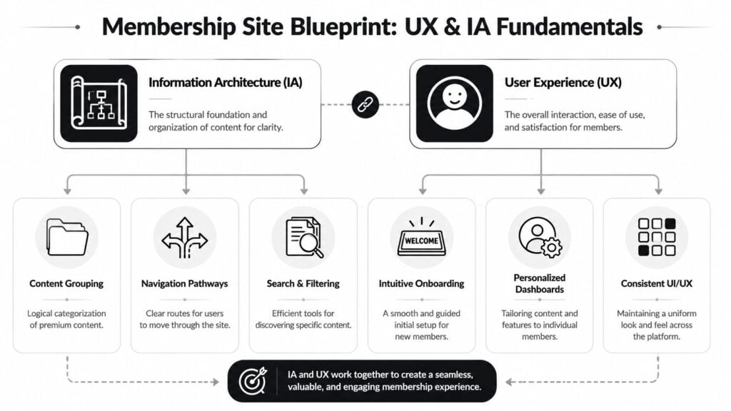
Information architecture is the site’s structural logic. UX is how that structure feels in use. On a membership site, those two are tightly linked because members return with a job to do. They want to resume a lesson, join a discussion, book a call, download a resource, update a card, or check what happens at renewal. If the structure makes those tasks hard, members experience the whole product as harder than it needs to be.
A membership site works like a well-run venue. The entrance is obvious. The signs are clear. The front desk answers practical questions fast. The same standard should apply after signup, especially on the pages owners often treat as administrative.
The page system that supports retention
Most membership sites need a compact set of pages that work together as one system, not a stack of disconnected screens.
| Page | What it must do | Common mistake |
|---|---|---|
| Homepage | Explain the value clearly and direct the right visitor forward | Trying to say everything at once |
| Membership levels page | Show plans, differences, and who each option is for | Hiding important plan details |
| Signup and checkout flow | Reduce hesitation and keep forms short | Asking for too much too early |
| Member dashboard | Give members a clear starting point after login | Putting every feature on one screen |
| Content or community area | Help members find the next useful action | Organizing by internal team logic instead of member intent |
| Account page | Let members manage billing, profile, renewal, and plan details | Treating it like a settings graveyard |
That last row deserves more attention than it usually gets.
The account page is where members confirm whether the business is easy to deal with. If billing dates are unclear, invoices are hard to find, or plan changes feel risky, trust drops. If cancellation terms are vague, people assume the worst. Good architecture reduces that friction before it becomes churn or a support ticket.
How the structure should connect
The strongest membership sites follow a short, predictable path:
- Understand the offer on the homepage.
- Compare plans on the membership page.
- Complete checkout without unnecessary fields or distractions.
- Arrive at a useful first screen right after signup.
- Return to a dashboard that supports continuation on every visit.
- Manage the subscription easily from account, billing, and renewal screens.
This sequence matters because returning members are not in discovery mode. They are in continuation mode.
A dashboard should function like a control center. It should show progress, recent activity, recommended next steps, upcoming events, saved items, and account status. It should also make practical tasks easy to find, including payment methods, invoices, renewal timing, and plan changes. Hiding those options may reduce clicks in the short term, but it usually increases frustration and support volume later.
If your team is still shaping these flows, this guide on how to define an onboarding process for new members is a useful reference because onboarding decisions and site structure affect each other.
Decisions to make before visual design
I usually want these choices settled before anyone debates typography or homepage hero treatments:
- Content grouping: Organize by outcome, skill level, or use case. Do not organize around the order you published things.
- Navigation labels: Use plain labels such as Start Here, Library, Community, Events, Billing, and Help.
- Member home base: Build a dashboard that answers “what should I do next?” without making members hunt.
- Search and filtering: Add them early if the library will grow. Retrofitting search after content sprawl is expensive.
- Mobile use: Members check schedules, lessons, and billing from phones. Design those paths first, not last.
- Plan management: Make upgrades, downgrades, pauses, and renewals understandable before members click.
- Account clarity: Show status, next billing date, invoice history, and access rules in one place.
- Exit paths: Cancellation should be clear, respectful, and easy to complete. Confusing exits damage brand trust even when people were ready to leave anyway.
For a practical refresher on the basics that make interfaces easier to use, this guide to effective UX principles for websites is a solid companion read.
One final rule helps keep architecture honest. The logged-in area should feel easier to use than the public site. If members need more effort after purchase than before it, the blueprint needs work.
The Welcome Mat Designing for Onboarding and Retention
The first few days after signup decide a lot.
I’d go further and say the first 72 hours usually set the tone for the entire subscription. If people feel lost, they don’t settle in and “figure it out later.” They drift. Some never log in a second time. Others stay just long enough to decide the membership feels heavier than the value they expected.
That’s why onboarding deserves much more attention than it usually gets.
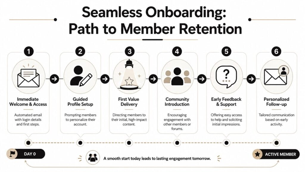
The first login should remove uncertainty
A new member should never arrive at a blank dashboard with fifty links.
The first screen after payment needs to confirm a few things immediately. Their access works. Their membership is active. There’s a recommended first step. Help is nearby if they need it. That combination creates relief, and relief is underrated in UX.
The onboarding sequence itself should be simple and guided.
- Immediate welcome: Send a clear email with login details and one recommended first action.
- Profile setup: Ask only for information that improves the experience, such as interests or goals.
- First value delivery: Point members to a quick win, not your largest library.
- Community introduction: Show them where people gather and how to join the conversation.
- Support touchpoint: Make it obvious how to get help without friction.
A lot of teams overcomplicate this by trying to showcase everything on day one. That usually backfires. New members don’t need the full map of your universe. They need orientation and momentum.
Community changes the retention picture
Here, the design decision becomes a business decision.
According to MemberPress’ roundup of membership statistics, community-driven memberships can achieve retention rates of 85% to 92%, compared with 60% to 70% for content-only platforms. That is a major gap. It tells you that interaction isn’t a decorative feature. It directly shapes whether people stay.
If your onboarding only says “here’s the content library,” you’re training members to consume alone. If it says “introduce yourself here,” “join this cohort thread,” or “share your progress in this space,” you’re helping them form ties that are much harder to cancel casually.
A short planning guide on how to define your onboarding process is worth reviewing if your current welcome flow feels improvised.
Here’s a useful explainer on the broader logic behind strong onboarding:

What a good onboarding flow actually looks like
I prefer an onboarding experience that gets a member to one small win and one human connection fast.
That might look like this:
| Time frame | Best next move |
|---|---|
| Right after signup | Confirm access and point to Start Here |
| First session | Deliver one practical resource or lesson |
| Day one or two | Encourage a profile intro or first comment |
| Day three | Recommend the next best action based on interest |
Don’t make new members assemble their own path from a pile of options.
If you run a learning membership, your first value moment might be a short lesson, a worksheet, or a curated “start here” path. If you run a community-led membership, it might be a welcome thread, a scheduled event, or a member directory filtered by role or goal.
Either way, the principle is the same. Early retention improves when members experience progress and belonging before the novelty wears off.
Delivering Your Value Content and Community Design
Once members are in, your core value delivery has to feel deliberate.
Many memberships often get messy as the creator keeps publishing, the library grows, categories pile up, and the site slowly turns into a storage closet with a login form. Good membership site design prevents that by shaping how value is delivered, not just where files live.
A helpful framing comes from the way current membership models are now grouped into content access, platform access, and community or social access, which Memberstack outlines in its membership site ideas guide. That’s useful because it forces a sharper question: what do your members most want?
Drip versus evergreen
There isn’t one correct answer here. There’s only the fit between your model and your member behavior.
Drip access works well when members benefit from sequence, pacing, or shared timing. That often fits skill-building programs, cohort-style communities, habit change memberships, and topics where too much content up front creates paralysis.
Evergreen access works better when members join with immediate needs and want a resource library, searchable answers, or self-directed progress. That’s common for template vaults, reference memberships, software education, and support hubs.
Here’s the trade-off in plain terms:
| Model | Best for | Risk |
|---|---|---|
| Drip | Guided learning and ongoing anticipation | Members may feel blocked if pacing is too slow |
| Evergreen | Flexible, self-serve access | Members may feel overwhelmed by abundance |
I usually tell clients to choose based on the question members arrive with.
If the question is “teach me step by step,” drip may be the better experience.
If the question is “help me solve this today,” evergreen usually wins.
Build a library that feels curated
The best content area feels edited.
That means fewer top-level categories, stronger filtering, and obvious pathways like Beginner, Advanced, Templates, Replays, or By Goal. Members should be able to tell where to click without learning your internal naming conventions.
A few patterns work reliably:
- Use pathways, not just folders: “Start a podcast” is more useful than “Audio Module 1.”
- Feature recent and relevant items: Don’t force members to dig through archives every visit.
- Show format labels clearly: Video, template, checklist, workshop replay, office hours.
- Archive without clutter: Old material can stay accessible without taking over the main navigation.
Community should support the value, not compete with it
A community area only works when it has a role.
Some memberships use community to answer questions around the content. Others use it for accountability, peer networking, feedback, or live discussion. The design should reinforce that role. If your content promises implementation, the community should make implementation easier. If your offer is networking, the member directory and discussion prompts should be central, not buried.
Members return for content. They renew for usefulness, progress, and connection.
That’s why the strongest memberships don’t isolate the library from the community. They let each support the other. A lesson can point to a discussion thread. A forum topic can link to a relevant resource. A live session replay can surface follow-up prompts. Those links create continuity, and continuity is what makes a membership feel alive.
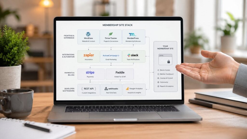
The Nuts and Bolts Choosing Your Tech Stack Wisely
A founder launches a polished membership, gets the checkout working, and assumes the hard part is done. Then support tickets start piling up because passwords fail, pages load slowly on live event days, and members cannot tell whether their payment went through. That is usually not a branding problem. It is a stack problem.
Good tech choices protect the member experience after signup, not just the sales page before it. The right setup makes onboarding easier, content delivery more reliable, and account tasks less stressful. The wrong one creates friction in the places that drive retention, especially around login, billing, and access.
All-in-one versus custom stack
An all-in-one platform reduces setup time. You get fewer integrations to configure, one support team to contact, and a faster path to launch. For solo operators, small teams, and new memberships still proving demand, that is often the smartest choice.
A custom stack gives you more control over how the product works. You might use WordPress with a membership plugin, Stripe for billing, a separate community tool, and a dedicated learning platform or email system. That can produce a stronger member experience, but only if someone on the team can maintain it without turning every update into a small project.
Here is the trade-off most membership owners are deciding between:
| Approach | Strength | Weak spot |
|---|---|---|
| All-in-one platform | Faster setup and simpler maintenance | Less control over edge cases |
| Custom stack | Greater flexibility and tailored workflows | More decisions and more upkeep |
If you’re comparing options, this guide to an affordable membership site tech stack is a useful starting point.
Performance is part of design
Members do not separate design from infrastructure. They judge the whole experience by what happens on screen. If the dashboard lags, video pages stall, or access rules break after a payment update, the site feels poorly designed no matter how polished it looks.
That is why I usually advise clients to treat performance and reliability as product decisions. A simpler stack can beat a more customizable one if it keeps the member area fast and predictable. In many memberships, the best architecture is the one that handles peak moments well, office hours, launches, cohort start dates, and renewal cycles, without forcing the team into constant maintenance.
Complex builds have a place. They make sense when the business model needs custom permissions, deep product integrations, or distinct experiences for different member types. They are a poor fit when the offer is still evolving and the team needs speed more than precision.
A practical decision filter
Use three questions before picking tools.
How different does the member experience need to be?
If your offer follows a common model, courses, content library, community, recurring billing, a standard platform may cover it well.Who will maintain this six months from now?
If the answer is you, choose tools you can update, troubleshoot, and replace without hiring a specialist for every change.Where does failure cause churn fastest?
Billing, login, content access, event delivery, and search deserve more attention than visual extras.
A reliable stack beats an impressive stack that fails during a renewal or blocks access after payment.
The stack should match the membership you are building. A software membership may need account-level permissions and product access controls. A community-first offer may depend on activity feeds, profiles, and event tools. A content-heavy membership may rise or fall on search, filtering, progress tracking, and media delivery.
Choose the tools that support those realities. Long feature lists do not matter if the day-to-day member experience feels fragile.
The Unseen Engine Designing for Renewals and Account Management
This is the part often overlooked until support starts drowning.
They design the homepage carefully. They polish the offer page. They test checkout. Then they leave the account area looking like a utility closet. That’s a mistake, because recurring revenue lives in the post-signup experience.
Current guidance still overemphasizes conversion pages while giving far less attention to logged-in operational flows. That gap is noted in this discussion of membership strategy and design from WP User Manager, which points out how renewal, cancellation, and billing-update experiences are often treated as minor details even though they’re central to recurring revenue.
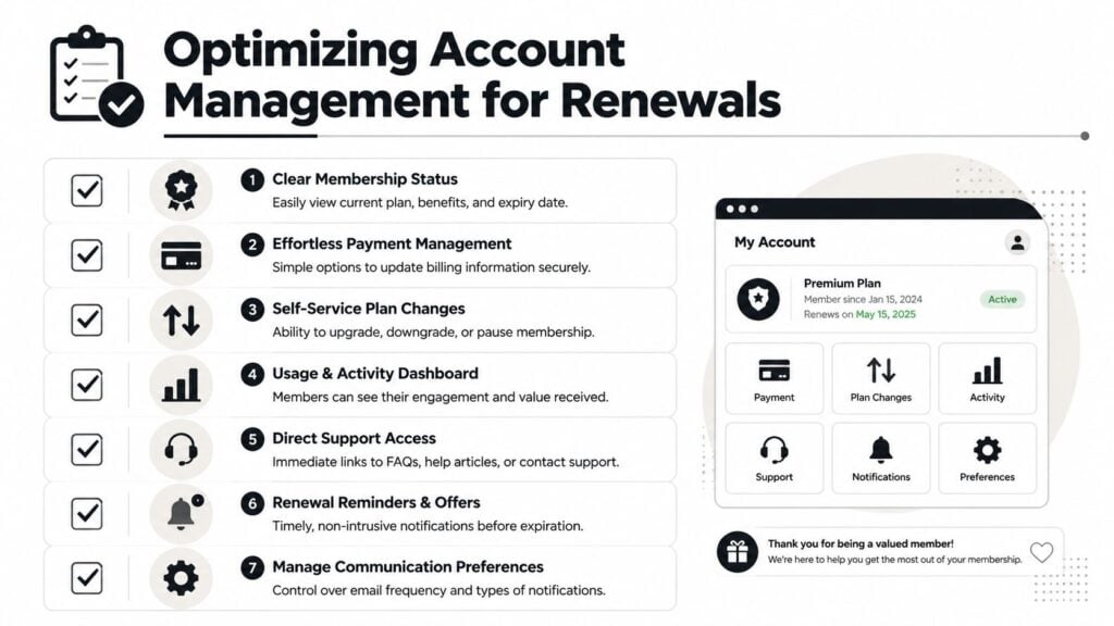
What members need from the account area
A good account page lowers stress.
Members should be able to confirm their plan, update payment details, change communication settings, review billing status, and find support quickly. Those tasks sound boring, but they are some of the highest-stakes moments in the whole product.
The minimum standard should include:
- Membership status: Current plan, renewal state, and what’s included
- Billing controls: Easy card updates and clear payment history
- Plan management: Upgrade, downgrade, or pause if your model allows it
- Support access: Visible help links and contact options
- Notification settings: Let members manage communication preferences
Stop hiding cancellation
A lot of owners still treat cancellation like something to bury.
I understand the instinct, but it usually creates more damage than protection. When members can’t find a cancellation option, they feel trapped. They email support angry. They dispute charges. They leave with less trust than they had before.
A better approach is a respectful cancellation flow with options that fit the member’s situation.
| Member intent | Better response |
|---|---|
| “I’m not using it enough” | Offer a pause or a lighter plan |
| “It’s too expensive right now” | Show a downgrade path |
| “I got what I needed” | Offer a clean exit and invite return later |
| “Something isn’t working” | Route to support before final cancellation |
That kind of design doesn’t force anyone to stay. It gives people choices without making them feel manipulated.
A thoughtful read on the psychology of retention in monthly memberships can help if you’re reworking these flows.
If members need support just to manage their own subscription, the interface is doing support’s job badly.
Renewals should feel clear, not sneaky
Members should know when renewal is coming, what renews, and how to update billing before there’s a problem. Confusion around payments erodes trust fast. Clear reminders, visible status, and self-serve controls do more for retention than a dozen persuasive banners inside the dashboard.
This part of membership site design rarely gets attention because it isn’t glamorous. It also happens to be where a lot of churn, failed payments, and resentment begin. Fixing it often delivers outsized results because you’re removing friction from moments that already carry tension.
Your Membership Design Checklist for 2026
A strong membership site doesn’t come from one good page. It comes from a chain of good decisions that support the full customer relationship.
If you’re planning a new build or auditing an existing one, use this as a practical scorecard.
Strategy and structure
- Value model is clear: You know whether members are primarily buying content access, platform access, or community access.
- Core pages exist: Homepage, plan page, checkout, dashboard, content or community area, and account page all have a defined job.
- Navigation is plain: Labels make sense to a first-time visitor and a returning member.
- The dashboard has a purpose: It points members to the next useful action instead of dumping everything on screen.
Onboarding and engagement
- Welcome flow is intentional: New members get access, orientation, and a fast first win.
- Community entry is easy: Members know where to introduce themselves, ask questions, or join discussion.
- Content feels curated: The library is organized around goals, not your internal publishing process.
- Return visits are supported: Members can pick up where they left off without hunting.
Operations and retention
- Billing is self-serve: Members can update payment details and understand their current status.
- Renewals are transparent: Nothing about payment timing or plan terms feels hidden.
- Cancellation is respectful: Members can leave without friction, and you can still offer sensible alternatives.
- Tech fits the business: The stack matches your resources, complexity, and expected member experience.
The best membership site design makes recurring revenue feel earned every month.
That’s the true test. Not whether the homepage looks modern. Whether the whole system helps people join, use, trust, and keep paying for something that stays useful.