
Video Engagement Metrics: A Guide for Course Creators
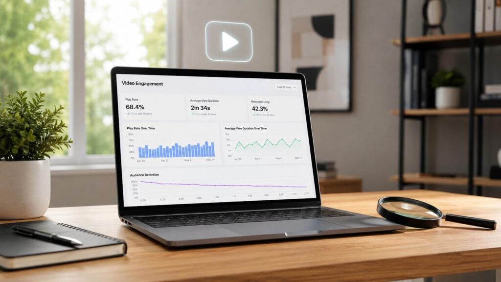
You upload a new lesson, refresh the analytics tab three times, and see the view count creeping up.
That number feels reassuring for about ten seconds.
Then the important questions surface. Did students watch it? Did they understand the hard part in the middle? Did they stop because the lesson was done for them, or because your explanation lost them? I run into this with course creators all the time. They’re not short on data. They’re short on useful interpretation.
That’s where video engagement metrics become helpful. Not as a vanity dashboard. As a reading of learner behavior. In online education, the gap between watching and learning is bigger than most creators think, and some of the numbers people celebrate can point to friction, confusion, or weak lesson design.
Why Your Video View Count Is Lying to You
A view count tells you one very limited thing. Someone started the video, or at least triggered a platform to count it.
For a course creator, that’s like knowing a student opened the textbook. It doesn’t tell you if they read the chapter, understood the example, or gave up after the first page. I’ve seen lesson libraries with healthy-looking view totals and weak student outcomes because the deeper signals were pointing the other way the whole time.
Modern video platforms are moving in the same direction. They care less about raw views and more about whether people stay. According to DemandSage’s video marketing statistics, YouTube now favors a 5-minute video with 60% average view duration over a 10-minute video with 30% average view duration, which is a clear sign that retention carries more weight than simple reach.
Views can hide the real teaching problem
If your lesson gets opened by every enrolled student but most of them leave before the explanation starts, the view count looks fine while the lesson is failing.
That’s why I like borrowing the mindset behind understanding cause and effect in business. A metric on its own rarely explains the outcome. You have to ask what caused the behavior. Did students stop because the intro dragged? Because the lesson title promised one thing and delivered another? Because the player loaded slowly on mobile?
Views tell you who walked into the classroom. Engagement tells you who stayed, listened, and followed the lesson.
A better question than how many watched
The question I want educators to ask is simple. Are students learning from this video, or just passing through it?
That shift changes everything.
A low-performing lesson is no longer a mystery. It becomes a trail of clues. You start looking at watch time, retention curves, replays, drop-offs, and clicks on supporting resources. Suddenly the analytics panel stops feeling abstract and starts reading like student body language.
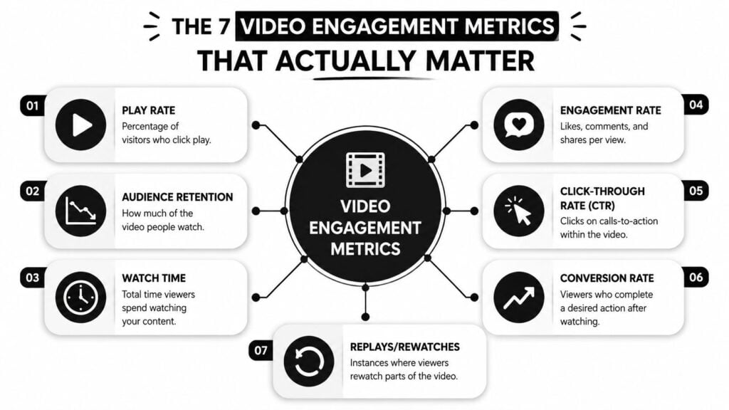
The 7 Video Engagement Metrics That Actually Matter
The easiest way to make video engagement metrics less intimidating is to treat them like classroom signals.
One metric tells you whether students sat down. Another tells you whether they stayed for the main idea. Another tells you whether they went back because they were interested or because they were confused. When I explain this to instructors, I usually compare it to cooking. You don’t judge a meal by how many people entered the kitchen. You judge it by whether they kept eating, asked for the recipe, or left half the plate untouched.
Here’s the core set I pay attention to first.
Play rate
Play rate is the share of people who land on the page and hit play.
Consider a workbook cover. If students see the lesson and skip it, the issue may have nothing to do with the teaching inside the video. It may be the title, thumbnail, placement on the page, or the way the lesson is framed in your curriculum.
A low play rate often points to packaging, not pedagogy.
Average view duration
Average view duration, often shortened to AVD, is how much of the video people watch on average.
I think of AVD as the number of pages someone read in a chapter. It gives you a better feel for actual attention than a raw view count. On modern platforms, AVD has become a major quality signal, and InfluenceFlow’s guide to engagement metrics notes that a 50%+ completion rate is treated as a meaningful medium-intent signal in scoring models.
Completion rate
Completion rate tells you how many viewers make it to the end.
This matters a lot for lessons with a payoff near the end, like a worked example, practice prompt, or CTA to download a worksheet. If students consistently leave before the wrap-up, they may be missing the part that helps the lesson stick.
Audience retention
Audience retention shows how viewing changes over the timeline of the video.
This is less like a final grade and more like a heart-rate monitor. It helps you spot where attention slips. If the graph falls early, your opening likely needs work. If it drops in one specific segment, that segment deserves a second look.
A quick way to visualize the idea is below.

Rewatch rate
Rewatch rate tracks where people replay parts of the video.
Many educators get fooled. A replay spike can mean the segment is valuable. It can also mean the segment is muddy. If students rewatch your explanation of a framework three times and still fail the quiz, that replay wasn’t a win. It was a rescue attempt.
Drop-off points
Drop-off points are the moments where viewers leave.
These moments are gold for course improvement because they narrow your problem. Instead of “students don’t like this lesson,” you get something more useful, like “students leave when I switch from example to theory” or “they disappear when I start reading from slides.”
Interactions and clicks
These are the actions around the video. Likes, comments, shares, resource clicks, quiz starts, and CTA clicks.
For education, I care most about interactions tied to learning behavior.
- Resource clicks can show that a student wanted help applying the lesson.
- Quiz starts can signal active participation.
- Comments often reveal where your wording was unclear.
- CTA clicks matter when the lesson should lead to a next step, such as a worksheet, office hours, or the next module.
Practical rule: Treat each metric like a different camera angle on the same lesson. No single number tells the whole story.
How to Interpret Your Metrics for Online Courses
The same metric can mean very different things depending on the type of lesson.
A low play rate on an optional bonus workshop might be fine. A low play rate on your welcome lesson is a warning sign. A replay spike in a software tutorial might mean students are following along step by step. The same replay spike in a concept-heavy theory lesson may point to confusion.
That’s why I always read video engagement metrics in context. Your course structure matters. The promise of the lesson matters. The student’s intent matters.
Read the lesson like a student journey
I find it useful to group course videos into categories and judge them by what they’re supposed to do.
| Video type | What the metric story usually means |
|---|---|
| Welcome video | If students don’t start or finish it, your onboarding may feel too broad or too slow |
| Core lesson | A steady retention curve usually means the pacing and clarity are working |
| Tutorial | Rewatches can be healthy if students are copying steps in real time |
| Q&A or office hour replay | Lower completion can be normal if students only need one answer |
| Bonus content | Play rate matters less than whether the right students use it when needed |
A creator might panic over a lower completion rate on a long Q&A recording when there’s no real problem. Another might celebrate strong rewatch behavior in a lesson that students find confusing. Context is what turns data into judgment.
The engagement quality gap
This is the blind spot I see most often.
Many dashboards treat all engagement as positive. Watch time goes up, replay activity rises, and the creator assumes the lesson is landing. But in learning, engagement quality matters more than engagement volume. If students keep replaying one section because your explanation overloaded them, the metric looks lively while comprehension suffers.
That’s why I like pairing video data with activity data. If your platform supports it, compare the lesson timeline with quiz results, assignment completion, and resource usage. If you want a framework for that broader review, this guide to auditing LMS user activity is a practical next step.
What confusion looks like in the data
A confusing lesson often leaves a recognizable trail:
- Early drop-off because the intro takes too long to get to the point
- A replay cluster around one dense explanation
- Weak follow-through on the worksheet or quiz after the video
- Comments with surface-level questions that suggest students missed the core idea
When students rewatch a hard segment and then perform well, that replay likely supported learning. When they rewatch and still stall, you probably need to redesign the explanation.
That’s the shift I care about most. Don’t ask only whether students watched. Ask whether the metrics show progress, friction, or false confidence.
What Good Engagement Looks Like Benchmarks for 2026
Benchmarks help, but only if you compare the right thing to the right format.
A course creator can make bad decisions by chasing one universal standard. Educational video behaves differently depending on length, purpose, and viewer intent. A concise how-to lesson and a long lecture replay should not be judged by the same expectation.
Benchmarks worth paying attention to
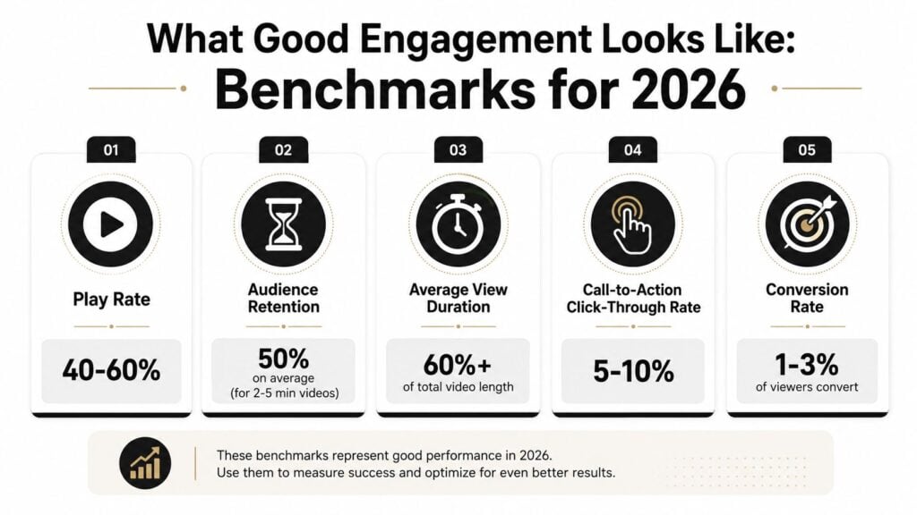
For educational content, Swydo’s video marketing metrics roundup reports that standard 3 to 5 minute videos average 43% engagement, while how-to videos of the same length reach 74% engagement. That gap matters. It suggests students will stay longer when the lesson clearly solves a problem they already want solved.
Another useful benchmark comes from Video Engagement Benchmarks. In educational and explainer content, top-tier performance reaches 74% retention in the 3 to 5 minute range. The same source shows that videos over 60 minutes drop to a 16% average engagement rate, and that the best educational videos often keep 60% to 70% of viewers at the halfway mark.
What I’d call healthy for course content
I wouldn’t use benchmarks as a grading rubric. I’d use them as a health check.
Here’s how I interpret them in practice:
- Short instructional lessons under 5 minutes should usually hold attention well if they solve one clear problem.
- How-to videos deserve a higher standard because intent is stronger. Students came for a task, not a general discussion.
- Long lecture-style recordings naturally lose more viewers, which is one reason many course libraries perform better when large lessons are broken into smaller chunks.
- The opening matters a lot. The same benchmark sheet notes that strong educational videos keep a fairly flat retention curve through the first 10 to 15 seconds. If your graph drops hard right away, the problem is usually visible before the lesson even starts.
A benchmark should guide revision, not trigger shame. If your numbers are below the healthy range, that just tells you where to improve first.
Platform benchmarks are useful, but secondary
If you publish on social platforms as part of your funnel, platform averages can help with promotion strategy. Swydo reports 5.9% average engagement for YouTube Shorts, 5.6% for LinkedIn video, and 3.8% to 4.9% for TikTok, while Instagram Reels and Facebook Reels trend lower on average in that dataset.
For course creators, those numbers matter less than whether the right students keep learning once they click through.
Actionable Fixes for Common Engagement Problems
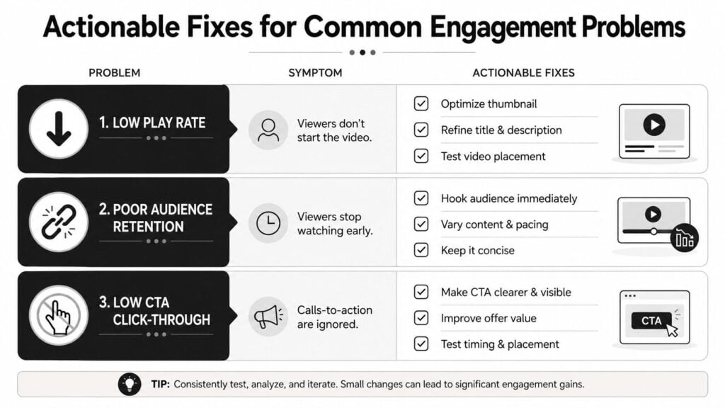
Once your metrics point to a problem, the next move is usually simple. Change one thing that likely caused the issue, then measure again.
The trap is changing five things at once. New intro, new thumbnail, shorter edit, different CTA, revised lesson title. Then you get a better result and have no idea what made the difference. In education, that makes your analytics noisy and your production process harder than it needs to be.
When people don’t start the video
If play rate is weak, look at the invitation before you look at the lesson itself.
Common fixes:
- Rewrite the lesson title so it promises a clear outcome, not a vague topic
- Replace the thumbnail or preview image with something cleaner and easier to scan
- Move the video higher on the page so students don’t have to hunt for it
- Add one sentence of context above the player explaining why this lesson matters now
This is also where production tools can help if you’re repackaging lessons into promos or previews for enrollment pages. If you need quick variants for thumbnails, hooks, or short promotional cuts, a tool like ShortGenius AI video ad maker can speed up testing without forcing a full manual re-edit every time.
When viewers disappear early
An early drop-off usually means your opening isn’t earning attention fast enough.
I tell instructors to check the first lines of the script. Are you leading with housekeeping? Are you summarizing the module before teaching anything? Are you spending too long on who you are, when the student already knows?
Try this instead:
- State the outcome first
- Show the problem the student is about to solve
- Start the example quickly
- Cut throat-clearing language
If you want a broader production checklist for this, LearnStream has a useful article on creating engaging online course videos.
When rewatching may mean confusion
At this point, the engagement quality gap becomes impossible to ignore.
EnterpriseTube’s discussion of video engagement analytics notes that 70% of video viewers stop before the end, and that in educational contexts, heavy replay behavior on complex segments may reflect confusion rather than healthy engagement. That’s a significant distinction for anyone teaching technical or layered material.
Use this quick diagnostic:
| If you see | It may mean | What to do next |
|---|---|---|
| Replays plus strong quiz performance | Students are reviewing productively | Keep the segment, maybe add a summary note |
| Replays plus weak quiz performance | Students are stuck | Re-record with a simpler example |
| Replays plus many support questions | Your wording is unclear | Add captions, diagrams, or a downloadable cheat sheet |
When the middle of the lesson sags
Mid-video dips often happen when energy and structure both flatten out.
Good fixes include:
- Insert a visual change such as a diagram, cursor demo, or worksheet example
- Break one long explanation into smaller beats
- Use a pattern interrupt like a quick recap question or “pause and try this” prompt
- Trim repeated points that students already understood the first time
If attention drops in the same place across multiple lessons, the issue may be your teaching pattern, not that specific topic.
When students ignore your CTA
A CTA can fail even in a strong lesson if it arrives too late or feels detached from the value of the video.
Test these adjustments:
- Place the CTA closer to the moment of insight
- Make the next step feel like part of the lesson, not an ad-on
- Tie the CTA to immediate utility, such as a worksheet, checklist, or quiz
- Say the reason clearly, so students know why clicking helps them learn
Small edits often outperform big rewrites because they target the actual friction point.
Building Your Video Engagement Tracking Dashboard
A useful dashboard answers a teaching question, not just a reporting question.
Say you open your analytics and see that Lesson 4 has a high replay rate. That can feel like good news until you check the worksheet scores and notice students still missed the core idea. Now the metric means something different. They were not replaying because the lesson was compelling. They were replaying because the explanation did not click. That is the engagement quality gap in practice.
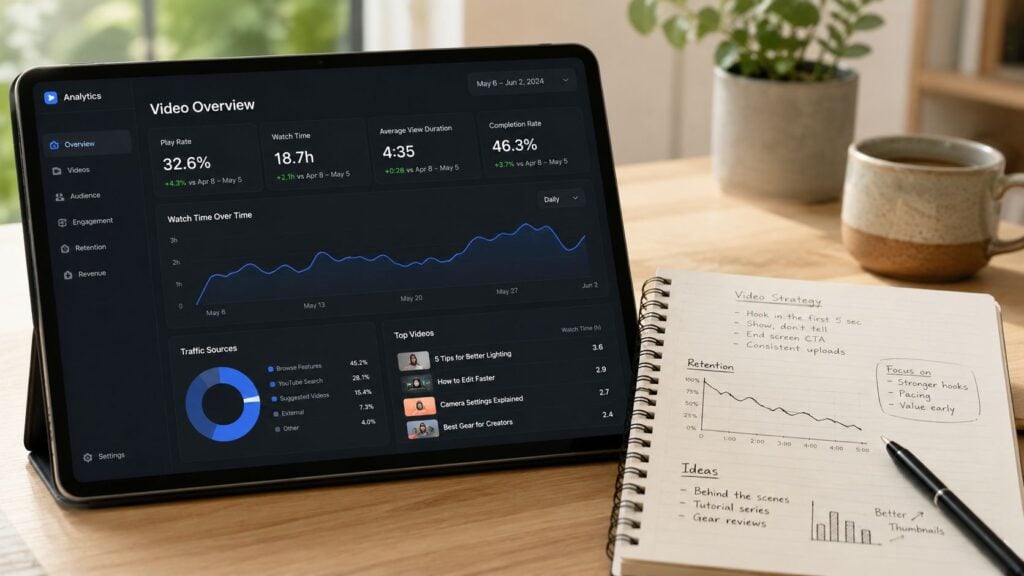
That is why a dashboard should work like a teacher’s gradebook mixed with class observation notes. You are not collecting numbers for their own sake. You are tracking where attention and learning line up, and where they split apart.
What to track
Keep the setup simple enough that you will maintain it. A spreadsheet is often enough.
I recommend one row per video and columns for:
- Video title
- Lesson type such as welcome, tutorial, case study, or Q&A
- Length
- Play rate
- Average view duration
- Completion rate
- Notable drop-off point
- Replay segment notes
- Associated quiz or worksheet result
- Action taken after review
That last pair matters more than many creators expect. A completion rate without a learning check is like judging a workout by time spent at the gym. You need some sign that the effort produced the result you wanted.
If you are choosing a platform with stronger reporting, this guide to video hosting platforms for online courses can help you compare what analytics access you need.
How often to review it
Review timing should match the stage of the lesson.
New videos deserve early attention because small mistakes repeat fast across a course. Older lessons usually need pattern review, not constant inspection. A practical rhythm looks like this:
- Weekly for newly published lessons
- Monthly for the full library
- Quarterly for larger revision decisions, such as splitting a long lesson or rebuilding a weak module
This keeps the process steady instead of reactive.
How to test changes without confusing yourself
Change one variable at a time.
If you rewrite the opening, add captions, trim two minutes, and swap the thumbnail all at once, you will not know what caused the result. A clean test is much more useful. Pick one lesson, choose one likely problem, make one targeted edit, then compare the same metrics after the revised version has enough views to show a stable pattern.
For example, if viewers drop at the same definition every time, test a clearer example first. If replays fall and quiz performance rises, you improved understanding. If replays fall but quiz scores stay flat, students may be skipping faster. That is the whole point of a dashboard. It helps you separate smoother watching from stronger learning.
A practical dashboard mindset
You do not need analyst-level skills.
You need the habit of checking behavior against outcomes. Good course creators treat metrics the way a good coach treats training notes. If a runner slows down every time a hill appears, the answer is not just “they finished the route.” The better question is “what part of the route keeps breaking form?” Video metrics work the same way.
A strong dashboard helps you spot friction, test a fix, and record what changed. Over time, that turns scattered analytics into a teaching system.
Start Measuring What Truly Matters
The most useful video engagement metrics don’t just tell you whether a lesson was seen. They tell you how learners moved through it.
That difference matters. A high view count can flatter you. A replay spike can mislead you. Even a decent completion rate can hide weak comprehension if students finish passively and learn very little. The main job is to close the engagement quality gap by reading the numbers in context and pairing them with learning signals whenever you can.
I think of this as digital body language. Students show you where they’re interested, where they’re lost, and where your lesson design asks too much of them. If you pay attention, the data becomes a teaching partner.
That’s the value of measuring video engagement metrics well. You make better edits, design stronger lessons, and build a course that respects how people learn online.