Apply Inclusive Design Principles: Boost E-Learning
You’ve probably had this moment already.
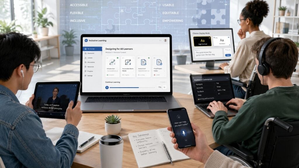
A course goes live, the feedback looks good, and then a thoughtful learner sends a quiet message that tells a very different story. They can’t finish the quiz without a mouse. They can’t tell which answer option is highlighted because the colors are too similar. They’re trying to watch a lesson while commuting, while caring for a baby, or while dealing with a short-term injury, and your course assumes a calm desk setup with perfect vision, hearing, and dexterity.
That’s where inclusive design principles stop feeling abstract.
I think of inclusive design as a teaching skill as much as a design skill. When I build a course, I’m not just organizing lessons. I’m shaping who gets to participate easily, who has to work harder than everyone else, and who may give up before they ever reach the good stuff.
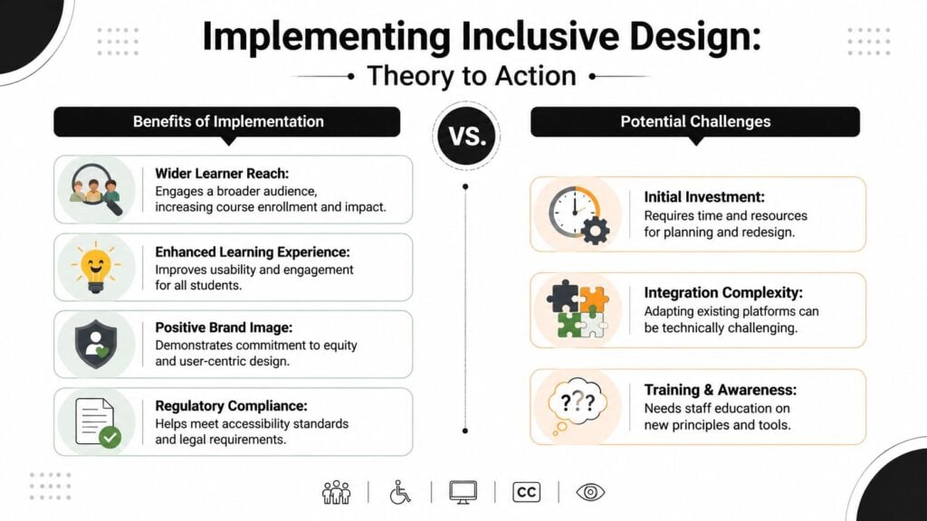
For course creators and membership owners, this matters on two levels. It affects the learner experience, and it affects retention. If your best students have to fight your platform to learn from you, some of them won’t complain. They’ll just disappear.
Why Your Best Students Might Be Struggling
A lot of creators picture accessibility as a niche concern.
But the friction usually shows up in ordinary situations. A student is reviewing a lesson one-handed while holding a sleeping baby. Another is trying to complete a worksheet on a phone during a lunch break. Someone else relies on keyboard navigation and gets stuck in a lesson player that was clearly designed for mouse users first.

I’ve seen this happen in otherwise strong courses. The content is excellent. The teaching is clear. The community is active. Yet small design decisions create silent barriers.
Quiet friction looks like this
- A quiz uses color alone to show correct and incorrect answers, which can leave some learners guessing.
- A video has no captions or transcript, so students in noisy spaces miss key points.
- A lesson page breaks when zoomed, making text harder to read instead of easier.
- A download is only available as a PDF, even when some learners would do better with HTML text, audio, or a simple checklist.
None of those problems mean the creator doesn’t care. They usually mean the creator designed for a default learner who had time, bandwidth, focus, and the same physical setup the creator had while building the course.
The learner who struggles most with your interface is often the learner who would benefit most from your teaching.
That’s why inclusive design principles matter. They push us to notice the gap between “the course exists” and “people can use it comfortably.”
And from a business angle, this isn’t separate from growth. When students can access your material in the way that suits them, they stay engaged longer, get through lessons more smoothly, and are more likely to feel that your membership fits into real life instead of competing with it.
What Inclusive Design Really Means for Your Courses
A lot of people mix up accessibility and inclusive design. They’re related, but they aren’t the same thing.
I use a simple building analogy. Accessibility is like adding a ramp to a building so more people can enter. That matters. But inclusive design starts earlier. It asks how the whole entrance should work so people with wheelchairs, strollers, luggage, limited mobility, different language needs, or temporary constraints can all use it well from the beginning.
That same mindset applies to online learning.
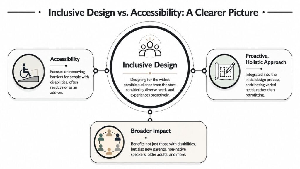
Accessibility handles barriers
Accessibility gives you the technical baseline. It covers things like keyboard access, captions, contrast, and screen reader support.
Those details matter because they remove obvious blockers. If a learner can’t tab through your navigation or read your lesson text, they never reach the teaching.
Inclusive design shapes the whole experience
Inclusive design asks a bigger question. How does this course feel for different people in different situations?
A foundational milestone came in 2016, when Microsoft published its Inclusive Design methodology. It introduced the idea that exclusion is a problem to be fixed, not a natural state, and it framed design around the full range of human diversity, including ability, language, culture, gender, and age.
That idea lands hard in e-learning. Most of us didn’t set out to exclude anyone. But if we don’t actively look for exclusion, it slips in through default choices.
A short video can help make that mindset concrete:

What this looks like inside a course
Here’s the practical difference.
| Course element | Basic accessible fix | Inclusive design approach |
|---|---|---|
| Video lesson | Add captions | Add captions, transcript, clear audio, and downloadable notes |
| Worksheet | Provide a PDF | Provide editable text version and simple mobile-friendly option |
| Navigation | Make links tabbable | Keep navigation predictable, clear, and easy across all modules |
| Community prompt | Use plain text | Use plain language and examples so more learners can join in confidently |
The shift is subtle but important. You stop asking, “Can people technically access this?” and start asking, “Can they learn from this in a way that feels fair, clear, and workable?”
That’s also why inclusive design principles don’t belong only to developers. Course creators, instructional designers, video editors, copywriters, and community managers all shape whether learners feel welcomed or shut out.
The Core Principles of Inclusive Design Explained
The phrase inclusive design principles can sound broad until you attach it to actual course decisions. I find it easier to work with a handful of principles that show up again and again in digital learning.
Provide a comparable experience
This principle means learners should get the same value even if they use different methods.
A student watching a video with sound on should get the same core lesson as a student reading a transcript or using a screen reader. The format may differ, but the learning payoff shouldn’t shrink.
For a membership site, that might mean:
- Video lessons need backup formats like transcripts or detailed lesson summaries
- Charts and diagrams need explanation so a learner isn’t locked out of meaning when they can’t see the visual
- Audio-only teaching needs text support when the audio setting isn’t practical
If you want a helpful primer before you redesign anything, ADA Compliance Pros has a useful page on definitions of inclusive design that explains the concept in plain language.
Make information perceptible
Learners can’t use what they can’t perceive.
The technical side matters here. Inclusive design often uses WCAG 2.1 Level AA as a baseline, including text contrast of at least 4.5:1 for normal text. Interfaces that fail these basics have been shown to increase user error rates by 35% and abandonment by 28% in diverse user populations, according to the UK Design Council’s inclusive design report.
In course terms, perceptible information includes:
- Readable text with strong contrast
- Captions for video
- Alt text for images
- Clear headings so people can scan long lesson pages
- Simple labels on buttons, downloads, and quiz instructions
Practical rule: If a learner removes color, sound, or a mouse from the experience, your core lesson should still make sense.
Offer flexibility in use
People don’t all learn under ideal conditions. Some need keyboard navigation. Some prefer reading before watching. Some need to enlarge text. Others need fewer moving parts on screen.
That’s why I like pairing inclusive design with UDL thinking. If you’re building more than one route into the same lesson, these UDL examples in e-learning give useful inspiration for how to vary format without losing instructional quality.
A practical example is a weekly module that includes a video, a text summary, a downloadable worksheet, and a short audio recap. That setup helps learners with different preferences, but it also helps people dealing with fatigue, limited time, or a distracting environment.
Give learners control
Control is easy to underestimate.
A learner may need to pause motion, zoom text, slow down a video, or complete a task in their own order. When your course locks the interface into one rigid path, you create unnecessary effort.
Plain language is also crucial. The more cognitive load created with dense labels, jargon, or confusing buttons, the more challenging the course becomes to follow. Maze’s inclusive design guidance emphasizes descriptive and simple language for calls to action and product content, and that advice fits online education perfectly.
Putting Principles into Practice on Your Platform
The jump from principle to implementation happens on the page itself. On the page, creators either make inclusion manageable or accidentally make it fragile.
A polished lesson inside Kajabi, Teachable, Thinkific, or WordPress can still frustrate learners if the basics are missing.
Start with interaction, not decoration
Before adjusting fonts or swapping colors, test the core learning actions.
Can someone move through the page with a keyboard alone? Can they start and pause the video? Can they open downloads, submit a quiz, and return to the lesson menu without getting stuck?
Providing multiple input methods and preserving user-defined browser settings is critical. Suppressing those capabilities causes a 40% drop in task completion among users with mobility impairments, while enabling flexible use through customizable interfaces can reduce time-to-task by 22%, according to the Principles of Inclusive Design examples page.
That should change how you review a course launch. Don’t just click around with your mouse. Tab through it. Zoom in. Turn captions on. Try it on your phone.
A practical upgrade list
Here are improvements I’d prioritize first on most course platforms:
- Fix heading structure: Use real H1, H2, and H3 headings so screen reader users can scan lessons quickly.
- Keep navigation predictable: Put lesson menus, progress controls, and downloads in consistent places across modules.
- Avoid one-format teaching: Pair videos with transcripts, checklists, or text summaries.
- Design forgiving quizzes: Prevent accidental submission from one wrong click or tap.
- Respect user settings: Don’t block zoom, contrast settings, orientation changes, or browser resizing.
If you’re auditing an existing site, IMADO’s guide to remediation of common WCAG failures is a good reference for spotting frequent issues that show up in real interfaces.
And if your training serves schools, nonprofits, or government buyers, it’s also worth understanding how accessibility expectations overlap with Section 508 compliance for e-learning content.
Small design decisions that help a lot
I’d group them into three buckets.
| Area | Better choice | Common mistake |
|---|---|---|
| Lesson content | Use plain language and short sections | Dense paragraphs with vague labels |
| Media | Add captions, transcripts, alt text | Making the video the only source of instruction |
| Interaction | Support keyboard, touch, and mobile use | Hover-only menus and tiny click targets |
None of this requires a total rebuild.
Most of the time, inclusive design principles show up as habits. You label things clearly. You give learners more than one way in. You make the path through the material easier to understand and harder to break.
Tools and Workflows to Make Inclusion Easier
You don’t need to become an accessibility specialist to make solid progress. You need a repeatable workflow.
That’s good news for course creators because workflow fixes scale better than one-off heroic efforts. Once your process catches common issues early, you spend less time patching lessons after students complain.
Build inclusion into your normal production flow
I’d treat inclusion checks the same way I treat copy edits or upload checks. They belong inside the routine.
A simple course production workflow might look like this:
- During scripting, flag jargon and add cues for visuals that will need transcript context.
- During recording, speak slide text clearly enough that captions and transcripts will make sense.
- During editing, export captions and review them manually.
- During upload, add alt text, headings, and downloadable text alternatives.
- Before launch, test keyboard navigation, zoom, and mobile layouts.
That approach works because it spreads the effort out. You’re not trying to fix everything the night before launch.
Use personas that reflect real life
One of the biggest gaps in course design is that creators plan for permanent disabilities less often than they should, and they plan for temporary or situational limitations even less.
WebAbility recommends building personas that include hybrid or situational disabilities, such as a learner with a broken wrist or someone studying while holding a baby, in its guidance on inclusive design principles. That’s especially relevant for online education because people rarely consume courses under perfect conditions.
A learner doesn’t need a formal diagnosis to need a more flexible course experience.
That means your persona set shouldn’t stop at “desktop user” or “busy professional.” Add a parent using a phone one-handed. Add a learner in a noisy house. Add a student with unreliable internet who downloads materials in advance.
For educators working in low-bandwidth contexts, this guide for Kenyan educators on offline learning is a useful reminder that inclusion also involves delivery conditions, not just interface settings.
Tools worth using
I’m careful here because tools change fast, but the categories stay useful:
- Captioning tools: Use AI subtitle tools, then review for accuracy. This roundup of AI subtitle generators for course videos can help you compare options.
- Contrast checkers: Browser-based contrast checkers are handy for reviewing lesson pages and buttons before publish.
- Keyboard testing: No fancy app needed. Just put your mouse aside and tab through your course.
- Screen reader spot checks: Even a short test can reveal missing labels, poor heading structure, or confusing navigation.
The goal isn’t perfection on day one. It’s building a course creation system that naturally catches exclusion earlier.
A Practical Checklist for Your Next Course Launch
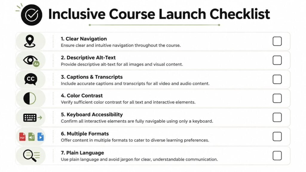
When I’m reviewing a course before launch, I don’t use a giant technical audit. I use a short checklist that catches the most common ways a learner gets blocked.
That’s usually enough to surface the big issues before they turn into support emails, refunds, or quiet drop-off.
Content checks
- Video support: Are all videos captioned, and is the key teaching also available in text?
- Image meaning: Do images, charts, and diagrams include alt text or surrounding explanation?
- Language clarity: Is the lesson written in plain language without unnecessary jargon?
- Format options: Can learners access important material in more than one format?
Design checks
- Readability: Is the text easy to read with enough contrast and spacing?
- Scalability: Does the page still work when zoomed in?
- Structure: Are headings used properly so the lesson is easy to scan?
Technology checks
- Keyboard use: Can every important action be completed without a mouse?
- Mobile experience: Does the lesson work cleanly on phones and tablets?
- Error tolerance: Can someone recover easily from a wrong tap, wrong click, or mistaken form input?
- Consistency: Do navigation, buttons, and lesson layouts behave the same way across the course?
A good checklist keeps you honest. It stops you from assuming that strong content alone will carry the experience.
I’d also recommend asking one person outside your team to test a new module without guidance. Watch where they hesitate. Confusion is often a design clue, not a user flaw.
Measuring the Impact of Your Inclusive Efforts
Course creators usually ask the same practical question at this point. How do I know whether this is helping retention?
The honest answer is that the industry still doesn’t give us a neat benchmark. There is a gap in data-driven metrics for measuring inclusive design’s impact on learner retention and revenue in digital courses, and there’s no consensus on how to quantify its effect on key business outcomes, according to the Inclusive Design Principles resource.
That doesn’t mean you can’t measure anything. It means you need to build your own before-and-after view.
What I’d track first
Look for signals that connect directly to usability and learner momentum:
- Completion patterns: Do more learners finish lessons or modules after you add captions, transcripts, or better navigation?
- Support requests: Do fewer people ask where to find materials, how to submit work, or how to play videos?
- Engagement quality: Do discussion posts show that more learners are keeping up with the content?
- Feedback language: Are students describing the course as clear, easy to follow, and flexible?
Use a simple comparison window
Pick one module or one month of your membership and improve it with a small set of inclusive changes. Then compare it with the earlier version using the same platform reports and the same student feedback prompts.
You’re not trying to prove a universal law. You’re trying to answer a practical business question inside your own product. Did these changes reduce friction enough that more people stayed engaged?
Inclusive design earns its place in your business when learners stop fighting the format and spend more energy on the learning.
That’s the part many creators miss. Better inclusion doesn’t only help the students who identify a barrier out loud. It often helps the quieter majority too. Clearer navigation, stronger captions, flexible formats, and better mobile use tend to make a course feel easier to continue.
And in memberships, continuation is the whole game.