
Retention Metrics for Online Courses

You launched the course, welcomed the first wave of students, and watched the sales notifications come in.
Then a quieter question showed up. Are people staying?
I’ve seen this happen with course creators, membership owners, and training teams over and over. They know how many people bought. They know how many joined. But when I ask how many are still active, renewing, finishing lessons, or showing up next month, the answer gets fuzzy fast.
That’s where retention metrics stop being “analytics stuff” and start becoming a practical teaching tool.
The numbers don’t just tell you whether revenue is stable. They tell you whether students felt momentum, where they got stuck, and whether your course experience gave them a reason to come back.
Beyond the Excitement of Launch Day
A course can look healthy on the surface and still have a retention problem underneath.
Imagine hosting a workshop in a big room. At the start, every chair is full. It feels great. But if people slip out during each break, the room can look busy for a while before you realize half the audience has gone home.
That’s what happens when creators only track signups.
You might have a growing total member count because new people keep joining. At the same time, older students may be drifting away, cancelling, or going inactive. If you only look at the headline number, you miss the story behind it.
Why this blind spot is so common
A lot of teams are stronger at acquisition than retention. Launches are visible. Ads are visible. Affiliate pushes are visible. Student drop-off is quieter.
That’s part of why one stat jumps out at me. In the B2B sector, the overall average customer retention rate is approximately 72.5%, yet less than half of B2B companies are currently measuring their retention rate according to CustomerGauge’s retention benchmark article.
That tells me two things.
First, retention is valuable enough to shape the health of a business. Second, a lot of smart operators still aren’t measuring it consistently.
Practical rule: if you don’t measure retention, you’re relying on vibes to judge whether students are succeeding.
What retention is really showing you
For educators, retention isn’t just a business KPI. It’s feedback on the learning experience.
When students stay, renew, or keep showing up, they’re usually saying something with their behavior:
- The promise matched reality. They got what they expected when they enrolled.
- The next step felt clear. They weren’t left wondering what to do after lesson one.
- Progress felt possible. The course didn’t overwhelm them right away.
- The experience kept earning attention. Community, new lessons, coaching, or structure gave them a reason to return.
On the other hand, weak retention often points to a specific friction point. Maybe onboarding is confusing. Maybe your course library feels like a maze. Maybe students bought for one outcome and never reached an early win.
Retention metrics help you spot those patterns before they become a bigger problem. That’s why I treat them less like accounting and more like listening tools. They show whether students are building a real relationship with your teaching, or just passing through.
The Core Retention Metrics You Must Track
A lot of course creators open their analytics and freeze.
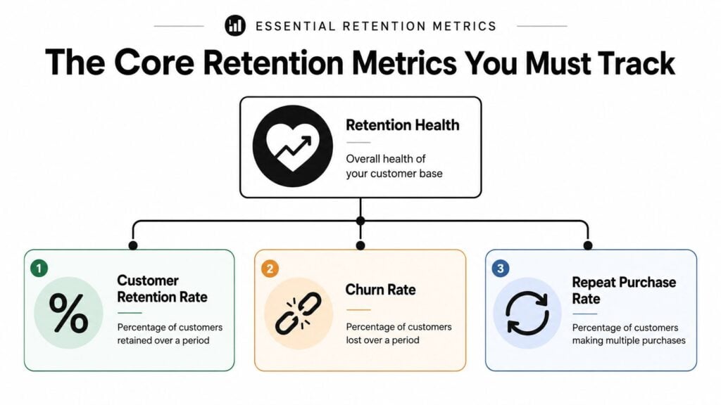
There are too many numbers, too many charts, and no clear sense of which ones explain student behavior. The fix is to track a small set of metrics that answer four practical questions: who stayed, who left, how much a student relationship is worth, and whether students are still showing up often enough to build a habit.
For most courses, memberships, and cohort programs, I start with four metrics: customer retention rate, churn rate, lifetime value, and DAU/MAU. Together, they give you more than a dashboard. They give you a story about whether students are getting value after the sale, where momentum drops, and how usage connects to renewals.
Customer retention rate
Customer retention rate, or CRR, measures how many existing customers stayed with you during a given period.
The formula is:
CRR = [(customers at the end of a period – new customers acquired during the period) / customers at the start of a period] × 100
If you run a membership, CRR answers a plain question: of the students you already had, how many remained enrolled?
A strong CRR shows your current students continue to see value after the initial purchase. It also protects you from a common mistake. New sales can make the business look healthy even while older students depart. If 50 new people join this month, but many existing students cancel, revenue might look fine for a while. Your retention rate reveals what acquisition alone can hide.
Churn rate
Churn rate measures the share of customers who left during a period.
A simple formula is:
Churn rate = lost customers during the period / customers at the start of the period × 100
Churn works like the exit door count. Retention shows who stayed in the classroom. Churn shows who stopped attending.
That difference is useful in practice because churn often points more directly to the problem. If students leave early, you may have an onboarding issue. If they leave after finishing a few lessons, they may have hit a motivation gap. If they leave after one quick win, your offer may not show a strong next step.
I usually read churn as a behavior clue, not just a loss number:
- Early confusion: students joined but never got settled
- Low momentum: they started, then stalled
- Mismatch: the offer did not fit their real goal
- Value fade: the reason to keep paying became unclear
Lifetime value
Customer lifetime value, or LTV, estimates the value a customer brings across the full relationship.
For a creator business, that means asking: if one student joins today, how much revenue does that relationship usually produce before it ends?
You can calculate LTV in several ways, depending on whether you sell one-time courses, subscriptions, renewals, or upsells. The exact formula matters less at first than the habit of connecting retention to revenue. A student who stays for six months and buys a second offer is often more valuable than a student who buys one premium course and disappears.
This is why I do not evaluate an offer by front-end sales alone. LTV helps you see whether the learning experience keeps creating enough value to support the business over time.
DAU and MAU as an early warning sign
One engagement metric deserves a place beside your revenue numbers: DAU/MAU.
It stands for Daily Active Users divided by Monthly Active Users, multiplied by 100. According to Statsig’s retention metric documentation, a ratio above 20% is considered healthy for media and education apps, while below 10% indicates significant churn risk.
For educators, this metric is useful because billing data usually lags behind behavior. Students often stop engaging before they cancel. They log in less, skip lessons, stop posting in the community, and drift out of the routine.
DAU/MAU gives you a quick read on stickiness. Are students returning often enough for your course to become part of their week, or are they treating it like a tab they plan to open later?
Watch behavior before you watch billing. Billing usually reflects a decision students made earlier.
A simple dashboard that stays useful
If I were building a first retention dashboard today, I would keep it tight and readable. A good setup does not need twenty widgets. It needs a few metrics you can scan monthly and connect to real student actions. If you need help laying that out, this guide to LMS reporting dashboards for beginners gives a useful starting point.
| Metric | What it tells you | Why it matters |
|---|---|---|
| CRR | Who stayed | Whether students keep getting value |
| Churn rate | Who left | Where student loss may be happening |
| LTV | Relationship value over time | Whether retention supports healthy revenue |
| DAU/MAU | Habit and engagement | Whether students are still actively using the product |
If you want a second opinion on how these retention metrics fit together, MetricMosaic’s customer retention guide is a useful companion read because it lays out the relationships between common retention measures in a very practical way.
How to Calculate and Visualize Your Data
You open your spreadsheet after a launch and see one retention average for the whole business. It looks tidy, but it hides the part you need. Which students stayed, which ones faded early, and what changed in their first few weeks?
That is why cohort analysis is so useful.
Cohorts work like class groups. Students who joined in January experienced a different version of your course than students who joined in April. You may have changed your welcome emails, cleaned up lesson order, added office hours, or improved the community. If you blend all of those students together, you lose the story behind the number.

Start with one clear cohort view
Start simple. Group students by the month they enrolled, then track what percentage of each group is still active in month 1, month 2, month 3, and so on.
Now your question changes. Instead of asking, “What is retention right now?” you ask, “How did the March group behave after joining?” Averages blur causes, so this shift is important.
Here is a plain example:
- January cohort: strong signup numbers, weak month-1 retention
- February cohort: smaller signup numbers, better month-1 retention
- March cohort: similar signup numbers, stronger month-2 retention after onboarding updates
That view gives you something useful to work with. You can connect changes in retention to changes in student experience.
What to look for in cohort patterns
A cohort chart is less like a scoreboard and more like a classroom observation log. You are trying to see where the learning journey broke down, or where it started working better.
Look for patterns like these:
- Sharp early drop-off: students enrolled but never settled into the course. That usually points to onboarding friction, weak expectation-setting, or too many choices too soon.
- Slow decline over time: students got initial value, then lost momentum. The content may be solid, but the routine around it is weak.
- Stronger newer cohorts: a recent change likely helped. Protect it and test whether the improvement holds.
- One unusually weak cohort: something specific may have gone wrong that month, such as mismatched messaging, a pricing experiment, or a different traffic source.
A helpful question is, “What did this group experience in the first 7 to 14 days?”
That is often where the plot turns.
Make the chart easy to scan
You do not need advanced analytics software to build a useful view. A spreadsheet, LMS export, Airtable base, or simple dashboard is enough if the labels are clear and the layout answers practical questions fast.
Your chart should make three things obvious:
- When the group joined
- How retention changed over time
- Where the biggest drop happened
Color helps here. A heatmap can work well because weak cells stand out immediately. If month 1 is consistently cold across several cohorts, you know where to start. If retention improves after a curriculum change, newer rows should look stronger at the same stage.
If you want a plain-English walkthrough for setting this up, this guide to LMS reporting dashboards for beginners explains how to structure reports so you can read them quickly.
Add Net Revenue Retention if you run memberships
If your business includes memberships, tiered plans, add-ons, or team access, add Net Revenue Retention, or NRR, to your reporting.
The formula is:
NRR = [(Starting MRR + Expansion Revenue – Churned Revenue – Contraction Revenue) / Starting MRR] × 100
NRR answers a different question than student count retention. It shows whether your existing member base is becoming more valuable over time. You can lose some members and still grow revenue from that same base if upgrades and expansions outweigh churn and downgrades.
For educators, that is not just a revenue metric. It is also a behavior signal. When members upgrade, renew at higher tiers, or buy add-ons, they are showing continued trust in the learning experience.
My practical reporting setup
I like one page that combines student behavior with business context. Nothing fancy. Just enough to spot a problem and trace it back to a real part of the student journey.
| Report view | What I’m checking |
|---|---|
| Monthly cohort chart | Which student groups are staying longer |
| Activity trend | Whether usage drops before cancellations |
| NRR snapshot | Whether existing members are expanding or shrinking revenue |
| Notes column | What changed in onboarding, pricing, content, or community that month |
The notes column often gets ignored.
It should not. A chart shows movement. Notes help explain why that movement happened. When you pair the numbers with what students experienced, retention tracking becomes much easier to use.
What Are Good Retention Benchmarks
You open your dashboard a month after launch. Sales looked great on day one, but now you are staring at a retention number and wondering if it is healthy or a warning sign.
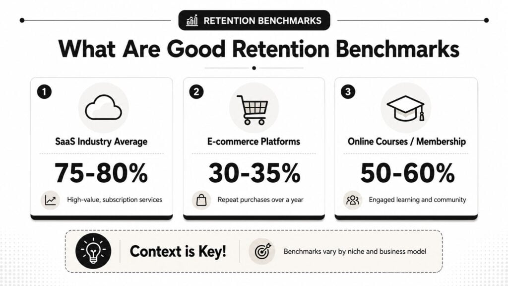
That question trips up a lot of course creators because retention only means something when you match it to the kind of product you sell. A membership library, a fixed-length cohort course, and a low-cost workshop can all produce very different retention patterns. The number matters, but the story behind the number matters more.
Industry context changes the meaning
Benchmarks help most when they give you perspective, not pressure.
As noted earlier, retention rates vary a lot across industries. That matters because online education businesses often behave more like subscription products than one-time retail purchases. Students stay if the experience keeps solving a problem, building momentum, or helping them reach the next milestone.
A course business sits in an interesting middle ground. It is part education, part subscription, and part habit-building. That is why a generic average from the internet can point you in the wrong direction. You need a comparison set that reflects students’ actual usage of your offer.
For example, a template shop with a mini-course may see faster drop-off than a community-led membership where students return every week. Neither model is automatically better. They merely ask for different student behavior.
Use benchmarks as a reference point
I treat benchmarks the way I treat pacing guides in a course curriculum. They help you see where you are, but they do not grade your worth.
If your retention is lower than expected, start by asking what students experienced before they left. Did they get a quick win? Did they know what to do next? Did the promise on the sales page match the course experience?
If your retention is strong, ask a different question. What is helping students stay, and can you repeat that experience for new cohorts?
A useful benchmark gives you a place to begin your investigation.
A better question than “What is good?”
I prefer this question:
“Compared with similar offers, and compared with my own recent cohorts, am I improving?”
That framing keeps you from chasing a number that does not fit your model. It also turns retention into something practical. You are no longer hunting for one magic percentage. You are checking whether your student journey is getting stronger over time.
If you want to connect retention with learner follow-through, this guide on average online course completion rates and why they matter is a helpful companion.
Set targets in two layers
The most useful targets have two parts.
First, use outside context. Look at businesses that resemble your format closely enough to give you a realistic range.
Second, use your own history. Compare this month’s cohort with the last one. Compare students who completed onboarding with students who did not. Compare members who joined a live event with members who stayed passive.
That is where retention becomes useful. You stop asking, “Is this number good?” and start asking, “Which student behaviors lead to better staying power?”
Here is a simple way to interpret what you see:
- Near your benchmark: look for consistency across cohorts and traffic sources
- Below your benchmark: review onboarding, expectations, and the first student win
- Above your benchmark: identify what your best students are doing early and make that path easier to follow
Benchmarks are starting points. Your real goal is to understand why students stay, why they drift, and what changes move those patterns in the right direction.
Practical Tactics to Improve Your Retention
Retention improves when the student experience gets easier to continue.
That sounds simple, but it changes how you work. You stop asking, “How do I add more content?” and start asking, “What makes students come back tomorrow?”

Build onboarding around one quick win
A lot of churn starts right after purchase.
Students join with energy, open the dashboard, and see too many modules, too many tabs, or no clear first step. That’s how motivation leaks out. I’ve found that a better onboarding experience usually starts with one small, visible result.
For a writing course, that might be publishing a first short piece. For a design membership, it might be completing one template. For a leadership program, it might be using one framework in a real meeting that week.
When students get an early win, your retention metrics often improve because they connect the purchase to a result.
Reduce decision fatigue inside the course
Large content libraries can hurt retention when students don’t know where to begin.
Try tightening the path:
- Create a start-here route: one lesson, one checklist, one next action
- Label content by outcome: not by your internal naming system
- Recommend a weekly rhythm: tell students what “good progress” looks like
- Use drip strategically: release content in a way that supports momentum instead of burying people in choices
This is especially important for memberships. People rarely leave because the library is too small. They leave because the library feels too hard to use.
Use community as a retention layer
Courses teach. Communities keep people returning.
When students can share progress, ask questions, and see others moving forward, the product becomes harder to abandon. The accountability is social, not just instructional.
That doesn’t mean every business needs a noisy forum. Sometimes a focused weekly call, office hours thread, or small peer group works better than a giant community space.
Here’s a good rule: design community around a specific learner behavior. Reflection, troubleshooting, accountability, wins, or feedback. Don’t just bolt on a chat area and hope it creates value.
Match the tactic to the metric
I like connecting each tactic to a metric because it keeps the work honest.
| Tactic | Metric it most often helps | Why |
|---|---|---|
| Clear onboarding path | Churn rate | Fewer people stall right after joining |
| Weekly usage prompts | DAU/MAU | Students return more regularly |
| Outcome-based content structure | CRR | The offer feels easier to keep using |
| Upsell to deeper support | NRR | Existing members expand their relationship |
If you want more practical ideas relevant to education businesses, this guide on student retention strategies is worth bookmarking.
Ask where the drop happens, then fix that moment
I wouldn’t try to “improve retention” as one giant project.
I’d find the exact moment where students disappear and work there first.
If most drop after week one, fix onboarding. If they stay for a month and then fade, improve ongoing prompts and progress tracking. If free members never convert to paid continuation, tighten the bridge between initial value and long-term value.
A short training video can also help reframe how retention connects to customer behavior and long-term value:

The best retention tactic is usually the one that removes friction at the moment students are most likely to quit.
Keep your interventions small enough to measure
The mistake I see most often is changing too many things at once.
If you redesign the onboarding emails, rename the modules, launch a community, and change pricing in the same month, your retention metrics may move, but you won’t know why. Smaller experiments give cleaner answers.
A better rhythm looks like this:
- Spot the drop-off point
- Pick one likely cause
- Change one part of the experience
- Watch the next cohort closely
That’s how retention becomes manageable. Not through one grand fix, but through a series of better student experiences.
Your Simple Retention Measurement Workflow
Retention gets easier when you turn it into a routine.
I like a four-step cycle that fits on one page and repeats every month.
Measure
Pull the same core retention metrics every month. CRR, churn, activity, and if you run a membership model, NRR. Keep the date ranges consistent so the comparisons stay useful.
Analyze
Look at cohorts, not just totals. Check where students stop showing up, which group retained better, and what changed in the learning experience for that group.
Act
Pick one fix. Rewrite onboarding. simplify navigation. add a weekly prompt. tighten the first milestone. Avoid changing five things at once.
Repeat
Run the cycle again next month. Over time, this gives you a clean history of what you changed and what happened next.
If you want a structured place to think through that process, Satura AI Retention Lab is a useful resource for organizing retention analysis and turning observations into action.
You don’t need to become a data analyst to do this well. You just need a habit.